


Equipment reservation app: prevent conflicts and track returns
Plan an equipment reservation app that prevents double bookings, records returns and damage, and places faulty items on maintenance hold.
Developing and designing an iOS app involves many factors to ensure the best possible user experience. Let's take a look at these together.

iOS devices like iPhone and iPad are some of the most popular smart devices in the world. With the rising number of smartphones and apps worldwide, it is logical that the number of iPhone apps is also increasing daily.
Individuals, as well as businesses, use different types of iOS apps to fulfill their requirements and achieve their requirements. The good thing is that iPhone app development has become easier and quicker with a reliable no-code platform like AppMaster.
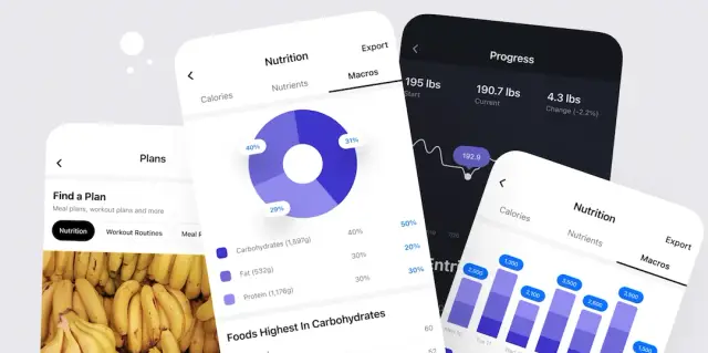
Image Source - dribbble/ Autor - Isaac Sanchez
Whether going through the traditional app development process or modern no-code iOS app development, you can turn your app ideas into a reality by keeping some important factors in this. This comprehensive guide to iPhone app design will help you learn about iPhone app development.
Yes, you can create a user-friendly and attractive iPhone app design by keeping some important things in mind, such as the correct placement of UI elements and knowing how to create an intuitive UI design.
Moreover, platforms like AppMaster have easy-to-use drag-and-drop features that help inexperienced as well as experienced designers in building different screens and the overall iPhone app.
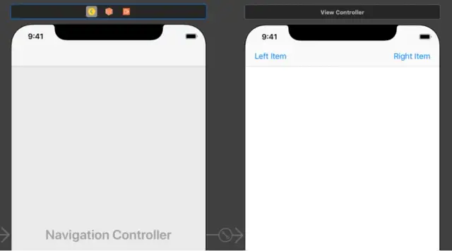
The major steps involved in iOS app development are:
Whether you want to create an Android app for your personal use or publish a mobile app on Apple's App Store, there are certain UI/UX design conventions that you should follow to get the best results. The major stages involved in UI/ UX design are:
The size of the mobile screen matters a lot while designing an app. In order to publish an app on Apple's app store, you have to consider many different factors, including the fact that the apps are optimized for iPhone screen sizes. The following pictures show different iPhone screen sizes:
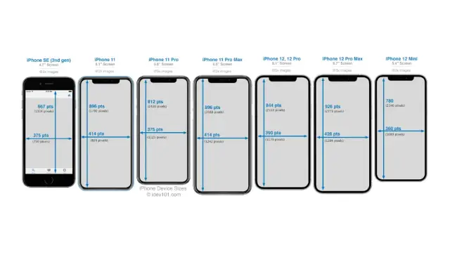
Selecting the suitable screen size for your iOS app is important to ensure your iPhone app reaches the maximum number of people and does not get lost in the crowded iOS App Store.
Generally, you should always use the size of the most popular iPhone screen size to ensure your iOS app reaches the maximum number of people. However, if you are building an app for a specific purpose that involves a lot of visual details, you should also test that iPhone app on smaller screen sizes.
Keep the following things in mind while choosing the perfect artboard for iPhone app design:
You should also remember that a design that functions well on a compact screen (375pt) would almost likely function well on a larger screen (414pt), but the opposite of these conditions will not work properly.
Therefore, designing for smaller displays is usually preferable first, then verifying and modifying for bigger ones. The height of the artboard does not affect the iPhone app design much because the width is a much more critical aspect to consider while choosing the right size.
The size of fonts and other UI components on different iOS devices are measured in terms of "points" by iPhone app designers. Your screen is constructed of small squares of light called "pixels." A crisper picture results from smaller pixels, which is fantastic for an iOS app. It enhances the visual appeal for users as well.
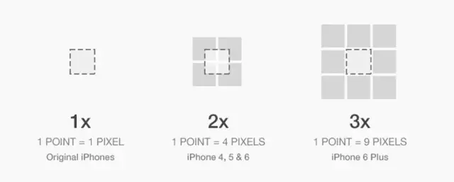
However, if you just reduced the size of your pixels, everything on the screen would do the same. The size of components on the screen is measured in points by iOS app designers in order to maintain balance. We could simply utilize a 2x2 square of pixels for every point (2x) after pixels were half as tall/wide as they began. Additionally, we could utilize a 3x3 square of pixels for every point once pixels were around a third of their original height/width.
It is possible to have displays with greater resolutions due to the point system, which prevents the items on the page from just becoming smaller. Designers often use phrases synonymously; you'll have to determine what they mean based on the context.
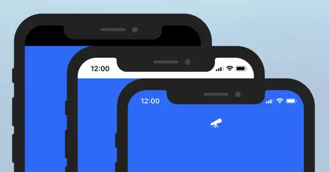
People can enjoy their favorite iOS apps and games on all of their devices by using a uniform layout that changes depending on the circumstance. Respect each platform's important display and system features. Safe screen zones enable you to avoid interfering with interactive system components like Dynamic Island on the iPhone, the Home indication, and the app switcher on the iPhone and iPad.
Make sure your app works on all screen sizes for a given device if it runs on that particular device. Therefore, an iPhone-only app must function on all iPhone screen sizes, and an iPad-only app must function on all iPad screen sizes. Every page has a status bar, with the exception of those with full-screen photos, videos, or other media. The time, Wi-Fi, signal, and battery indicators are all shown on the status bar, which may include text and icon writing in either black or white.
Any color or transparency may be used for the status bar's backdrop. Ultimately, designers choose the best design, colors, and overall theme according to the iPhone app they are creating. The iOS status bar is also useful for showing small icons whenever there is a notification from an iPhone app. Use white text if you're utilizing a status bar on any picture other than the lightest of images. Another option is to add a backdrop blur if you need a simple status bar over a few different photos. This "frosted glass"-style status bar blurs whatever colors are underneath it, improving the text's readability without adding more colors, borders, or excessively attention-grabbing components to the interface.
The light gray page backdrop serves as the frosted glass's "default" color. Hence the text above it should be black and not white. iPhones have had "notch" designs and rounded edges on the border only since the release of the iPhone X. The status bar on older iPhones and all iPads is shorter and more condensed.
The app's navigation, page title, key page actions, and - often - search are all shown in the nav bar. It typically has three rows with a height range of 44pt to 54pt. Accordingly, an iPhone app will display one, two, or three rows based on the page's requirements and the scroll position. Use a single row if you just need to compactly show a few page activities. The default iOS app page layout does provide two rows, one for page actions and the other for a big page title, if you can spare the extra room. This kind of design is more common in iOS apps for iPhones with bigger displays.
However, if the first row is empty and you need to display a search, you will require the third row. Now, just the pre-scrolled behavior is shown in the images above. iOS defines some intriguing behavior as soon as the user begins scrolling. When the iPhone apps are scrolled, a search bar that must always be visible shifts from the third to the second row.
Only when the user is at the very top of the page will it be visible if it is less significant; otherwise, it will completely vanish. When a user scrolls back to the top of the screen after the iOS nav bar rows have vanished, they will reappear. These factors must be considered while developing apps for iPhone to ensure the UI elements are placed correctly to ensure maximum user-friendliness.
The ability to easily move between various areas of an app is provided by the iOS tab bar, which sits at the bottom of an iPhone app screen. Tab bars are transparent, may have a tinted backdrop, are always the same height regardless of the screen's orientation, and are hidden while a keyboard is seen.
Any number of tabs may be present in a tab bar. However, the number of tabs that are actually visible depends on the size and orientation of the device. The last tab that can be seen turns into a More tab when certain tabs can't be seen owing to a lack of horizontal space, revealing the remaining tabs in a list on a different screen.
The device's most basic interaction model of the iPhone and iOS apps is established with the help of the home indication - going to the home screen. Apple begins by instructing users that they must swipe on that bar to move about the UI from the lock screen. If you mistakenly press or push on the lock screen, iOS will gently push up the home indication to animate what action has to be taken to return to the home screen.
The home indicator's constant appearance on the screen serves as a visual signal for where to swipe and enables the system to process touch inputs more rapidly and initiate the swipe action more quickly than it would otherwise. The possible cancellation of a gesture intended for an open application is not a concern for iOS. This is a major reason why switching tasks on the new iPhone X seems so much more responsive than launching Control Center on an earlier iPhone.
The best iPhone apps are the ones that utilize the built-in navigation features of the iPhone in the best way. The four main navigation options are Back, Swipe right, Cancel, and Swipe down.
Follow these guidelines for creating easy navigation options in iPhone apps:
Each app and game must have a beautiful app icon since they are an essential component of the user experience across all Apple platforms and iOS apps. You should design an iPhone app icon that can easily adapt to various forms and degrees of detail while keeping strong visual consistency and message since each platform specifies a somewhat different style for app icons.
Some of the important tips to keep in mind for an attractive iPhone app icon are:
Following are some other important conventions that you must keep in mind to design an efficient iPhone app:
iOS Tap Target Size
Every button, slider, and input control that the users can tap on in your iOS app should be at least 44x44 points in size.
Text links are the lone case where doing so is really acceptable. Each line of text in paragraph text will probably be much smaller than 44pt. This implies that your links will have tap targets that are smaller than 44pt, and it will be difficult for users to touch links precisely if they appear in the same place on two lines of text that follow one another.
Even while it can't always be prevented, it's important to be aware of this as a potential problem so that designers can modify the design of the iPhone apps accordingly. Otherwise, it can adversely impact the user experience.
Dark Mode
In order to utilize the 'Dark Mode' option in iPhone apps appropriately, you should follow these guidelines:
Invert text colors
Inverted text color is used in iPhone apps. It means black text turns into white, dark gray text turns into light gray text, and medium gray text essentially remains the same. If you examine the typography of the dark mode-enabled apps, you'll see that iOS actually reduces the number of text color tones and streamlines them for their dark theme. If you're unsure whether to make a middle-brightness gray lighter or darker, use the solution with the text standing out more against the backdrop.
Shifting background colors
The colors in the backdrop have all just been made darker, as opposed to the text, which has darker hues become brighter. In dark mode, a backdrop color that was lighter in light mode remains lighter. It happens because the sky is the source of light.
If you realize that, you'll realize that the backdrop hue indicates depth (unlike text). As a result, it operates entirely differently. These tips can be followed for Android apps as well.
Traditional iOS app development procedures require a lot of time and cost. Therefore, it is much better to rely on no-code tools to build iPhone apps for yourself. By using these platforms, you can even build a basic iPhone app for free. However, if you want to build a sophisticated app that wants to be one of the best iPhone apps, you will have to spend some money.
No-code app development is one of the best ways of building an iOS app easily, quickly, and cost-effectively. AppMaster is a powerful drag-and-drop app builder that allows you to build Android apps, web apps, and iOS apps.
The user-friendly app builder AppMaster enables anyone, with or without coding skills, to develop as many applications as they'd like, all of which may be native to certain devices such as iPhones. The powerful visual editing tools of AppMaster make it easy for anyone to design iPhone apps and publish them on the iOS app store.
Following are some of the many benefits you can expect to enjoy by using AppMaster for no-code iOS app development:
Not least, AppMaster integrates effectively with a variety of different tools. You can get push alerts, personalize your push notifications, make social media reports, and get authentication for your mobile projects or applications by integrating your preferred technologies. Among the connectors that AppMaster offers are Zoom, Discord, Microsoft Azure, Slack, and more.
Experiment with AppMaster with free plan.
When you will be ready you can choose the proper subscription.


