


 Mar 10, 2026
 7 min
7 minRole-Based Dashboards for Teams in One Shared System
Role-Based Dashboards help sales, operations, finance, and support work in one system while each team sees the tasks, data, and KPIs that matter.
Delve into the art of crafting adaptable user interfaces on Android using Jetpack Compose. Learn the best practices to create dynamic, responsive layouts that shine on any device.

Creating UIs that provide seamless interactions across many devices and screen sizes is no longer just a nicety — it's essential. As users engage with apps on devices ranging from smartwatches to televisions, it becomes imperative for an app to adapt its interface to ensure usability and aesthetics are not compromised. This is where Adaptive UIs come into play: they are designed to respond to the diverse array of screen dimensions, orientations, and resolutions present in the ecosystem of modern devices.
An Adaptive UI is not solely about scaling up or down based on screen size. It's about reimagining components to make optimal use of available space while maintaining a consistent experience. What could be a full navigation menu on a desktop might need to be collapsed into a hamburger menu on a mobile device. A multi-column layout on a tablet may need to reflow into a single-column stack on a phone. All these adaptations ensure that the core functionalities are easily accessible and the content is readable without excessive zooming or scrolling.
Moreover, Adaptive UIs are not just focused on the present. They are forward-thinking, poised to embrace device innovations without necessitate extensive redesigns. This approach is economical in terms of time and resources while supporting a longer lifespan for the application. Importantly, it also fosters inclusivity, making apps accessible to a broader audience irrespective of the devices they prefer or require due to physical limitations.
In Android development, Google's Jetpack Compose is a cutting-edge toolkit that simplifies UI development. Its declarative syntax enables developers to intuitively describe UI components which the framework translates into an efficient and adaptive layout. Whether targeting a fixed-size device or ensuring your app looks good in split-screen mode on foldable phones, Jetpack Compose makes these tasks more straightforward. As we delve deeper into how Jetpack Compose handles adaptive layouts, it will become clear why it is a powerful ally for crafting interfaces that stand the test of time and technology.
Using Jetpack Compose with sound development principles and user-centric design, developers can build Adaptive UIs that are reactive and proactive, anticipating changes in user interfaces prompted by the next generation of devices.
Jetpack Compose is revolutionizing how developers construct UIs in Android applications. As a modern toolkit, it simplifies the process, making it a preferred choice for building adaptive, scalable, and interactive user interfaces. If you're new to Jetpack Compose or looking to refine your understanding, this section will guide you through the initial steps and fundamental concepts.
To embark on your journey with Jetpack Compose, you'll need to set up your development environment. This process involves updating Android Studio to the latest version that supports Jetpack Compose and configuring your project to use the appropriate dependencies.
Here's a broad outline of the steps to get started:
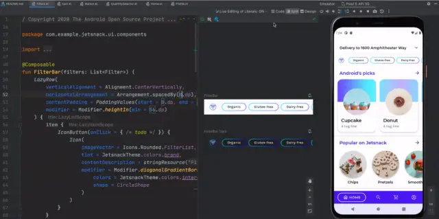
Image Source: Android Developers
Once you grasp these concepts, you'll be well-positioned to learn about more sophisticated features like theming, navigation, and animation within Jetpack Compose.
Remember, a strong foundation is crucial when learning any new technology. Take the time to experiment with each new construct and practice by building actual UI components. As you grow more comfortable, you'll appreciate the power and elegance Jetpack Compose brings to Android UI development.
For developers looking for added efficiency and integration with backend systems, AppMaster can complement Jetpack Compose by facilitating the seamless connection between the adaptive UI and the backend logic, enhancing the development workflow.
Developing an adaptive UI requires an understanding of responsive design concepts which ensure that users receive a consistent experience regardless of device or screen size. Jetpack Compose's modern toolkit operates on these principles, empowering developers to create elegant and functional interfaces across an array of devices.
At its core, responsive design is about flexibility and adaptability. It entails the creation of UIs that can detect the device's screen size and orientation, adjusting the layout dynamically to fit the content optimally. It's about considering typography, spacing, image scaling, and interactive elements to guarantee that they all behave predictively under varying conditions.
Beyond these principles, it's essential to be attentive to the context in which your application will be used. Factors such as ambient lighting, network conditions, and even user's hand size (for handheld devices) can influence the design choices that make an interface genuinely adaptive.
By incorporating these responsive design principles into the development process with Jetpack Compose, developers can create UIs that look good and provide a seamless experience that resonates with the user on any device. Platforms like AppMaster further enhance this experience by streamlining the backend integration, ensuring that the responsive UI is backed by equally responsive business logic and data management.
Developing user interfaces in Android has taken an innovative turn with the advent of Jetpack Compose. This modern toolkit has transformed the way developers construct and visualize UI components. Below, we’ll discuss the layout fundamentals that Jetpack Compose offers for building adaptive UIs.
At its core, Jetpack Compose operates on the principle of composing small, reusable units called 'Composables'. These functions declare how a portion of the UI should look and behave. Developers build a UI tree by nesting these composable functions. Jetpack Compose takes care of the rest, updating the layout in response to data changes without requiring verbose XML layout files.
The layout system in Jetpack Compose is both versatile and straightforward. Let's break it down:
Column, Row, and Box, which you can think of as the divs and spans of Compose. They structure other composables hierarchically and define the arrangement — whether it's vertical, horizontal, or layered composition.Modifier methods attached to composable functions, you can manipulate UI elements' size, padding, margins, and click behavior. Modifiers can be chained one after another to apply multiple configurations to a single composable.Button, TextField, and Scaffold further simplify the development process and ensure consistency with design standards.Understanding these layout fundamentals is crucial for leveraging the full potential of Jetpack Compose. Each aspect contributes to a more engaging, user-friendly, and adaptive UI design that excels on the numerous device screens Android applications cater to. Importantly, platforms such as AppMaster espouse the creation of consistent and scalable solutions, where the UI/UX paradigm can be resourcefully executed using tools like Jetpack Compose, integrated with powerful backend services rapidly and with little coding effort.
Developing adaptive user interfaces (UIs) that work across various device form factors is a critical aspect of modern Android application development. Jetpack Compose, a modern toolkit designed to simplify UI development, provides a set of features to create UIs that look great and adjust seamlessly to different screen sizes and orientations. One such feature is the powerful concept of Modifiers.
Modifiers in Jetpack Compose act like building blocks for composables, which are the core elements that define your UI. They modify composables by decorating them with additional properties like padding, alignment, layout constraints, etc. Understanding and effectively using modifiers is essential in creating layouts that adapt to the user's device and preferences.
Before digging into modifiers, you should set up your Jetpack Compose environment. Confirm that you have the latest version of Android Studio and that Jetpack Compose is included in your project's dependencies. Once the environment is set up, you can begin experimenting with different modifiers to manipulate the layout and behavior of your UI components.
There are several types of modifiers available in Jetpack Compose, each serving a unique purpose:
.width(), .height(), or .size()..padding()..fillMaxHeight() or .fillMaxWidth()..background() and .border()..clickable().When building adaptive UIs with modifiers, consider the following strategies:
.fillMaxWidth(fraction) to make your UI responsive to different screen widths.Row and Column layouts to dynamically position elements based on available space.For complex layouts, you may need to employ more sophisticated modifier techniques:
Jetpack Compose and its system of modifiers provide a flexible and efficient way to construct UIs that can automatically adjust to the user's environment. By combining different strategies and modifier types, developers can build interfaces that are intuitive, accessible, and visually consistent across a wide range of devices and screen sizes. And for businesses or enterprises using platforms like AppMaster, which aids in backend development, integrating a dynamic frontend created with Jetpack Compose can be even more streamlined and effective.
Creating an adaptive user interface that looks great across many device screens is crucial when building Android applications. Jetpack Compose's modern toolkit has ushered in a new era for Android UI development, providing developers with the power to design apps that look good on every screen size and handle changes in orientation effortlessly.
The concept is straightforward - construct a UI that adapts its layout to the width and height available, whether on a compact phone, a mid-size tablet, or a large-foldable screen. Yet, Jetpack Compose's real strength lies in how it copes with the changes in a device's screen orientation from portrait to landscape or vice versa.
Screen orientation change is a type of Configuration change. In traditional Android development, Configuration changes can be disruptive, forcing an activity to restart and creating a hassle to save and restore state. Jetpack Compose simplifies this by inherently handling these changes smoothly and enabling developers to create reactive UIs that can adapt without extensive boilerplate code.
val configuration = LocalConfiguration.currentval screenWidth = configuration.screenWidthDp.dpval screenHeight = configuration.screenHeightDp.dp
Using the LocalConfiguration.current composable provides screen width and height, thus allowing your UI to make decisions based on these dimensions. You can then craft your composables to adapt to these changes, ensuring that the UI is consistently responsive.
To truly harness the capabilities of adaptive UIs, you'll need to think beyond fixed widths and heights. Jetpack Compose allows developers to create fluid grids and wrappable components with ease:
LazyVerticalGrid( cells = Adaptive(minSize = 128.dp), content = { items(items) { item -> // Your item content here } })
The Adaptive class within LazyVerticalGrid helps in creating a grid where the column size adapts to the screen size, which is incredibly useful for displaying collections of data or controls.
Just as in traditional Android development, resource management still plays a critical role. By leveraging resource qualifiers, you can provide different resources for different screen sizes and orientations. For example, you might define separate layout files for screens with certain minimum widths or heights, or for landscape versus portrait orientations.
Jetpack Compose integrates seamlessly with these Android fundamentals, enabling developers to utilize the rich set of resource qualifiers that have been part of the platform for years.
AppMaster, a platform specializing in no-code backend solutions, appreciates the fluidity that Jetpack Compose brings to the table, especially when it comes to crafting orientation-specific UIs. To build a composable that changes with orientation, consider the following example:
@Composablefun ScreenWithOrientation() { val orientation = LocalConfiguration.current.orientation if (orientation == Configuration.ORIENTATION_LANDSCAPE) { LandscapeLayout() } else { PortraitLayout() }}
This simplifies the logic required to deliver two distinct UI experiences for portrait and landscape modes, without the need for cumbersome lifecycle management.
Handling screen sizes and orientations in Jetpack Compose is about embracing flexibility and reactivity. With smart use of Compose's tools and Android's resource system, your applications can offer a seamless user experience that fluidly adapts to any device. As technology continues to evolve, so too will the ways we build responsive, user-centric designs.
Creating an accessible application is no longer a 'nice to have'— it's a must. Designing for accessibility means ensuring that people with varying abilities can use your app comfortably and effectively. This consideration is an integral part of the user interface design, especially when building Adaptive UIs with Jetpack Compose, which is designed to accommodate diverse users and contexts.
Jetpack Compose offers various tools that help developers consider and implement features that make UIs more accessible, such as:

Developers should also leverage the AccessibilityTree in Jetpack Compose, which gives an overview of how accessibility services interpret your app's UI. By using this tool, you can identify and fix areas of your app that may not be accessible to all users.
Testing is another critical component of designing accessible UIs. Each feature should be tested both programmatically, using accessibility linters or checkers, and manually, considering various disabilities. Furthermore, involving users with disabilities in testing provides invaluable feedback and ensures a more inclusive user experience.
Finally, remember that accessibility is an ongoing process. As technologies and standards evolve, so should your app's UIs. Employing a mindset geared towards inclusivity broadens your app's reach and ensures a more engaging experience for all users.
Incorporating platforms like AppMaster can simplify the process of making accessible UIs by handling backend connections and providing a supportive foundation to manage data and business logic, while you focus on creating an Adaptive UI that’s inclusive for everyone.
State management becomes a critical concern when building adaptive UIs, particularly in the mobile space where screen sizes and user interactions can vary widely. In the context of Jetpack Compose for Android, state is the information that determines the configuration and behavior of your UI at any given moment. Reacting to changes in this state smoothly and efficiently is what makes an interface truly adaptive.
Leveraging state within Jetpack Compose involves understanding mutable state, state hoisting, and the recomposition process. Let's dive into how state can be used to build more dynamic and responsive UIs.
In Jetpack Compose, state objects are created using the mutableStateOf function, which returns an observable object that can trigger recomposition when its value changes. This reactivity is fundamental for creating adaptive UIs that must update in response to different user inputs or environmental changes such as device orientation.
val textState = remember { mutableStateOf("Hello, Compose!") }// 'textState' is now an observable state that can be used in a Composable
State hoisting is a pattern where you move state to a higher logical level. This promotes better separation of concerns, increases composability, and makes the UI more adaptive. By hoisting state, you enable a component to react to state changes regardless of where those changes originate, facilitating greater flexibility and modularity in your UI design.
@Composablefun MyTextInput(text: String, onTextChange: (String) -> Unit) { TextField(value = text, onValueChange = onTextChange)}// In the parent Composablevar text by remember { mutableStateOf("") }MyTextInput(text = text, onTextChange = { text = it })
Recomposition is how Compose responds to state changes; it redraws the UI with the new state. To ensure efficiency, Compose is smart about what parts of the UI it recomposes. For example, when building a UI that adapts to different orientations, you can define different layouts based on the orientation state. The framework only recomposes the affected part of the UI.
val orientation = remember { mutableStateOf(Configuration.ORIENTATION_PORTRAIT) }// Now your UI can react and change layout based on the 'orientation' state
Part of creating an adaptive UI is managing state across configuration changes, such as rotations or keyboard visibility changes. A special Compose function, rememberSaveable, is used to remember state across such changes. This ensures that the state of your UI components is preserved, providing a seamless user experience.
var count by rememberSaveable { mutableStateOf(0) }// 'count' will be preserved across configuration changes
Beyond device configurations, state can also adapt the UI to different user preferences, such as theming, language, and accessibility settings. Using state, your composables can react to these user preferences and provide an adaptive UI tailored to individual needs.
val isDarkThemeEnabled = remember { mutableStateOf(false) }// UI components can toggle between light and dark themes
State is not only used for UI properties but also for handling data fetched from backend systems. With no-code platforms like AppMaster, which automates the creation of backend systems, you can integrate a seamless flow of data into your adaptive UI. This allows your interface to dynamically display data or adjust its presentation according to the data state.
val userProfile = remember { mutableStateOf<UserProfile?>(null) }// 'userProfile' will be updated when data is fetched from the backend
To sum up, leveraging state in adaptive UIs designed with Jetpack Compose is paramount. By using mutable state, state hoisting, and smart recomposition, you can create intuitive, adaptable interfaces that provide an optimal user experience across various device types and user scenarios.
When it comes to building complex layouts with adaptive UIs in Android, developers seek out powerful frameworks and tools that can simplify the process while offering high flexibility. Jetpack Compose, the modern toolkit for building native UIs on Android, provides a range of advanced techniques that cater to even the most intricate designs. Let's delve into some of these advanced techniques that enable developers to create multifaceted and adaptive layouts.
Just like in traditional Android XML layout building, Jetpack Compose offers a ConstraintLayout that allows developers to construct complex UIs with a flat view hierarchy. ConstraintLayout in Compose gives you the power to define constraints for your composables relative to other elements or guidelines, enabling a high degree of control over positioning and size. Sometimes, you need to articulate UI components in relation to one another, and ConstraintLayout is your hero for crafting such scenarios.
To utilize ConstraintLayout, you would typically create a ConstraintSet defining the constraints, and then apply it to a ConstraintLayout scope. The beauty here is that you can react to state changes and update your constraints dynamically, making your UI truly adaptive.
While predefined layouts like Row, Column, and Box serve many use cases, sometimes you need something really tailored. Compose enables developers to create custom layout composables using the Layout composable. You can measure and place child composables exactly how you need to, opening up an avenue for custom, adaptive strategies in your app's UI.
For example, you could build a staggered grid layout that adapts to content size, or even a circular layout that positions elements radially. These custom layouts can adapt to different screen sizes and orientations by re-measuring and repositioning children as part of the recomposition process.
Complex UIs often require scrolling behaviors that are not always linear or one-dimensional. With Jetpack Compose, you can nest scrollable composables like LazyColumn or LazyRow to create multi-directional scroll experiences. Moreover, you can synchronize scroll states between different parts of your layout, providing a seamless user experience, which adjusts itself as needed to fit various screen sizes.
Imagine a news app where articles can be scrolled vertically while categories slide horizontally at the top. Achieving this in Compose is possible and simpler than you might expect, thanks to the cohesive design of scrolling components.
One of the lesser-known yet powerful techniques in Jetpack Compose is subcomposition. It allows you to compose a part of your UI tree separately from the rest, and then insert it wherever needed. This can be particularly useful for layouts where certain UI elements are dynamically inserted into different UI parts at runtime. Subcomposition keeps things adaptable by letting you reconcile these seemingly disparate parts into a cohesive whole as conditions change.
For instance, if you have a set of controls that need to appear in multiple places within your app based on user interaction, you can define them once and then subcompose them into the appropriate container whenever needed.
An app's ability to adapt its UI doesn't stop at static layouts; it extends to how these layouts transition and animate in response to user actions and device orientation changes. Jetpack Compose provides the animateContentSize() modifier, which smoothly animates size changes of a composable, handling all the heavy lifting of frame-by-frame animation for you.
Besides simple size transitions, Compose's animation APIs allow you to define complex, choreographed animations that can adapt to different user inputs, such as dragging, tapping, or rotating the device. Animations can be highly customizable and reusable across different parts of your UI.
As a seasoned developer and advocate for simplifying the development process, leveraging these advanced techniques can lead to dynamic and intuitive user interfaces. Platforms like AppMaster offer seamless backend integration for those generated interfaces, rounding out the complete application experience for developers and users alike. With tools like Jetpack Compose and the AppMaster platform, the bridge between complex design ideas and functional, adaptive user interfaces becomes a reality, changing what's possible in Android development.
Building an elegant, responsive UI with Jetpack Compose is one part of the puzzle; ensuring it holds up to the users’ expectations is another. Testing is a critical step in the development process, ensuring that the community of Android users, regardless of their device specifications, experiences your application as intended. When testing adaptive UIs created with Jetpack Compose, it’s vital to consider the variability in screen sizes, resolutions, orientations, and user interactions that can influence the design's performance.
To start, unit testing in Jetpack Compose allows developers to verify individual composables or smaller components in isolation. This includes testing the logic behind layout changes, ensuring that when data changes, the UI reacts as expected. Utilizing the ComposeTestRule, you may write tests to simulate different screen configurations and check how your UI components adjust.
Integration testing takes a broader approach by examining user flows through multiple composables. These tests aim to uncover issues that might surface when your adaptive UI interacts with other parts of the application. This is where you try out different user journeys and ensure seamless transitions and correct layout adaptations.
UI tests are crucial in assessing the look and feel of your application. With tools like Espresso and UI Automator, you can create automated tests that interact with your Jetpack Compose UI as a user would. These tests can confirm that UI elements are not just present, but also displayed correctly across various device configurations — helping you catch any design discrepancies that might disrupt the user experience.
Let’s not forget the role of manual testing, where actual devices and emulators come into the mix. Developers need to engage with the application on different screen sizes and aspect ratios to ensure that the UI maintains its adaptability. Especially for edge cases such as foldable devices or high-resolution tablets, manual testing can be invaluable. Working with a diverse range of real devices helps to perceive the application's UI as users would, offering practical insights that automated tests may miss.
Lastly, performance testing your adaptive UI is fundamental. Jetpack Compose is designed to be efficient, yet complex UIs can still impact performance. Monitoring the UI's frame rate, memory usage, and responsiveness helps ensure a smooth user experience across all devices. You can incorporate performance testing into your CI/CD pipeline by using tools like Android Profiler and benchmarking libraries to automate this aspect.
When integrating and testing connectivity with backend systems, platforms like AppMaster come in handy. They provide a backend environment to test your UI’s interaction with the server-side seamlessly, ensuring that your adaptive UI is functionally compatible with the underlying business logic and data flow.
A comprehensive testing plan that includes unit, integration, UI automation, manual, and performance tests will ensure that your Jetpack Compose adaptive UI is responsive and delivers a high-quality user experience on every device it graces.
Developing an adaptive UI that responds gracefully to different screen sizes, orientations, and input methods is crucial, but to create a fully functional application, these interfaces need to be supported by powerful backend systems. Integration with backend systems is an integral step to ensure that the UI is adaptable and the data and services that drive it are responsive and scalable.
Using Jetpack Compose to build the UI components is the first step. With its reactive programming model, Jetpack Compose makes handling dynamic data a breeze. The UI components, or composables, you define can automatically update in response to data changes, ensuring that the UI is always in sync with the backend data.
Most modern applications rely on REST APIs or live data streams to fetch and send data to the backend. Jetpack Compose integrates seamlessly with these APIs by using state management and observable patterns to ensure that your UI reacts to data changes in real-time. For instance, using LiveData or Flow in Kotlin, you can create data streams that your composables can subscribe to. Whenever the data updates — be it a database change or a message from a WebSocket — your UI will reflect these changes without the user needing to act.
Adaptive UIs often depend on sophisticated business logic that resides on the server. This separation of concerns allows for better scalability and maintainability. Your Jetpack Compose UI can interact with business logic through HTTP requests, or by using libraries like Retrofit to simplify network operations. Moreover, platforms like AppMaster provide an environment where business logic is visually mapped out, making it easier to understand and integrate with your Android app.
For applications that require offline capabilities or which handle complex datasets, it's vital to manage local data persistence and ensure it is synchronized with the backend. Jetpack Compose can work alongside ORMs or database libraries like Room, offering a smooth bridge between your UI and the local database. When data changes on the backend, the synchronization logic will update the local store, automatically updating the UI through the reactive data flow established by Compose.
User authentication is a common requirement for modern apps, and integrating with authentication services is critical for security. Jetpack Compose, being a UI toolkit, does not handle authentication directly. Nevertheless, it can be used with various authentication solutions, such as OAuth, OpenID Connect, or Firebase Auth. By incorporating authentication flow into your Compose UI, you ensure that your app adapts visually to different devices and securely manages user sessions across these devices.
By following these practices and leveraging the potent combination of Jetpack Compose with backend systems, developers can create adaptive Android applications that are as versatile in their functionality as they are in their presentation. The focus shifts from merely creating a flexible layout to architecting an entire system that can withstand diverse user requirements and technological shifts.
Turning the theory of adaptive UIs into real-world applications, case studies are a testament to the power and flexibility of Jetpack Compose in action. By exploring several instances where Jetpack Compose was used to create dynamic, responsive user interfaces, we can appreciate the practical advantages and innovative solutions it provides. This section delves into a few scenarios where developers harnessed Jetpack Compose to build adaptive UIs that shine across many Android devices.
In online shopping, an e-commerce platform sought to overhaul its Android app to enhance user experience and drive conversion rates. They turned to Jetpack Compose to create a UI that could adapt to various screen sizes and orientations, providing a seamless shopping experience on a phone, tablet, or foldable device.
By leveraging composables that adjusted layout elements based on screen size, the e-commerce platform introduced a flexible grid that could display two, three, or four product columns. Moreover, they utilized state management to remember user preferences and shopping cart contents, ensuring the experience was personalized and consistent across sessions.
Modifiers were particularly crucial, as they allowed for the easy alignment and spacing of UI elements, contributing to a visually appealing layout that resonated with users. The impact was significant: increased user engagement and a notable uptick in sales, demonstrating Jetpack Compose's ability to deliver adaptive UIs that drive business results.
A popular media player application faced the challenge of delivering a user-friendly experience that could adjust to different device functionalities, such as varying aspect ratios and screen real estates. They aimed to provide uninterrupted entertainment irrespective of the user's device choice.
Jetpack Compose enabled the creation of a media player interface that automatically resized and shifted components, offering an optimal view in both portrait and landscape modes. The use of aspect ratio constraints ensured that video content was always correctly framed, and playback controls appeared over the video or tucked away, based on the active UI state.
The practical outcome was impressive—a media player that felt intuitive to use on any device. User surveys reported higher satisfaction levels, and the time spent in the app increased. Jetpack Compose was pivotal in this success by providing the tools needed to build a truly adaptive and user-centric media experience.
A productivity application, aiming to distinguish itself in a crowded market, relied on Jetpack Compose to create a UI that adapted to device characteristics and the user's work habits. The application featured a dashboard that self-organized based on the tasks and tools the user accessed the most.
Advanced techniques, such as using ConstraintLayout, allowed the developers to construct a complex UI that was easy to navigate and modify. Jetpack Compose's reactive framework meant the UI could update in real-time as tasks were completed or priorities changed.
Integration with backend systems, such as those provided by AppMaster, ensured that all user data was synced across devices, resulting in a consistent and efficient workflow. The productivity application saw an adoption rate far exceeding expectations, demonstrating how adaptive and reactive UIs can play a pivotal role in meeting user expectations and enhancing productivity.
These case studies exemplify the real-world impact of adaptive UIs built with Jetpack Compose. As developers continue to uncover the full potential of this toolkit, we can expect to see even more innovative applications that combine aesthetically pleasing design with functional flexibility and responsiveness, all aimed at providing the best possible experience to the end-user.
With the advancements in mobile technology and the increasing complexity of user interfaces, developers need tools that can keep pace without compromising on efficiency or user experience. Jetpack Compose represents a significant leap in this direction for Android UI development. Its modern, declarative paradigm frees developers from the constraints of traditional view-based layouts and unleashes a more intuitive approach to building interfaces.
As the Android developer community continues to embrace Jetpack Compose, we can expect to see an evolution in the way apps are crafted. Compose's ability to handle complex UI patterns with minimal and readable code makes it not just an option, but an inevitable choice for modern Android development. Moreover, its integration with other Jetpack libraries and Kotlin features will continue to improve, thus providing a rich ecosystem for developers to plug into.
The trend towards adaptive UIs is one that Jetpack Compose is uniquely positioned to champion. With the inherent flexibility of its composables and the power of reactive programming, developers can create applications that look great and function seamlessly across various devices and form factors. This is especially important as the variety of screen sizes — from wearable devices to foldable smartphones—continues expanding.
Furthermore, tools like AppMaster embrace the philosophy of rapid development and scalability, allowing for seamless backend integration with Jetpack Compose frontends. The synergy between powerful backend generators and adaptive UI frameworks like Jetpack Compose is shaping a new era where full-stack development becomes more approachable and time-efficient.
The community can expect Jetpack Compose to grow with features that make development even faster and easier. Anticipating advancements like drag-and-drop design tools, improved live previews, and an even tighter integration with IDEs will further streamline the development process. As we continue to move into an era of screen diversity and user-centric designs, Jetpack Compose stands as a pillar of modern UI development, ready to meet the challenges head-on and evolve with the needs of developers and end-users alike.
 What is an Adaptive UI?
An Adaptive UI is a user interface designed to provide an optimal experience across different devices and screen sizes by dynamically adjusting its layout and functionality.
Why is Jetpack Compose suitable for building adaptive UIs?Jetpack Compose streamlines UI development with its declarative approach, making it easier to create dynamic and reactive layouts that adapt to various device configurations.
What are some key responsive design principles?Key responsive design principles include using relative units, creating flexible grid-based layouts, and applying media queries for different screen sizes.
How do Modifiers work in Jetpack Compose?Modifiers in Jetpack Compose are used to alter or decorate composables, such as changing dimensions, handling padding, and managing click events.
Can Jetpack Compose handle different screen orientations?Yes, Jetpack Compose can handle different screen orientations by utilizing the Configuration changes and recomposition to adjust the UI accordingly.
How does Jetpack Compose aid in designing for accessibility?Jetpack Compose provides built-in tools and composables that make it easier to create accessible UIs, such as providing content descriptions and customizing touch targets.
What's the role of state management in adaptive UIs with Jetpack Compose?State management is crucial as it helps track and respond to changes in the UI, ensuring that the interface remains consistent and adaptive to user interactions and device configurations.
What are some advanced techniques for complex layouts in Jetpack Compose?Advanced techniques include using ConstraintLayout for intricate designs, employing custom layout composables, and building nested scrollable components.
How should I test my adaptive UI developed with Jetpack Compose?Testing should involve a combination of unit tests for individual composables, integration tests for user flows, and UI tests across different screen sizes and orientations.
Is it possible to integrate Jetpack Compose UIs with backend systems?Absolutely, Jetpack Compose UIs can be integrated with backend systems. Platforms like AppMaster facilitate the connection between the UI and backend, managing data models and business logic seamlessly.
What is the future of UI development with Jetpack Compose?The future of UI development with Jetpack Compose is expected to center around more intuitive and efficient ways to build cross-platform, dynamic interfaces with less code and more functionality.
Experiment with AppMaster with free plan.
When you will be ready you can choose the proper subscription.
 Mar 10, 20267 min
 Mar 08, 202611 min
 Mar 07, 20269 min