


 Jul 14, 2026
 6 min
6 minEquipment reservation app: prevent conflicts and track returns
Plan an equipment reservation app that prevents double bookings, records returns and damage, and places faulty items on maintenance hold.
Unlock the secrets of theming in Jetpack Compose to customize your app’s aesthetics. Learn how to define themes, apply color schemes, and create a unique user experience with our in-depth guide on personalizing your app's interface.

Welcome to the world of theming with Jetpack Compose, the latest and greatest UI toolkit for native Android development. Embarking on a journey to customize your app's aesthetics through theming is not just about slapping on a few colors and hoping for the best — it is about creating a cohesive, accessible, and memorable experience for your users. In this guide, we delve into the nuances of theming, offering you a deeper understanding of its principles and how to apply them effectively. Whether you're looking to infuse your brand's personality into your app, support dynamic theming, or integrate with modern design systems like Material You, you've come to the right place.
We'll also touch on how the AppMaster platform can assist in achieving a smooth theming workflow, harnessing the power of no-code development to bring your design vision to life in a hassle-free environment. So, let's set the stage for a transformative process that transcends mere color choices and elevates the user experience to unprecedented heights.
Theming in Jetpack Compose is a fundamental app design aspect beyond mere colors and fonts. It encompasses a comprehensive design decision set that provides structure and context to your app's aesthetics and user experience. Below, we’ll discuss the core concepts you need to grasp to effectively theme your Android apps using Jetpack Compose.
At the base of theming within Jetpack Compose lies the CompositionLocalProvider. This Declarative UI toolkit's construct enables you to propagate data down the component tree without explicitly passing it through each element. When it comes to theming, this is particularly powerful as it allows you to set values, such as color schemes and typography, at the top level of your app, and have them transmitted consistently throughout the entire user interface.
MaterialTheme is the central framework that you'll be interacting with when applying a theme in Jetpack Compose. It provides a structured way to define and apply theming elements — colors, typography, and shapes — that make up your UI. By customizing MaterialTheme, you encapsulate your design language, ensuring that UI components adhere to a consistent look and feel across your app.
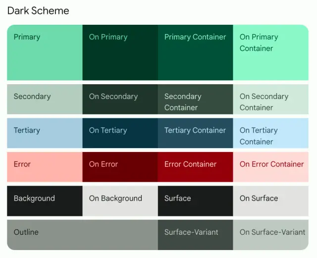
Within a Jetpack Compose theme, color schemes play a pivotal role. They influence user's emotions and can significantly impact their interaction with your app. Jetpack Compose offers a colors property, where you can define your color scheme using essential attributes like primary, secondary, background, and surface colors. These are then utilized by the components within your app to maintain a visually coherent experience.
Typography is another crucial aspect of theming. Jetpack Compose allows you to customize typography by defining fonts, sizes, weights, and styles for different text elements such as headings, subheadings, and body text. Consistency in typography enhances readability and ensures a more polished interface.
The shape system is an integral part of theming, as shapes can convey function and intention. The Shape attribute within the MaterialTheme enables you to define shape appearances for components like buttons, cards, and modals, aligning them with the theme of your app.
By thoroughly understanding these thematic components of Jetpack Compose, developers can start to create not only functional but also visually engaging apps. And for those who are looking to streamline this process even further, integrating a platform like AppMaster can enhance your workflow by providing no-code solutions that interface smoothly with Jetpack Compose. This combination can prove invaluable for developers aiming to produce high-quality, customized apps quickly and efficiently.
When crafting your Android app's aesthetic identity with Jetpack Compose, the color palette and typography serve as the cornerstone of your design system. A thoughtful approach to selecting colors and fonts reinforces brand identity and enhances the user experience by providing visual continuity and readability.
Your app's color scheme is one of the first design elements that captures attention. Choosing colors that reflect your brand’s ethos and appeal to your target audience is important. Jetpack Compose simplifies the process of implementing a color palette through the use of a ColorPalette object. This object contains the primary, secondary, background, surface, error, onPrimary, onSecondary, onBackground, onSurface, and onError colors, which define the look and feel of your application.
To define your color palette:
ColorPalette instance specifying your colors.MaterialTheme function.Remember that the user’s emotional connection with the application can be influenced significantly by color. For this reason, your palette should consist of complementary colors, along with neutrals for balance. Furthermore, color contrast is vital for visually impaired users, so aim for accessible design by adhering to the Web Content Accessibility Guidelines (WCAG).
Typography in Jetpack Compose is managed through a Typography object which contains text styles for different text appearances, such as h1 through h6 for headings, subtitle1 and subtitle2 for subtitles, and body1 and body2 for body text.
When customizing typography, consider the following:
Typography conveys information and sets the tone and hierarchy within your app. The right font family, size, and style combination can lead to an intuitive and aesthetically pleasing user interface. Jetpack Compose’s typography system allows you to theme your app with a cohesive typographic style, contributing to its identity.
Bringing the aspects of color and typography together for theming your app in Jetpack Compose will establish an effective visual language. Not only will this make your application more attractive, but it will also improve user interaction. An intuitive, consistent theme is a silent guide, helping users navigate your app naturally.
AppMaster, with its no-code capabilities, further enhances the theming process by providing a visual representation of the design, allowing you to experiment with different palettes and typography settings until you find the perfect match for your brand and your users' needs.
Dynamic theming and Dark Mode have become quintessential features in modern app design, with users expecting apps to adapt to their environment and preferences. Jetpack Compose, with its declarative UI framework, supports dynamic theming out of the box, allowing developers to create apps that respond to system settings or user-defined themes with minimal effort.
At its core, dynamic theming refers to the capability of an app to modify its theme based on certain conditions, such as system settings or user input. This can include changes in color schemes, typographic scales, or component shapes. With Jetpack Compose, themes are typically structured around the MaterialTheme composable, which acts as an umbrella for providing default styling properties and color palettes to your UI.
To implement dynamic theming, you first need to define multiple theme variants that your app might switch between. This could simply be a Light and Dark theme, or more elaborate themes based on user choices.
To enable theme switching, developers can create a composable that allows users to toggle between different themes. This can be done by maintaining a state representing the current theme and updating it based on user interactions. Jetpack Compose utilizes a reactive programming model where the UI automatically updates upon state changes, making this process smooth and intuitive.
@Composablefun DynamicThemeToggler() { var isDarkTheme by remember { mutableStateOf(false) } Switch( checked = isDarkTheme, onCheckedChange = { isDarkTheme = it } ) MaterialTheme( colors = if (isDarkTheme) DarkColorPalette else LightColorPalette ) { // Your app’s screen content goes here }}
When it comes to integrating Dark Mode, the process is similar to implementing dynamic theming. Yet, instead of relying on user interaction, the app checks the system's theme settings to determine whether to apply the dark color palette. Compose offers tools like Configuration.uiMode to determine the current UI mode and toggle the theme accordingly.
@Composablefun AppTheme(content: @Composable () -> Unit) { val uiMode = Configuration.UI_MODE_NIGHT_YES val darkTheme = uiMode and resources.configuration.uiMode MaterialTheme( colors = if (darkTheme) DarkThemeColors else LightThemeColors ) { content() }}
It is also possible to listen for changes in the system settings to automatically switch between light and dark themes without requiring an app restart. This proactive approach to theming is much appreciated by users who may use battery saver modes or have their devices switch modes based on the time of day.
Smooth transitions between themes improve the user experience, and Jetpack Compose promotes this by encouraging the use of animatable color changes. The animateColorAsState function can help your app to gracefully transition between color states within the theme.
Furthermore, incorporating dynamic theming and Dark Mode isn't just about user preference; it's also about accessibility. Not every user can comfortably digest content on a brightly lit screen, so allowing them to choose a theme that suits their eyes can be a relief.
While Jetpack Compose optimizes the theming process for developers, platforms like AppMaster take it a step further by simplifying the development and deployment process. With its no-code approach, AppMaster allows for seamless integration of dynamic theming through visual customization tools. As you visually design your app, you can implement and test out different themes and quickly compile and deploy to see changes in action, ensuring an efficient and effective development workflow.

Dynamic theming and Dark Mode are more than cosmetic features. They are critical for the accessibility and user satisfaction of an app. Jetpack Compose provides the tools to craft a dynamic, user-friendly UI, while AppMaster enhances the developer's experience, offering an accelerated path from design to production, with visually appealing and adaptable themes that cater to diverse user needs.
Creating an appealing and unique user interface extends beyond color schemes and typography. In Jetpack Compose, the power to personalize your app's look is at your fingertips, especially through the nuanced customization of shapes and icons. These elements are integral to your app's visual identity and contribute substantially to user interaction. Let’s delve into how you can tailor shapes and icons to fit your theme perfectly in Jetpack Compose.
Jetpack Compose offers a flexible system for defining shapes that can be used across different components in your application. By customizing shapes, you can create a consistent visual language that matches your branding or the particular style you aim to convey.
To begin, define your custom shapes in a Shapes object. Here, you can specify shapes for small, medium, and large components, which correspond to elements like buttons, cards, and dialog backgrounds:
val CustomShapes = Shapes( small = RoundedCornerShape(4.dp), medium = RoundedCornerShape(8.dp), large = RoundedCornerShape(16.dp))
After defining your shapes, you can apply them within your theme using the MaterialTheme function:
MaterialTheme( shapes = CustomShapes, // Include your defined colors and typography) { // Your application content}
Once applied, these shapes become the default within your app's theme, ensuring a consistent application of rounded corners or other shape modifiers across the UI.
Icons are more than just simple graphics; they're a vital part of the user interface that guides interaction and improves navigation. Jetpack Compose makes it simple to integrate custom icons that resonate with your app’s theme and enhance usability.
Begin by adding your custom vector assets to your project's res directory. Once added, you can use these icons anywhere in your Composable functions. Here's how you can display a custom icon:
Icon( painter = painterResource(id = R.drawable.custom_icon), contentDescription = "Custom Icon")
To maintain the theme consistency, you can incorporate a consistent icon set that aligns with your app's visual design. This can be done by creating a dedicated object that holds references to all your custom icons:
object AppIcons { val customIcon = painterResource(id = R.drawable.custom_icon) val anotherIcon = painterResource(id = R.drawable.another_icon) // Add more icons as needed}
With this approach, you can easily manage and update your icons from a single source, which can be particularly beneficial as your application scales. To use them in your theme:
@Composablefun ThemedIcon(contentDescription: String?) { Icon( painter = AppIcons.customIcon, contentDescription = contentDescription )}
By crafting a specific iconography style and applying it consistently, you ensure that your app stands out aesthetically and fosters an intuitive user interaction flow.
Implementing these customizations manually can be time-consuming, especially for larger applications. Here’s where AppMaster can aid you. With AppMaster’s no-code platform, customizing and implementing a unique theme, including shapes and icons, is streamlined for efficiency. You can visually design your application’s UI while ensuring that your aesthetic choices are cohesive and propagate throughout your app without having to dive deep into the code or manage multiple files.
Integrating custom shapes and icons in line with your theme is key to a visually attractive and branded user interface in Jetpack Compose. It's not just about the visual delight; these elements contribute to the user experience, making navigation and interaction more enjoyable. Whether you’re an experienced developer or leveraging the capabilities of a no-code platform like AppMaster, take the time to infuse your app with these personalized aesthetic touches.
The advent of Material You marks a significant departure from the one-size-fits-all design approach that often comes with mobile apps. This powerful new framework, which is part of the Material Design family, offers unprecedented personalization for Android user interfaces, making it an ideal choice for developers using Jetpack Compose.
Let’s delve into how you can use Material You in Jetpack Compose to create an interface that stands out and resonates with your users personally.
Material You is Google’s latest design system emphasizing dynamic theming, responsive layouts, and human-centric aesthetics. One of its standout features is the ability to adapt and apply a theme based on the wallpaper and settings of a user’s device. This creates a cohesive and fluid design that extends across the entire Android ecosystem, offering users a more unique and intimate experience.
To leverage the color extraction capabilities of Material You, your app can extract primary and accent colors from the user's wallpaper to dynamically modify your app's color scheme. This is achieved through the DynamicColorPalette—a set of functions in Jetpack Compose that help you define color values that reflect the user’s current palette.
val palette = dynamicColorPalette( lightColorPalette = {...}, darkColorPalette = {...})MaterialTheme( colors = palette, typography = {...}, shapes = {...}) { // Your UI content here}
The code above adjusts the app's theming in real time, conforming to user customization and thus delivering a personalized experience.
Adaptive typography is another cornerstone of Material You. As the color palette of your app changes, text elements must remain legible and harmonious with the design. With Jetpack Compose, you can define a typographic scale that adapts to the user’s settings and preferences.
Similarly, shapes can be altered to match with the dynamic themes. You can customize the corner size of cards, buttons, and other components to complement the tone and style set by the user’s chosen theme.
The design repositories offered by Jetpack Compose in conjunction with Material You include components that respond to user's accessibility settings like font and display sizes. This ensures that your app does not just look good, but is also user-friendly for a wider audience, respecting their device preferences for an inclusive experience.
Developers who are geared towards creating apps with a focus on efficient design can utilize AppMaster. This no-code platform allows for easy and rapid backend, web, and mobile application development. With its compatibility with Jetpack Compose, you can craft your UI with drag-and-drop tools and then tap into the dynamic features of Material You to bring personalized theming to life. Embracing AppMaster within your workflow has the potential to significantly expedite the development process, while giving you the flexibility to create a powerful, user-centered design aesthetic.
Integrating Material You in Jetpack Compose applications is more than just an aesthetic upgrade. It is a commitment to user engagement and satisfaction. By crafting a unique experience that shifts and changes according to the user’s personal style, developers are fostering a closer connection between the user and the technology, making the app feel more like an extension of the self.
By bridging human-centric design with intelligent theming capabilities, leveraging Material You with Jetpack Compose allows your app to evolve visually, reinforcing its relevance in the eyes of each individual user.
Customizing your app's aesthetics with Jetpack Compose also extends beyond the application canvas into the broader Android system user interface. This includes the status bar, navigation bar, and even the keyboard that pops up when a user needs to type. While Jetpack Compose offers an innovative approach to UI development, ensuring your themed app runs smoothly across different devices and Android versions is still crucial.
The key to tackling system UI compatibility lies in understanding the intricacies of different Android versions and their respective features. Earlier versions of Android may not support certain UI customizations, such as modifying the navigation bar color, leading to inconsistencies in the app's theme. Therefore, it's essential to define fallback strategies that provide an almost identical experience across various devices and system versions.
By using the SystemUiController class from the accompanist-systemuicontroller library, you can seamlessly adjust the color and appearance of system bars to match your theme. For instance, changing the status bar color may involve:
SystemUiController(window).setStatusBarColor( color = MaterialTheme.colors.primaryVariant )
Still, be mindful of user preferences such as Dark Mode. Always provide an alternative color scheme for such scenarios. Also, confirm that the text and icons on the system bars remain legible against the background color you choose.
Handling compatibility requires you to perform conditional checks against the Android version currently running on the device. This enables you to call version-specific APIs only when they are available:
if (Build.VERSION.SDK_INT >= Build.VERSION_CODES.M) { // Use APIs available in Marshmallow (API 23) and above window.decorView.systemUiVisibility = View.SYSTEM_UI_FLAG_LIGHT_STATUS_BAR }
For devices running earlier versions, provide a default appearance that resembles your intended style as closely as possible, while considering functionality over aesthetics.
Comprehensive testing on a wide range of devices and screen sizes is non-negotiable. This not only uncovers visual discrepancies but also helps identify potential usability issues. Testing tools and services, both physical and virtual, can assist in this crucial phase. Employ a combination of automated tests and manual assessments to establish a visually appealing and functionally strong design, regardless of device characteristics.
Theming with compatibility in mind benefits greatly from Jetpack Compose’s adaptive capabilities. Utilize dynamic sizing units like dp for layouts and responsive typography scales to ensure your theme adapts to different screen densities and orientations. Also, don't shy away from using Compose's own Modifier.systemBarsPadding() to handle insets and avoid overlaps with system UI elements.
When combined with the powers of no-code platforms like AppMaster, iterative testing and UI adjustment become significantly more efficient. For example, AppMaster allows you to quickly scaffold Jetpack Compose-based interfaces and preview how they would look across various devices before diving into intensive testing phases.
Mastering system UI customization and ensuring compatibility is a substantial part of the theming process. By paying close attention to system integration, employing vigilant testing, and making informed adjustments, you can provide a consistent and delightful user experience that complements your stunning Jetpack Compose theme.
Creating a visually appealing and cohesive user interface (UI) is more than selecting a few colors and fonts; it's about crafting an experience that resonates with users and reinforces your brand's identity. Whether redesigning an existing app or starting from scratch, adhering to certain theming best practices can streamline this process and enhance the user experience. Below are fundamental guidelines to follow when theming with Jetpack Compose to ensure a uniform and engaging UI.
A cohesive UI theme results from careful planning and adherence to best design practices. By considering your users, your brand, and the tools at your disposal, like AppMaster and Jetpack Compose, you can craft a theming concept that elevates your app from merely functional to truly memorable.
Theming an application is not just about choosing attractive colors and fonts; it’s about creating a cohesive visual language that enhances the user experience. While working with Jetpack Compose simplifies the implementation aspect of theming, several challenges can arise. Here, we discuss navigating some of these common issues to ensure an effective and professional-looking theme for your app.
Consistency is key in theming. Users who navigate your application expect uniformity in components – from buttons and dialogs to bottom navigation bars. Achieving this consistency can be challenging, particularly when dealing with custom components or third-party libraries. To overcome this, define a clear design system that includes colors, typography, shapes, and component styles. Jetpack Compose's MaterialTheme makes it easy to apply consistent styling by using CompositionLocalProvider, which allows you to provide custom values that affect all composables that read from them.
Another common challenge is ensuring your theme looks great on various devices, screen sizes, and orientations. Responsive design practices come into play here. Use adaptive layouts that can accommodate different screen dimensions and leverage Compose's BoxWithConstraints to make decisions based on available space. Moreover, testing your theme across different devices during the development phase can help identify and resolve UI issues tied to scaling or layout changes.
Users appreciate apps that respect their preferences, such as the system's dark mode settings. Implementing dynamic theming that responds to these settings can be intricate. In Jetpack Compose, you can listen to system theme changes using uiMode configuration in the Context. Then, apply corresponding theme colors accordingly. Remember to provide options within the app to toggle these settings, offering users greater control over their app experience.
It's essential to ensure your app is accessible to everyone, including those with visual impairments. Color contrast ratios must meet accessibility standards to ensure legibility. Tools like the Web Content Accessibility Guidelines (WCAG) checker can help evaluate your color choices. Furthermore, incorporate content descriptions for images and provide sufficient contrast for interactive elements within your themes.
As your application evolves, so will your theme. Managing these changes without affecting user experience can be cumbersome. Here, version control and gradual rollout of changes prove beneficial. Always provide users with a sneak peek or an option to revert to the classic theme for a certain period to smoothen the transition.
Your app's theme is a direct reflection of your brand. Keeping brand identity consistent across different platforms and touchpoints is crucial. Start by defining a brand guide and ensure that your theme in Jetpack Compose aligns with this guide. This may involve creating custom color palettes, typography scales, and component shapes that resonate with your brand’s aesthetic.
The desire for personalization is rising among users. Providing an option for users to customize their app theme can improve satisfaction but also adds complexity to your theming code. To address this, structure your theme to be mutable and store user preferences persistently using Jetpack DataStore or SharedPreferences. Use these preferences to dynamically adjust the theme as required.
While working directly with code has its advantages, the AppMasterno-code platform can significantly simplify the theming process. By allowing you to visually design your app’s theme, including the color palette and typography, AppMaster streamlines theme customization. This visual approach can reduce errors and speed up the iteration cycle, an ideal solution for developers and designers striving for perfection in their app aesthetics.
Integrating a no-code platform like AppMaster into your theming workflow can shift the tides in your favor when building aesthetically pleasing and functionally powerful applications. One of the advantages of Jetpack Compose is its modern approach to building UIs with less overhead and a more intuitive process. Yet, coupling this with a no-code platform's efficiency and rapid development capabilities can further enhance productivity and the final user experience.
AppMaster excels in this domain as it brings forth an amalgamation of flexibility and power without needing in-depth coding knowledge. Through its intuitive visual development environment, you can design your app's UI with drag-and-drop ease, including intricate theming elements such as color schemes, typography, and shape designs.
In the Jetpack Compose context, AppMaster lets you visually lay out your components and define the theme parameters. These parameters can then be mapped and translated into Jetpack Compose's theming structure. This means you can define your color palettes, type scales, and shapes, preview the aesthetics, and have AppMaster generate the corresponding code. The convenience continues with this platform being capable of outputting the source code, allowing for any necessary tweaks or advanced customizations beyond the scope of the visual editor.
An example where AppMaster stands out is dynamic theming, including Dark Mode toggling. You can conveniently set up themes that respond to system settings or user preferences through its support for conditional logic and state management within the UI designer. Furthermore, with every design iteration, AppMaster ensures that the changes remain in sync with the no-code model, thus preventing the introduction of technical debt that could stall your project.
Lastly, team collaboration and workflow integration is simplified with AppMaster. Designers and developers can work in tandem, with the platform serving as a single source of truth for the theming aspects of the application. As a result, this leads to a cohesive development process, ensuring that both the vision and technical implementation of the application's theme align harmoniously.
In the journey to craft an intricately themed application with Jetpack Compose, we must circle back to the essence of why we theme: to harmonize the application’s functionality with its aesthetics. Weaving together the threads of colors, typography, shapes, and motion, theming goes beyond mere decoration. It's a thoughtful process to ensure that an application’s design language speaks to its usability and purpose, enhancing the user experience.
Jetpack Compose gives developers a canvas to express creativity while paying homage to Material Design's tried and tested principles. By leveraging Compose's flexible theming system, developers can create apps that not only look attractive but feel intuitive to use. This balance is critical: an app that dazzles users with its looks but falls short on usability misses the mark, just as an app that is functional but visually bland may fail to engage users.
This guide has explored the nitty-gritty of establishing a custom theme that embodies your app's spirit and brand identity. We've learned how to create a cohesive color scheme and how to implement typographic hierarchies that lead our users on a clear journey through our app. By embracing dynamic theming, we've empowered our apps to adapt to user preferences and environmental contexts like the coveted Dark Mode. And we've navigated the more personal aesthetics of shapes and icons to craft a truly unique user interface.
AppMaster champions this harmonization by providing a platform where the customization of an app’s theme is as much about the efficiency of development as it is about aesthetics. It allows for visual design and interactive interfaces that align with your theming choices, creating a seamless and speedy developmental cycle that marries form with function beautifully.
As we conclude, remember that theming is a continuous evolution, much like the platforms and devices our apps inhabit. Our themes must grow and adapt with each new design trend, device screen, and user expectation. By staying informed, testing thoroughly, and engaging with user feedback, we create applications that look good and feel right. In the end, it's this synergy between functionality and aesthetics that leads to truly memorable applications that users return to time and time again.
Each swipe, tap, and scroll within our apps is an interaction with our carefully selected theming elements. Our job as developers and designers is to ensure that every action is easy, intuitive, and visually pleasing. When functionality and aesthetics dance harmoniously, we provide an experience that resonates with users on every level. Jetpack Compose and tools like AppMaster are partners in this creative process, offering the foundations and flexibility to build apps that effectively blend innovation with inclusive design.
 What is Jetpack Compose?
Jetpack Compose is a modern toolkit for building native Android UI. It simplifies and accelerates UI development on Android with less code, powerful tools, and intuitive Kotlin APIs.
Why is theming important in app development?Theming is crucial for creating a consistent and engaging user experience. It helps in reflecting your brand's identity, makes your app stand out, and ensures that UI elements are visually appealing to users.
How can I define a custom color scheme in Jetpack Compose?You can define a custom color scheme by creating a ColorPalette object with your preferred primary, secondary, background, and other necessary colors, then applying it to your MaterialTheme.
What is Material You, and how does it relate to theming?Material You is a new design approach that emphasizes personalization and expression. It's built on Material Design principles and allows for a more dynamic and responsive theming experience based on user preferences.
Can Jetpack Compose handle dynamic theming and Dark Mode?Yes, Jetpack Compose can handle dynamic theming, including Dark Mode. You can define themes with corresponding light and dark color schemes that switch based on system settings or user choice.
How do I customize icons and shapes in my Jetpack Compose theme?You can customize icons and shapes by creating a Shapes object with your desired shapes for different components and overriding default icons with custom vector assets.
What are some best practices for theming in Jetpack Compose?Best practices for theming include using a consistent color palette, ensuring text readability, supporting Dark Mode, and designing for accessibility. Additionally, leverage existing theming libraries and components to maintain a cohesive look and feel.
Are there any compatibility issues to consider when theming with Jetpack Compose?Compatibility issues in theming may arise with different Android versions and screen sizes. It's important to test your theme on various devices to ensure a uniform appearance and experience.
Can I use AppMaster with Jetpack Compose to improve my theming workflow?Yes, AppMaster's no-code platform is compatible with Jetpack Compose, allowing you to visually create your app's UI, including theming, which can speed up development and facilitate easier customization.
How do I address common challenges in theming?Address common theming challenges by prioritizing user experience, maintaining consistency, testing extensively, and staying updated with the latest theming techniques and tools.
Experiment with AppMaster with free plan.
When you will be ready you can choose the proper subscription.
 Jul 14, 20266 min
 Jul 13, 202611 min
 Jul 08, 20266 min