Screen Types to Build an Efficient Mobile App UX for 2022
Your mobile app screen experience directly impacts your app user. Try out these three screen types to create an efficient mobile app UX for 2022.
Mobile apps are part of daily life, so the competition in this technology is rising. The mobile industry focuses on creating better hardware and software. Creating responsive mobile apps that attract and satisfy the app user demands high knowledge of the technology. Your app must stand out from the other apps.
The best way to give your app a unique look is to have a unique interface. The interface is the first thing that your app user will experience. For that reason, you should know highly about UI app design screens and the types that are commonly used to attract customers. Below we will discuss the common screen types used in the app industry.
Splash UI design screen
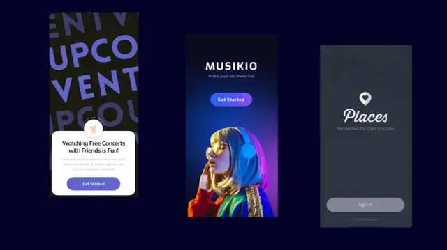
Image source:
The splash screen is your first display when the app user runs the app. These screen types have a crucial role because this is your chance to engage and attract app users. If your initial user experience is pleasant, he will be happy to see the rest of your app. Otherwise, there are chances that you might lose your new customer.
Usually, the splash screen is a logo design centered on the screens. However, adding a loading bar on your splash screen will be much more effective. This way, your customer will know how much time he has to wait to enter the app.
The splash screen types should not take long because this will annoy you. So make sure it has a smooth and pleasant user experience. If your user is happy, he will visit again. Otherwise, an unhappy consumer with a terrible experience will not return.
Things that splash UI design should have
- The most important thing is that the splash screen should not take too long. The maximum splash display time must be 2 to 3 seconds. If your splash screen takes a lot of time, your user will get frustrated and not be a happy customer.
- With time, if you notice that your app is used regularly, try to reduce the splash time as much as possible. You can even remove it if demanded by multiple users.
- Design should be visual and simple. Design should pleasantly deliver the message. You have very few seconds to deliver your message pleasantly. Make sure that you do not add a lot of texts. Try to add visuals that quickly deliver the message to your consumers.
Onboarding UI design
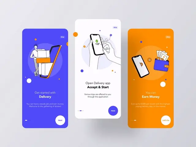
The onboarding design screen types will describe the app features, benefits, and how to navigate the features of the app. An excellent example is when you install windows on your device. Then, Cortana (AI robot) guides you about the basic setup and functions you can do. This screen type is crucial as, at this step, the user will understand whether the app will solve his problem or not. The onboarding display is usually different for creating mobile apps because every platform has its distinctive way of solving the particular solution. Some facts should be considered when the UI design onboarding display.
Facts to consider while Design onboarding UI screen
Understand the psyche of your user. Make sure you address the minor details like what kind of guidance a client requires. Either you are going into too much detail, or do your details offend the client? These kinds of things should be addressed while designing.
Show the features of your mobile apps excitingly. The client should be excited to see that your platform can solve his problem. Divide the tutorial steps so that the app user's excitement increments on every step he completes.
Make a connection with the customer using email or social media. Most probably, the user will not use your platform as much as they will use social media like Instagram, Facebook, etc. Another way is to keep reminding the user about your platform through emails. For example, offer discounts, tell them features about your platform, send a greeting message on special holidays, etc.
Main Menu or Home Tab
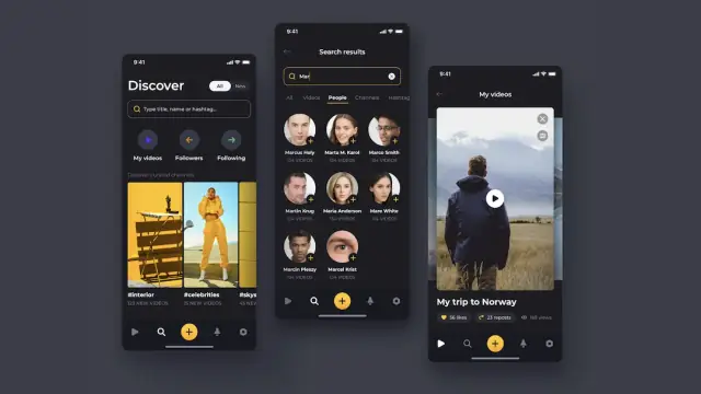
The main menu or home tab is the screen type where the users will spend a lot of time. He will navigate the functions, extra features, and many other things. The home screens should be attractive, engaging, and simple at the same time. Of course, the home screen depends upon the platform's product and features. But still, there are some essential functions that every home tab must have.
A common mistake a developer makes is when they don't create a search field in the main menu. Usually, users do not have time to navigate every function. So instead, they type the specific function in the search field and get their result within a few seconds.
Navigation elements that provide access to multiple contents are also very effective on the main menu screens. Also, a menu with a list of all the potential directions will help the users reach certain functions within a single tap.
Sign-up and Login Screen
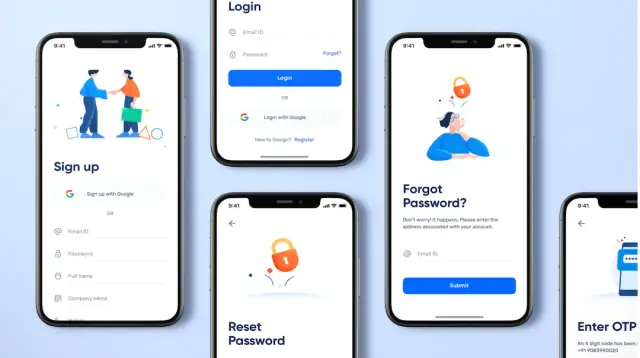
The signup and login success screen user is created to help the users register on your platform. Usually, users expect to sign up within 1-2 minutes. After that, you can link your user account with their Facebook or Gmail accounts. Please make sure you also add a separate signup feature so those users who do not want to connect their social media accounts can create an account on your platform.
The login success screen user should be to the point and minimalistic. In a typical login screen, there are two input options. The first one is the profile name, and the second one is the password. Some platforms also have a confirmation feature. The signup option must be available for people using the platform for the first time.
Importance of app account
A profile on the platform makes interaction with the device and people very reliable and easy. A personal account is significant in the world of social media. Your account is communicating with your social network. Having a profile makes sharing personal data or information very convenient. It would help if you considered the following factors while UI is designing the profile screens.
The first detail you need to address is ensuring that the profile success screen user looks simple and clear. The profile will look hectic if it contains much text and information. Most of the time, the profile screen is designed so that the reader gets easily informed without reading a lot of long texts. Secondly, the designer should research his targeted audience. Then, the profile success screen user should look professional and attractive to the audience that you are willing to target.
Stats screen
Some apps have a stats screen. The Stats screen tells the information simply and understandably. Not all platforms need to have a stats screen. It depends upon the product that your platform is offering. Ensure that screen has only the critical information. The data on the screen should not look complex for a pleasant user experience. The numeric digits used in the stats should be easy to follow.
Calendar UI design
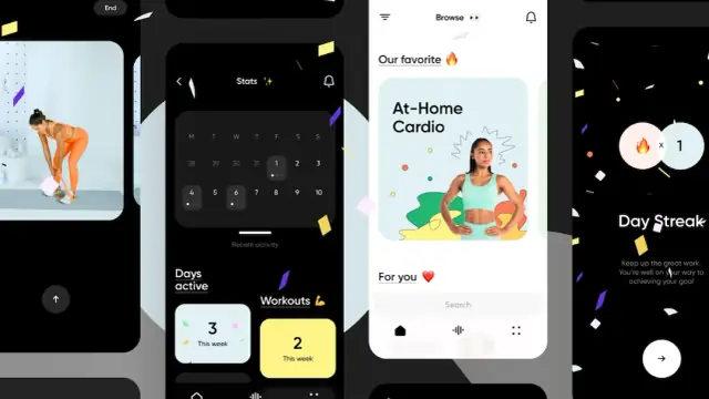
The calendar is an essential part of our lives. Especially the calendar has a lot of importance in our study and work life. We manage and mark special tasks on a calendar. That is why most apps have a calendar screen where you can easily see your tasks. For example, health, study, fitness, and event apps have a calendar screen.
An extra feature you can add to your calendar is to sync it with Google or iCloud. Make sure that the design of the calendar screen is customer-friendly and that the calendar style resembles the basic design of your apps.
Terms and conditions screen
The terms and conditions screen is shown to the new app users before they sign up for your app. This screen is a document containing information about the services you will offer. It also asks the app user about certain permission like access to files, galleries, etc. In the document, you should mention the use of the content, terms of services, rules, regulations, and rules that relate to the permanent ban or suspension. It is an important document, so get legal advice while creating terms of service documents.
FAQs
How many screens should an app have?
The ideal mobile screen number is between 8 to 11, respectively. Moreover, most successful apps have 11 screen types. Therefore, optimizing your app experience for about 8-10 screens and 30-50 controls per screen is advised.
What are 10 UX tips for designing better mobile apps?
Following are the 10 UX tips for creating a mobile app user experience:
- Your display types should be responsive
- Try Iterative designs
- Follow the UX minimalist and simple
- Perform testing with the help of real-time customers
- Keep it highly visual with a grand color scheme
- Update it frequently
- Understand your customer's needs
- Follow the UX rules
- Avoid the long-scroll problem
- Watch for market trends
What are the different screens of an app called?
Every platform consists of sub-sections which we commonly refer to as screens. The most common app screen types you can create are:
- Splash screen
- Sign-in and profile screens
- Home screen
- On-time tutoring screen
- Feed screen
- Product screens
- Checkout screen
- Statistics screen
What makes great apps in terms of visual design?
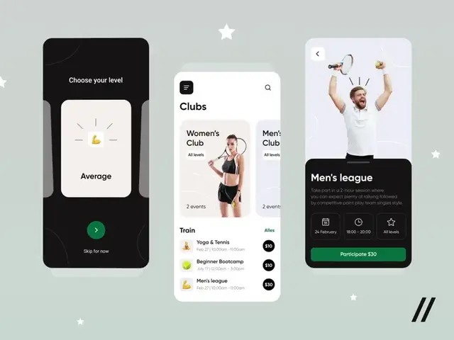
When it comes to visual design, make great mobile apps by following the basic elements and principles of visual design. This includes defined unity among the elements, keeping the gestalt principles in your mind, and placement and size of fonts matter a lot. Other essential elements are contrast, scale, and volume, along with eliminating negative white spaces.
How do you make an app screen?
Follow these steps to create a great mobile app screen:
- Create your column grid
- Create an alignment that scales
- Plan what types of screens you want in your app
- Make sure it upholds continuity
- Test input support for every element you integrated on your screen
What is a screen design?
Creating mobile app screen design is the layout of the apps. In layman's terms, it is the graphical design of your interface. These designs are just limited to your display. The main reason behind screen designing is to enhance the app user experience and improve app usability. The simpler and more accessible design will lead to great mobile app screen types.
What is the first screen of apps called?
The first screen of an app is called a splash screen. You may experience it as the logo or the app's launch screen. When customers open your app, a 1-2 second display appears on their device, which is just the name or logo of your app. The purpose of this screen type is to create a positive impact on the customer.
Why Are These Screen Types Important For Your Mobile App User Experience?
With over 6.3 billion smartphone consumers improving your app user experience is significant now because this will ultimately help you to make loyal app users and gain more.
The no-code platforms are paving their way in the industry, allowing new designers to show their creativity. These platforms do not require you to write down the long codes to create the desired module. Instead, just simply drag and drop, and you will have your design. Big organizations have a budget to afford professional UI/UX designers, but the lone wolf and small businesses always prefer a tool that cuts down their human force.
Try AppMaster as your next screen designing a no-code platform. With this tool, you will be the UX designer, coder as well as product manager of your app. You can experience how to create engaging smartphone screens and download their source code as well to patent the launch.


