25 Appealing Color Combinations For Your Next Design
You can produce various interesting hue schemes by utilizing the color wheel. Finding the appropriate color combination for a certain event is of the utmost importance.
Selecting the precise color combination that works best for your design is one of the most important steps in bringing it to life. It takes a skilled eye to pull together the appropriate colors to drive your message home, whether trying to convey the sensations associated with a stunning landscape, a romantic sunset, or a vibrant image exploding with color.
We have compiled a list of stunning color combinations that you are free to use in any of your projects to spare you some time and energy in your quest for the perfect color combination. These hue schemes may be used in almost any type of design.
Color Wheel and Color Combinations
Understanding how various colors interact with one another is the most important step in creating beautiful color combinations. Suppose you can master the color wheel and hue harmonies (what works, what doesn't, and how hue communicates). In that case, you will be able to blend colors more effectively, establish a stronger brand, and communicate more intelligently with your designers and printers.
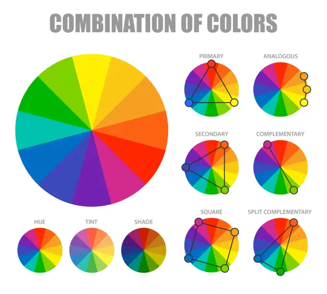 There are three fundamental hues which are red, yellow, and blue. There are also three secondary hues, green, orange, and purple, generated when the main colors are combined. Finally, there are six tertiary hues. If you were to draw a line in the middle of the wheel, you'd be able to distinguish between the warm hues (such as reds, oranges, and yellows) and the cold colors (blues, greens, purples).
When we think of cold hues, we often think of quiet, tranquility, and serenity. Warm hues, on the other hand, are linked with vitality, brightness, and activity. When you realize that each hue has its temperature, you may begin to comprehend how utilizing them might affect the information you want to convey.
A hue scheme, often known as a color combination, results from hues combining well. On the color wheel, hues that complement one another are those that are opposite to one another. Because of the strong contrast between the two hues, utilizing them together may create artwork that stands out, but combining them too frequently might get tedious.
On the color wheel, similar hues are grouped near one another. One hue will predominate, another will provide support, and a third will serve as an accent when developing an analogous hue scheme. The hues that make up a triad are uniformly dispersed over the color wheel and have a propensity to be highly vibrant and active. They produce contrast and harmony in the visual field, drawing attention to each individual component while simultaneously drawing attention to the whole. You can produce various interesting hue schemes by utilizing the color wheel. Finding the appropriate color combination for a certain event is of the utmost importance.
Best 25 Appealing Color Combinations
When it comes to design, the most powerful and versatile tool in a designer's hands is the hue. The following 25 hue choices are provided for consideration while you work on your next design.
These are the eye-catching color combinations developed specifically for you by our design team.
1. Peach and Royal Blue

For the first entry on our list, we'll go with a color combination that's currently popular: Peach and royal blue. These two hues create a triadic combination; the royal blue imparts an impression of boldness, which is well balanced by the peach color's sense of fun. This color combination works wonderfully for the creation of logos or is used as accent hues in the design or template of websites.
2. Black and Yellow
 The combination of black and yellow is one of the hue schemes utilized most frequently. The strong contrast between these two hues creates a beautiful color combination that works well together. This combination might be used well in the creation of an image or a label for a branded product.
3. Pink and Blue
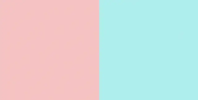
When combined, the pink and blue color combination produces a pleasing sense of harmony. The juxtaposition of pink and blue, with blue's more serious undertones, creates a sense of duality in the hue scheme. Pink tends to have a gentler, pastel, spring-like appearance.
4. Yellow and Red

The color combination of yellow and red is the next one on the list, and it is a combination that is both bold and vibrant. The spirit of joy is perfectly captured by these hues that contrast with one another. To give this time-honored combination of ketchup and mustard a contemporary and pastel makeover, try shifting the hues of the two condiments from red to coral.
5. Off-White and Cherry Red

The color combination or hue combo of off-white and cherry red is a truly timeless classic. This hue combination has a wonderful dual quality and functions well in both printed and digital formats.
6. Electric Blue and Lime Green

The hues electric blue and lime green are said to radiate vitality and vigor. These two vivid hues, when used together, perform particularly well in the creation of logos and in the fashion industry.
7. White and Baby Blue

White and baby blue are another timeless color combination that is noted for their dualistic qualities. This calm combination conveys a sense of ease and dependability, and it conjures up the sensation of looking up into the sky on a bright and sunny morning. The industries of healthcare, daycare and non-profit organizations would all benefit from using the color combination of white and baby for their brand colors.
8. Hot Pink and Cyan

This one is the trending image hue combo. Cyan is a difficult blue hue to match, but the hot pink and cyan hue scheme looks well together. It's a modern take on the traditional baby pink and baby blue that combines bubblegum pop with cyberpunk dystopia. These vivid, striking colors exude an energy that is perfect for a counterpoint to more fun brands.
9. Burnt Orange and Peach

Burnt orange and Peach make a similar color combination. These two-hue combo's attribute is probably their harmony, which makes them perfect for lifestyle, festival, or home interior businesses.
10. Blue and Bubblegum Pink

Next, sky blue and bubblegum pink. Bubblegum pink and baby blue convey youthful pleasure. This color combination works well for parenting companies, daycare logos, and children's clothes, goods, and toys.
11. Mustard, Sage, Forest
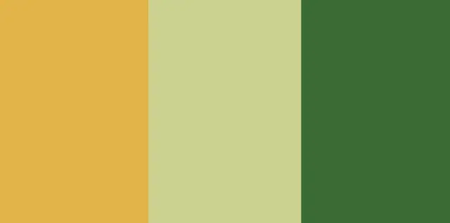
This one is another trending image color combo. Mustard, sage, and forest green contrast the cotton candy colors. These three colors create an earth-tone pallet. These hues are great for natural companies' logos, websites, products, and packaging.
12. Fuchsia and Neon Green

This hue combo is trending. Fuchsia and neon green are another high-energy hue mix. Fuchsia and neon green produce a lively feeling, making them great for fashion or avant-garde.
13. Orange, Peach, Custard
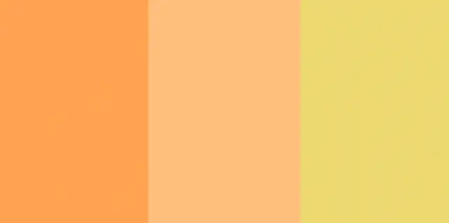
These color combinations are trending. Orange, Peach, and custard produce an orange gradient trending image. This combo is perfect for beauty or fashion firms wanting a playful, airy atmosphere.
14. Raspberry and Blue

Raspberry and blue create a cyberpunk, future vibe without being overly loud. This muted cyberpunk dystopia is excellent for lifestyle brands, logos, product development, trending image, and packaging.
15. Cherry Red and Bubblegum

Cherry red and bubblegum pink are comparable to cherry red and off-white. This combination offers a stunning high contrast, perfect for product, trending images, or brand design.
16. Coral, Spiced Apple, Peach
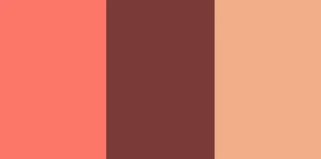
Coral, spiced apple, and Peach are warm colors and are best for trending image purposes. This mix is great for warm-toned interior design, graphics, and drawings. They give off a warm, feminine vibe.
17. Butter, Mint, Light Purple
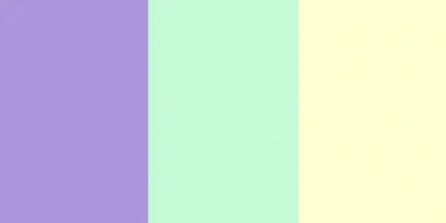
These three triadic pastel hues work together to provide a supple and warm appearance. Butter, mint, and light purple represent all that is spring, both alone and collectively. The design of products, packaging, trending images, and logos benefit most from this hue palette.
18. Forest and Moss Green

Forest and moss green make a monochromatic hue scheme for NGOs, cooperatives, and entrepreneurs. These hues are natural and grounded, expressing our bond with nature.
19. Green and White

Island green and white evoke the same natural and calming feeling as forest and moss green, but with a more contemporary twist. They make suitable backgrounds for more natural, minimalist, or holistic companies.
20. Beige, Black Brown, Tan
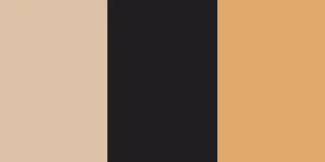
Beige, black-brown, and tan make a retro Victorian vibe for coffee, beer, and food companies. Black-brown conveys severity, while beige and tan provide warmth and togetherness.
21. Yellow and Verdant Green

The colors yellow and verdant green go well together. For organizations that value nature, like a plant nursery, this color combination works well for branding, packaging, and trending images or logo design.
22. Scarlet, Light olive, light Teal
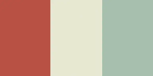
This traditional hue palette combines green and tempting fiery red. These hues provide a captivating, enigmatic effect, great for mature and understated different image designs.
23. Royal Blue and Pale Yellow

Royal blue and pale-yellow look professional and inviting together. Deep blue and pastel yellow indicate stability, security, and reliability, making them great for banking, fintech, and insurance.
24. Blue, Maroon, Indigo
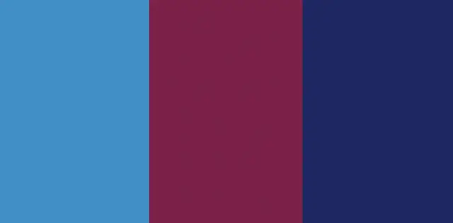
Another futuristic comparable color combination is blue, maroon, and indigo. These blue tones with maroon provide a twist to the hue blue's calm and dependability. This hue palette works for IT products, images, and brands.
25. Blue and Dark Blue

The color combo of light blue and dark blue may seem subdued, but they're not. This monotone mix promotes professionalism and trust, perfect for insurance or banking.
Different Color Codes
Red, green, and blue are represented in HTML by the hexadecimal triplets #RRGGBB. For instance, the color code for red is #FF0000, which stands for HTML color codes are displayed. These color codes allow you to alter the hue of a web page's background, text, and tables. The colors we see every day can be represented using color codes in a way that a computer can understand and show. The most widely used are Hex color codes, which are three-bit, six-digit hexadecimal integers. Each byte, or pair of characters, in a Hex code, represents how intensely a hue is red, green, or blue.
The lowest intensity of a color is represented by the hexadecimal number 00, while the hexadecimal value FF represents the maximum intensity. For instance, the hue white is made by combining all three of the fundamental colors in equal amounts, giving it the Hexadecimal color code #FFFFFF. The total opposite of hue is black, which is the absence of all colors on a screen display. Black has the Hex color code #000000, and each hue is shown at the lowest possible intensity. The color codes are different for each color.
With the help of a hue picker, you may choose the ideal shade and learn about lovely hue harmonies, tints, shades, and tones. You can also enter Hex color codes, RGB values, and HSL values to produce styles for HTML, CSS, and SCSS. Hex color codes for flat design colors, Google's Material design style, and the traditional web-safe hue system.
Conclusion
The best color combinations for your website or app are based on personal preference. We just offered you modern trends that you can rely on. As you know, choosing a good color combination for a product is only a tiny part of the path to launching a prosperous product with a trendy design. If you are just at the beginning of this path, we suggest paying attention to such a type of development as no-code.
This is a modern direction in developing mobile applications and websites that surpass classical development in terms of time and price. You do not need to be a developer to master these tools. AppMaster is an excellent example of such a tool with which you can build your mobile or web application without code. Learn more here.


