Role-Based Dashboards for Teams in One Shared System
Role-Based Dashboards help sales, operations, finance, and support work in one system while each team sees the tasks, data, and KPIs that matter.
When specific rules are applied, the Gestalt theory senses humans tend to arrange elements into sets. The theory argues that the whole is distinct from the whole of its constituent elements.
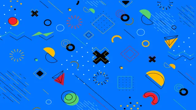
The Gestalt Principles are a set of rules or principles of human perception that describe how humans organize elements similar to one another, detect patterns, and clarify complicated images as we perceive objects. Designers use the guiding principles to arrange material on websites and other user interfaces in a way that is both beautiful in visual and simple to comprehend.
Gestalt psychology says that we do not merely focus on every minute component while attempting to make sense of the world around us. Good design relies heavily on the use of negative space. The first thing that comes to mind when considering the design is the use of white space. Another type of design creates the advantage of the space to suggest an aspect that doesn't exist at all.
The text gestalt comes from the field of psychology. It refers to the concept that it is easier and more significant for humans to comprehend a thing entirely than breaking it down into its component elements.
The book "Theory of Form" by Max Wertheimer, which was published in 1923 and was also known as "the dot essay" because it was illustrated with visual texts of dots and lines, was the source of the most persistent effect on art and design. Wertheimer believes that our natural propensity to regard elements that are adjacent to one another (proximity grouping), that seems like (similarity grouping), or that have structural economy (good Continuity) as belonging together contributes to the formation of certain gestalts. His hypothesis is what the gestalt principles are built upon as their foundation.

The human brain excels at filling in the gaps in design or images and assembling a whole bigger than the sum of the elements. When you see two circles of the same size and color positioned next to each other, you tend to sense that the circles are related to each other rather than simply being two separate circles. This is because the circles have the same size and color. It is the way that most people consider elements to be an attempt to classify them into gestalts.
The Gestalt theory sense that humans tend to arrange elements into sets when specific rules are applied. The theory argues that the whole is distinct from the whole of its constituent elements. Even in the lack of overt visual signals, humans instinctively develop a sense of spatial connections between objects when they are contrasted. That implies that even the most basic of object configurations may be utilized to create a sense of closeness and hence a hint of story.
The concepts of Gestalt attempt to define the various ways in which the human mind senses the elements of visual perception. Examining the various guiding principles is the most effective method for learning the concept of Gestalt. The Gestalt concept may be broken down into three broad categories of guidelines.
The use of Gestalt principles may rapidly transform a design that appears chaotic or like it is competing for a user's attention into one that provides a fluid connection that creates your site feel familiar while directing users toward the action you want them to do. Learning the gestalt principles should prioritize every person interested in design.
In its most basic form, the gestalt principle holds that the human brain will strive to simplify and arrange complex images and complex designs with many aspects by unconsciously organizing the pieces into an orderly system that generates a whole, rather than just a succession of disconnected elements. Gestalt Principles are a crucial element of visual design. There are many more than ten principles that overlap, but the ones that are most often known are as follows:
1. Continuity
The first gestalt principle is Continuity. According to the Continuity Principle, anytime our eyes start to follow anything, they will continue to move in that direction until they come across another item. This will happen even if the object they are following changes. Because they are forced to travel past one object and continue to another, the eyes generate momentum as they do so. Let's look at some Continuity examples,
Example: Logos
The continuity concept of Gestalt may be seen at work in the logos of companies like ProQuest, Amazon, and Coca-Cola. The Amazon logo has an arrow that starts at the letter A and ends at the letter Z. This arrow is meant to represent the fact that Amazon sells everything from A to Z. Similarly, when we look at the logo for the well-known soft drink brand Coca Cola, our eyes travel from the "C" in the text Cola to the "C" in the text Coca, passing through the letters L and A along the way. These many kinds of visual assistance make it easier for our eyes to track an approaching object or text.
2. Similarity
The second gestalt principle is similarity. According to the principle of similarity, our brains are wired to interpret any two items that share similar outward shapes as belonging to the same entity. There may be a connection between any two of them; the colors, the shapes, the textures, or something else. Let's look at some real-world applications of the similarity concept.
Example: Logo
Panda Security Touts, NBC, and Sun Microsystems have logos with objects and patterns with similar visual qualities, even though these things and patterns do not share the same color scheme, shape scheme, or size scheme. The wordmark and the logomark of the Panda Security Tout logo are integrated well with one another. Similarly, the leaves that make up the NBC logo each have a unique color, but they are all recognizable as belonging to the same group because they have the same images or design.
3. Proximity
The third gestalt principle is proximity. According to the principle of proximity, when two or more elements are close, the location of these elements portrays the relationship between different elements. It renders a certain meaning to that group. This applies whether the elements are physically close or not. Let's have a look at some real-world applications of the proximity concept.
Example: Logo of IBM
When we look at the IBM logo, we find three letters of text made up of short horizontal lines piled on each other. This is in contrast to the original logo, which consisted of eight horizontal lines with consistent intervals between them.
4. Common Region
This gestalt principle is of quite an importance. The concept of a common region is intimately connected to the image of proximity. According to this theory, our brains interpret the presence of several items within the same confined region as a sign that these objects belong together. Even if the objects are close to one another and have the same closeness, shape, size, or color, adding borders or other apparent boundaries is a wonderful method to create the illusion of separation between the groupings.
5. Pragnanz;
One of the gestalt principles is Pragnanz(law of Symmetry). The phrase good figure may be translated from German using the text Pragnanz. In addition to these texts, the law of good figure and simplicity are alternate names for the Law of Pragnanz. According to this theory, people naturally tend to view things in their most straightforward shapes. This gestalt principle is also known as the law of Symmetry. This principle is based on Symmetry. When individuals see elements in Symmetry as elements of a coherent group, they apply the Gestalt concept of Symmetry. People create complex images or designs in their minds' most basic form.
We love Symmetry because it is a basic, harmonious norm that gives a feeling of order and rightness in everything. That is most likely why Symmetry is so prevalent in government buildings worldwide. Studies have also revealed that Symmetry heavily influences our criterion for "beauty" in faces.
Example: Logo of Olympic
The Olympic emblem is comprised of five overlapping circles. This logo is often openly presented to us. The logo is composed of five circles arranged in juxtaposition with one another. It is less probable that the logo will be understood as a jumble of curved lines, geometric forms, color gradients, and straight text or lines.
6. Figure to Ground
The naked human eye is capable of distinguishing an item from its surroundings. When we look at a scene, we see some items in the foreground and others in the background; when the foreground and background create two separate images rather than complex design and complex images, things become interesting.
7. Closure
Because the human brain favors entire shapes or images, it tends to fill in the gaps between elements to see a whole image, producing a whole. With the closure, we can transmit information visually utilizing a limited number of elements while allowing the mind to fill in any gaps in the information. Because of this, we can simplify the designs and create them more interesting. It's the concept that your brain can fill in the gaps in a complex design and image to create it completely.
Many people believe closure to be one of the most interesting gestalt principles. It lends itself to being utilized in a wide variety of inventive ways. Using positive and negative spaces in conjunction with one another to create a whole is an essential element in the design and simple or complex images. You may create fascinating negative shapes by eliminating items from the front, or you can utilize negative space in the design to represent the shapes concealed from view.
When you display a partial image or design fading off the user's screen to indicate that there is more to be discovered if they swipe left or right, this is an essential example of closure at work in UX and UI complex or simple design. Without partial images or complex design, if only full images or designs are displayed, the brain does not quickly recognize that there is more to view, and as a result, your client is less likely to continue.
AppMaster is a non-coding platform. By understanding the Gestalt Principle of design, you can easily implement those designs in your non-coding platform with the help of AppMaster.
Experiment with AppMaster with free plan.
When you will be ready you can choose the proper subscription.