


Equipment reservation app: prevent conflicts and track returns
Plan an equipment reservation app that prevents double bookings, records returns and damage, and places faulty items on maintenance hold.
Learn the most common mistakes to avoid them in the future.
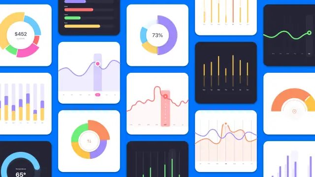
It is easy to get confused about what exactly works and what is effective when it comes to dashboard design. It is not uncommon for dashboards to be well planned and programmed, only for the front-end to fall flat. Today, we discuss some of the most common mistakes people run into when designing a modern dashboard. So get ready to learn!
First up on the list is the use of charts. Or rather the incorrect use. All too often, we notice charts that are ineffective at describing the actual message behind the data. We understand it can be easy to get excited about using the latest and most advanced-looking chart or graph, but if you can display the same information by using a classic pie chart, then that is almost always a better solution. This way, you can keep the point short and precise, and you won’t confuse your users either.
This is especially important to keep in mind when developing a larger dashboard, especially a visualization dashboard with many different elements included. We love when designers take the time to include tooltips that show when the user hovers or clicks for more details, as this can help cut down on confusion and even calls to customer service.
If tooltips are not your style, you can also keep in mind the context of the overall dashboard design. Just like it feels confusing when someone begins talking about a completely different topic in a conversation, it also feels confusing if the data suddenly shifts from being focused on return on investment to something else like the average temperature. Use clear dividers between sections, and use colors to help guide the user from one area to another.
Similar to the first point, it is unfortunately also very common for designers to love adding charts wherever possible. And even though it might technically be the correct chart for the situation, if you can manage to convey the same meaning by using “42%”, then you not only make it easier for the user but also save valuable space that can be used for other elements.
Furthermore, it helps the user understand things more quickly, as most of us are used to reading values embedded in the text, whereas looking at charts can take a little longer to get used to.
By now, you might have picked up on the overall message in this article. Keep it simple. If it is possible to contain all the important metrics and data points in a single screen, then that is almost always to be preferred, as opposed to creating multiple views that the user has to navigate between.
Depending on the type of dashboard, sometimes it is better to have a tall dashboard on a single screen rather than a compact dashboard that spans multiple screens. If the users need to click back and forth between different pages, they can lose focus and valuable time, which can be frustrating.
One way to instantly turn a mediocre dashboard into an awesome one is by cutting down on the excess data points. Consider the reasons people are using the visualization dashboard. Is it to learn how their business has performed over the past month? In that case, focusing on the core metrics, such as ROI, Profit, Expenses, and so on, is much better than showing all the intermediary data points used to calculate these core ones.
One of the most confusing things in dashboards can be when colors are misused. A good dashboard color scheme is made up of a few but distinctive colors, and equally as important, the colors are designed to create a sense of familiarity that the user instinctively learns to follow.
Also, remember to use a proper color scheme and not just pick any color you might personally like. By using a well-planned color scheme, you can achieve a coherent visual design that not only looks great but also helps simplify the visual overload a user gets when first visiting the dashboard.
There is a reason you are creating a dashboard design. Remember that reason. Let the use-case dictate not just what information you display but also how and where you display it. If the dashboard is to showcase the performance of a business, keep it relevant and to the point.
Make it easy for the user to learn all the relevant key information from a single screen, and you will see a huge improvement in customer satisfaction, guaranteed! If the development budget allows for it, having a screen that allows users to select what they want to measure can be a great way to customize the dashboard to each individual customer.
Some designers are great at taking advice from the end-users. Others, not so much. No matter how much time you have spent on that super awesome data visualization piece, if it does not help the users, it will be better to change it for something that actually does help the users.
The whole reason behind a dashboard is to help people find the information they need. So when they respond with criticism, try to listen to their grievances and issues and find a solution that works for everybody. Not only will you get a better product, but you will also get happier customers; they will stay around for longer and even have them recommend you to their friends.
This is another big reason why many dashboards feel ineffective. By letting users sort, filter, and specify which metrics they want to show, you in effect, allow them to customize their visualization dashboard without actually writing much code to handle this.
By simply applying basic filters and sorting rules to your dashboard design, you can help users tremendously and speed up their workflow, as well as feel they have a custom solution instead of a standard package that every other customer also gets.
Finally, we feel it worthwhile to mention another topic related to the consistency of design. If your dashboard has 3D elements for charts and graphs combined with 2D elements for the same data, that can quickly lead to confusion and a lack of visual coherence.
Consider clearly dividing the 2D from the 3D elements, either by giving it another color or moving it around on the screen so that users do not get confused with the different visualizations. Or if possible, use only one of the styles for all the charts and graphs to further simplify everything.
So there you have it! That was our ten most common problems when designing dashboards. The overall idea is to simplify as much as possible, keep clean lines and have a consistent design philosophy throughout every aspect of the dashboard. We wish you the best of luck!
The most common mistakes have to do with confusing the users. This can be because of many things, such as random color schemes, using too many screens, or even showing too much data.
Do not use different fonts, conflicting colors, and overly complex charts mixed together. Instead, keep everything nice and clean, using clear divisions between different sections and metrics.
With all the frameworks and design elements freely available, it has become easy to just copy and paste the good-looking ones into a mixed dashboard. But this can quickly feel “muddy” and unclear if the designer is not careful.
Keep everything as simple as possible. Always ask yourself what your users truly need to see, and try to remove everything that distracts from the main purpose.
Experiment with AppMaster with free plan.
When you will be ready you can choose the proper subscription.


