Embracing Minimalistic Design Principles in Your Mobile App: A Step-by-Step Guide
Discover the benefits of minimalistic design in mobile apps and learn how to apply this approach with a detailed step-by-step guide, including practical tips and best practices.

Minimalistic design is a design philosophy that emphasizes simplicity, functionality, and reduced visual clutter. It has its roots in various disciplines, including art, architecture, and graphic design, and has gained significant popularity in recent years, particularly in the digital realm. By focusing on essential elements and removing unnecessary ones, minimalistic design aims to provide users with a clean, streamlined, and efficient experience.
In the context of mobile app design, minimalism is crucial to ensure that your app offers a user-friendly and memorable experience. A well-designed mobile app must strike a balance between aesthetics and functionality, providing users with an intuitive interface that allows them to complete tasks with ease and find the information they need quickly. Minimalistic design principles help in achieving this balance and result in more effective, visually appealing mobile apps.
Why Minimalism Matters in Mobile Apps
There are several reasons why minimalism plays an important role in mobile app design:
User Experience
A minimalistic design approach ensures a positive user experience by making an app more intuitive and easier to navigate. A streamlined interface with a clear focus on specific features and tasks reduces cognitive load, enabling users to quickly understand how the app works and perform actions efficiently.
Performance
Removing unnecessary elements from your mobile app design can significantly improve its overall performance. By simplifying graphics, animations, and other visual components, your app will load faster and require fewer resources, providing a better user experience and reducing the likelihood of users abandoning the app due to slow loading times.
Visual Appeal
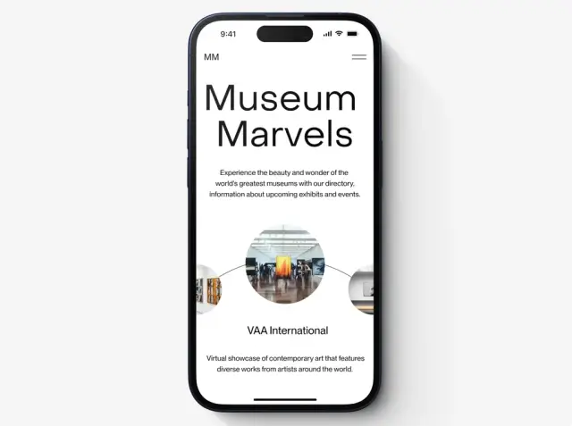
Minimalistic design principles promote a clean, polished look for mobile apps. By eliminating visual clutter and focusing on simplicity, your app will be more visually appealing to users, increasing the likelihood that they will continue to use it and recommend it to others.

Image source: Dribble. Author: Nivesh Birangal
Conversion Rates
Lastly, following minimalistic design principles can lead to higher conversion rates. Streamlined navigation and a clear focus on key features and calls-to-action result in a more enjoyable and efficient user experience, encouraging users to engage with the app and complete desired actions, such as signing up for a service, making a purchase, or sharing content.
Step-by-Step Guide to Implementing Minimalistic Design Principles
Implementing minimalistic design principles in your mobile app involves several steps. This guide outlines these steps to help you create a visually appealing and user-friendly app that embraces the minimalistic approach.
- Define your app's purpose: Start by clearly defining the main purpose of your app and the core features you want to offer. This will help you focus on what is truly essential and eliminate any unnecessary components and functionalities.
- Prioritize content and features: Identify the most important content and features in your app, and prioritize them based on user needs and the app's purpose. Aim to reduce clutter and focus on elements that offer the most value to your users.
- Use whitespace effectively: Whitespace, or negative space, plays a crucial role in minimalistic design, as it helps create a visually appealing layout and improves readability. Use whitespace strategically to separate different elements, group related items, and emphasize key features.
- Implement consistent typography: Typography is a key aspect of minimalistic design. Choose a limited set of fonts (preferably just one or two) and stick to them throughout the app. Use font sizes, weights, and styles consistently to create a sense of harmony and hierarchy in your design.
- Choose meaningful icons: Minimalistic design often makes use of icons to represent features or actions. Select simple, meaningful icons that users can easily recognize and understand. Keep in mind that excessive use of icons can lead to visual clutter, so use them sparingly and in a balanced manner.
- Limit your color palette: A minimalistic design incorporates a limited color palette to maintain simplicity and reduce visual distraction. Choose a few primary colors and use them sparingly throughout your interface, ensuring that they complement each other.
- Keep navigation simple: Navigation should be straightforward and easy to understand. Use clear labels, intuitive gestures, and simple menu structures to help users navigate your app with ease.
- Test and refine: Finally, always test your app with actual users and gather their feedback to refine your design. This will help you identify any issues or areas for improvement and ensure that your app effectively implements minimalistic design principles.
Embracing minimalistic design principles in your mobile app can lead to numerous benefits, including improved user experience, increased performance, and higher conversion rates. By following the steps outlined in this guide, you can create a visually appealing, user-friendly app that maximizes usability and adheres to the principles of minimalistic design.
Streamlining User Interactions and Gestures
When it comes to streamlining user interactions and gestures in your mobile app, there are several key considerations to keep in mind. Here are some important points to consider:
- Simplify user interactions: Reduce complexity by eliminating unnecessary steps and options. Strive for a clean and straightforward interface that allows users to achieve their goals with minimal effort.
- Incorporate intuitive gestures: Leverage common gestures such as swiping, tapping, pinching, and dragging to provide intuitive navigation and interaction. Consistency in gesture implementation across the app ensures familiarity and ease of use for users.
- Minimize user inputs: Reduce the number of required inputs by utilizing smart defaults, autofill, and predictive features. Simplify forms and minimize mandatory fields to streamline the user's input process.
- Enhance with micro-interactions: Add subtle animations and visual feedback to provide a delightful and responsive user experience. Micro-interactions can highlight actions, confirm user inputs, and guide users through the app.
- Prioritize accessibility: Ensure that gestures and interactions are accessible to all users, including those with disabilities. Provide alternative input methods and consider accessibility guidelines to make your app usable for a wider audience.
By following these guidelines and optimizing user interactions and gestures in your mobile app, you can create a seamless and intuitive experience that keeps users engaged and satisfied.
Minimalistic Design with AppMaster: A Real-World Example
AppMaster.io is a powerful no-code platform that simplifies mobile app design, leveraging minimalistic design principles for efficient and visually pleasing results. The platform's drag-and-drop interface allows users to create intuitive, clean, and functionally focused apps without any coding skills required.

A real-world example of using AppMaster to implement a minimalistic mobile app design is an app developed for a local gym. The app featured a simple color scheme with a limited palette, ample whitespace, a clear visual hierarchy, and well-organized navigation for quick access to essential information such as schedules, trainers, and fitness plans. To create this minimalistic mobile app, the developer followed these steps using AppMaster:
- Conducted an analysis of the gym's target audience, identifying their primary wants and needs.
- Selected the most relevant content and features to include within the app, prioritizing simplicity and functionality.
- Designed the app's user interface, using whitespace strategically for a clean, readable layout.
- Chose a limited typography and color palette, creating a cohesive visual style across the entire app.
- Opted for simple, meaningful icons that effectively represented vital app functions.
- Set up a straightforward navigation system, ensuring users could easily access all important app components.
By following this process, the developer ensured that the finished mobile app not only aligned with contemporary minimalistic design principles but also efficiently catered to their target audience's needs. The app's success demonstrated the benefits of minimalistic design in creating user-friendly mobile apps that have a positive impact on user engagement and retention.
Using platforms like AppMaster.io and embracing minimalistic design principles can help you create high-quality mobile apps that not only look amazing but also function seamlessly and provide an engaging user experience. Remember to prioritize your app's content and features, utilize whitespace effectively, maintain consistency in typography and color scheme, choose meaningful icons, and simplify navigation for best results.
FAQ
Minimalistic design is a design philosophy that emphasizes simplicity, functionality, and reduced visual clutter by focusing on essential elements and removing unnecessary elements from the overall design.
Minimalistic design enables mobile apps to be faster, more user-friendly, and easier to navigate, resulting in positive user experience, increased engagement, and higher conversion rates.
Key principles of minimalistic design include simplicity, consistency, functionality, and visual hierarchy, achieved through the reduction of unnecessary elements, the use of whitespace, and clear communication through typography and imagery.
AppMaster.io is a no-code platform that offers an intuitive drag-and-drop interface, allowing users to easily design and build mobile apps with minimalistic principles and without any coding skills required.
Some best practices include prioritizing content and features, using whitespace strategically, applying consistent typography, choosing meaningful icons, limiting color palettes, and keeping navigation simple.
By reducing unnecessary elements and focusing on essential features, minimalistic design can help improve the overall performance and speed of mobile apps, providing a better user experience and reducing loading times.
AppMaster.io offers a user-friendly platform with drag-and-drop functionality that simplifies mobile app design, enabling users to easily create visually appealing, high-performing apps that adhere to minimalistic design principles. Additionally, AppMaster.io's platform allows for quick modifications to designs and generates source code to ensure fast and efficient development without technical debt.
Yes, minimalistic design principles can be applied consistently across both iOS and Android platforms, as they focus on universal design concepts such as simplicity, functionality, and visual hierarchy.
Minimalistic design can contribute to higher conversion rates by streamlining navigation, reducing visual clutter, and emphasizing key features and calls-to-action, ultimately leading to a more enjoyable and efficient user experience that encourages user engagement and conversions.
Examples of mobile apps that successfully implement minimalistic design include Evernote, Airbnb, Lyft, and Medium. These apps showcase a clean, simple interface with a focus on functionality and ease of use, providing users with an enjoyable experience without distraction.


