


 Jul 14, 2026
 8 min
8 minEquipment reservation app: prevent conflicts and track returns
Plan an equipment reservation app that prevents double bookings, records returns and damage, and places faulty items on maintenance hold.

Learn how to design mobile-friendly internal forms with short sections, large controls, sensible defaults, and camera inputs for field staff.
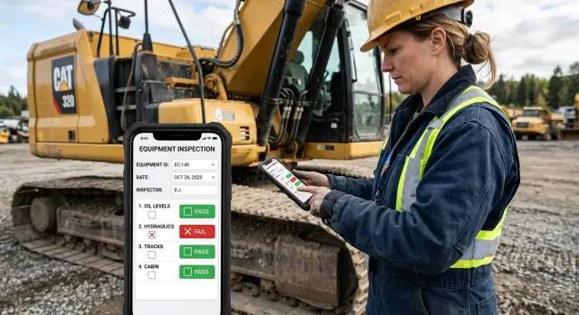
A form that feels acceptable on a desktop can become slow and irritating on a phone. Desktop screens leave room for long tables, tiny dropdowns, side-by-side fields, and instructions placed far from the question. On a phone, each choice makes a worker zoom, scroll, or hunt for the next action.
Field staff rarely complete records at a quiet desk. A technician may fill in a maintenance report beside a noisy machine. A delivery driver may update a job while standing outside. A site inspector may need one hand for equipment and the other for their phone. Interruptions are normal: a customer asks a question, a call arrives, or the worker moves to another area.
Physical conditions add friction. Gloves make small checkboxes and tightly packed controls hard to tap. Bright sunlight can hide low-contrast text and faint field borders. Rain, dust, and a cracked screen make precision harder. If someone needs three attempts to choose a date or open a dropdown, they will feel that delay on every visit.
Weak connections cause another problem. A long form can lose progress when the app waits until the final submit to save everything. Workers then have to re-enter details after moving between buildings, basements, rural sites, or loading areas. That experience encourages people to postpone forms until they can no longer remember the job clearly.
Typing causes much of the missing detail. Phone keyboards cover part of the screen, turn simple notes into a thumb exercise, and make serial numbers easy to mistype. Faced with ten optional text fields, a worker may write "done," skip the fields, or repeat the same wording across several jobs. The record then tells the office very little about what happened.
Mobile-friendly internal forms should fit the conditions where people use them. They ask only for information needed at that moment, use large controls, and avoid making workers recall details they could select or capture. A good phone form helps someone finish a report while the evidence, location, and conversation are still fresh.
Poor form design does more than annoy staff. It produces late submissions, vague notes, wrong values, and follow-up calls about missing information. Those small failures add up when a team handles dozens of visits each week.
A paper form often collects everything someone might want later. On a phone, that approach turns a simple visit into paperwork. Build mobile-friendly internal forms around the work a person does on site, then collect only the information that moves that work forward.
List the moments when staff use the form away from a desk. A maintenance worker may arrive at a property, confirm the asset, inspect it, record a fault, add a photo, and close the visit. A sales rep may log a meeting, choose an outcome, and schedule the next contact. Each job needs its own sequence.
Start with the smallest set of actions staff must complete before they can move on. Put those actions in the same order as the job. Do not ask someone to describe a fault before they have selected the equipment they inspected.
Separate information into two groups:
Make the first group mandatory only when the answer has a clear use. For example, require a site name, visit status, and a photo when a supervisor needs proof that work was completed. Keep a free-text observation field optional if the team rarely reads it.
Every question should lead to an action. If the form asks, "Was the issue resolved?", someone should use that answer to close the job or send it to the right person. If nobody acts on an answer, remove the field or make it optional. This prevents forms from becoming storage for random details.
Consider a field technician reporting a leaking pipe. The form can ask for the location, severity, a photo, and whether the water has been shut off. Those answers tell the office whether to dispatch an emergency repair. Asking for the technician's full work history or a long description of the building does not help during that visit.
Internal workflow apps can also show questions only when they apply. A "parts used" field can appear after the worker marks a repair complete. This keeps the screen shorter and respects the worker's time.
A long form feels even longer on a phone. Field staff often complete one while standing outside, wearing gloves, or trying to finish a job before the next call. Put related questions into short sections so each screen covers one clear part of the work.
For a maintenance visit, separate the work into stages such as site details, inspection, work completed, and sign-off. A technician can focus on the task in front of them instead of scrolling past twenty unrelated fields to find the next answer.
Do not split a form according to an old paper layout. Group fields by the moment when someone knows the answer. Contact details belong together because staff confirm them on arrival. Photos and condition notes belong together because staff collect both during the inspection.
Aim for three to six fields on most screens. Use fewer when people need to read instructions, choose from a long list, or add a photo. Small groups reduce missed answers and make it easier to spot an incorrect entry before moving on.
A useful order is:
Put urgent items early even if they disrupt the usual order. If a worker reports a leak, damaged equipment, or an unsafe area, the app should capture that fact before routine questions. It can then show the appropriate follow-up fields rather than making staff work through irrelevant steps.
When mobile-friendly internal forms need several sections, show progress in plain language, such as "Inspection, 2 of 4." A numbered progress bar also works. Staff should know how much remains before they begin a section, especially when they have poor signal or only a few minutes available.
Do not create a separate screen for every field. Too many taps can feel as slow as one huge page. Keep closely related answers together, such as an equipment status choice and its short explanation. Split sections when the work changes, not simply to make the form look shorter.
Let users go back without clearing answers. A technician may remember a serial number after taking a photo or notice they chose the wrong status. Easy backtracking prevents duplicate entries and makes the form easier to correct.
A form can ask the right questions and still fail in the field if people cannot use it with one thumb. Staff may be standing outside, wearing gloves, carrying equipment, or working in bright sun. Small controls turn a two-minute update into a frustrating task.
Give every interactive control a generous touch area. The visible icon can stay compact, but the area that responds to a tap should be large enough to hit without precision. Leave clear space between nearby controls, especially "Save," "Back," and "Delete." A user should not need to slow down because one wrong tap could discard an inspection.
Use controls that match the answer instead of asking people to type. For a status field, offer buttons such as "Complete," "Needs follow-up," and "Cannot access site." For a yes-or-no check, use two clearly labeled options. For dates, open a date picker and prefill today's date when appropriate.
A maintenance worker reporting a faulty light should tap the location, choose the fault type, and select urgency. They should not type "car park north entrance" or rewrite a standard issue every time. A searchable picker works well for long lists, but keep common choices near the top.
Placeholder text disappears as soon as someone starts typing. Users can forget what the field asked for, then scroll back or guess. Put a clear label above each field and keep it visible after the user enters an answer.
Use labels that describe the exact response needed. "Asset number" is better than "Details." If a format matters, add a short example below the label, such as "Use the number printed on the equipment tag." Do not make the example the only instruction.
Error messages should name the problem and tell the user what to do. "Invalid input" wastes time. "Enter a 6-digit asset number" gives a direct next step.
Show the message close to the affected field, use readable text, and avoid color as the only signal. A red border can help, but pair it with words. Keep completed answers in place when validation finds a mistake. Re-entering a full field staff mobile form because of one missing value quickly erodes trust in the app.
When building internal workflow apps in AppMaster, test each form on an actual phone before publishing. Tap through it with one hand, try it outdoors where possible, and check that every control remains comfortable to use.
Typing on a phone takes longer than most office teams expect. A field worker may be wearing gloves, standing beside equipment, or trying to finish a visit before the next appointment. Every field you can fill safely removes a delay and another chance for a typo.
Start with information the app already knows. When a technician opens an assigned job, the form can prefill their name, the current date, the customer site, and the job number. The worker should confirm the details rather than enter them again.
Defaults need a clear rule: staff must be able to see and change them. A wrong location or date can create a bad record, so do not hide prefilled values or lock them without a sound reason.
Some questions have the same answer most of the time. For example, a maintenance checklist might start with "Pass" for items the technician has inspected, while leaving an issue note blank until they find a fault. This can speed up routine visits, but only if the worker still reviews every item.
Avoid defaults for answers that carry risk. Do not preselect "customer signature received," "safety equipment checked," or "repair complete." These answers confirm an action, so the person doing the job should actively choose them.
Use a default when it comes from a reliable source or when changing it is easy. Good candidates include:
Free-text boxes invite slow typing and inconsistent wording. If workers repeatedly enter the same few answers, offer a short list instead. A status field can use "Complete," "Needs follow-up," and "Unable to access site." A reason field can show common causes, with "Other" opening a short note box.
Keep option lists short. A menu with 20 choices forces people to hunt for an answer and feels little better than typing. When needed, split broad choices into two simple questions, such as "Was the asset accessible?" followed by "Why not?" only when staff select "No."
AppMaster lets teams build these rules into no-code forms and business processes. The platform can carry job details into each form, show choices that fit the job, and keep editable defaults visible. Field staff make fewer taps while keeping control of the final record.
A phone camera can replace several typed fields. Ask for a photo when staff need to record damage, capture a serial number, save a receipt, or show finished work. A clear image often answers questions that a short note cannot.
Place the photo field beside the task it supports. After "Describe the damage," add "Take a photo of the damaged area." Do not put every upload field at the end of the form, where people may forget what each image was meant to document.
A label such as "Upload photo" is too vague. Staff need to know what the reviewer expects to see and how many images they should take. Keep instructions brief and practical:
These directions reduce follow-up questions. They also help a new employee gather consistent evidence without calling a supervisor from the site.
Use one photo field for one purpose when the image has a clear role. If a job needs several views, allow multiple photos and state the limit. For a maintenance inspection, two or three images may be enough. Asking for ten "just in case" slows the visit and fills storage with duplicates.
A photo does not always explain itself. Include an optional short caption below the upload field when staff may need to identify a location, explain an unusual condition, or describe why they could not finish a task. Limit the caption to a sentence or two instead of opening a large notes box.
For example, a technician can attach a photo of a leaking pipe and write, "Leak is behind locked access panel." The image records the condition, and the caption explains the next step.
Plan for jobs where taking a photo is impossible or unsafe. A worker may face poor lighting, a customer may refuse photos, or site rules may ban cameras. Let them choose a reason such as "customer declined" or "camera not permitted," then allow a brief note. Do not block submission unless the photo is required for payment, safety, or compliance.
Mobile-friendly internal forms should check image size and upload status before staff leave the site. If the connection drops, save the form and show which photo still needs to upload. That safeguard can prevent a completed visit from becoming a return trip.
A maintenance worker arrives at a retail site with two appointments still planned that afternoon. They open the inspection form on their phone before walking inside. The form already knows their name, the date, and the assigned location, so they do not have to enter routine details again.
The first screen asks for the inspection type. The worker taps "scheduled maintenance" rather than typing a description. The next screen contains only the checks for that visit: access to the equipment, visible damage, safety status, and whether the unit works after testing. Each answer uses large buttons that work with a thumb or gloved hand.
During the inspection, the worker finds a cracked cover on an outdoor unit. They choose "issue found," then take two photos directly in the form. One photo shows the full unit and the other shows the crack up close. The form stores the pictures with the site and visit record, so the worker does not need to find them later in a personal photo library.
A short note field appears only after the worker reports an issue. They write: "Crack on lower cover. Unit runs normally. Replace cover on next visit." A suggested follow-up date appears based on the company rule, and the worker can change it if the site needs faster attention.
Before leaving, the final screen shows a compact summary. The worker checks the location, confirms the visit status, and submits the form. This takes a few minutes instead of the time required to complete a desktop inspection sheet squeezed onto a phone screen.
The office team receives one complete record: who visited, which inspection they completed, the answers, photos, note, and requested follow-up. They can assign the repair without calling the worker for missing details. The worker records the facts once, while standing in front of the equipment.
A no-code app built in AppMaster can support this flow. Teams can show fields only when an answer requires them, set assigned locations as defaults, and send submitted records into the workflow the office already uses.
A field form can have a clean layout and still waste time. The usual problem is a series of small obstacles: repeated details, required fields that do not fit the job, and controls that work well only at a desk.
Do not ask people to enter the same information twice. If a technician selects a site at the start, the form should carry that site into the equipment check, photo record, and final report. Repeated typing invites mismatches such as "Warehouse 2" in one place and "WH2" in another.
Use required fields sparingly. Make a field mandatory only when someone needs the answer to close a task, meet a safety rule, or route follow-up work. A field worker may not know a serial number because a label has worn off, or may not have a customer signature when nobody is present.
Give users a clear alternative when information is missing:
A mobile-friendly internal form should help staff submit an honest report rather than pressure them to invent an answer just to complete it.
Teams often test phone form design in an office, on a large recent phone, with reliable Wi-Fi and clean hands. That test misses the conditions that cause trouble outside.
Try the form on a smaller phone. Step outdoors and check whether labels, errors, and photo previews remain readable in bright sunlight. Put on work gloves and see whether buttons are large enough to tap without hitting the wrong control. Test a weak connection too, especially if staff must attach several photos.
A maintenance worker may need to record a leaking valve while holding a tool. If the camera button sits beside "delete photo," one wrong tap can remove the evidence. Put destructive actions away from the main path and ask for confirmation before deleting an attachment.
Users also need to fix mistakes before submitting. Show their selections, numbers, and photos in a simple review screen. Let them return to the relevant section without clearing what they already entered. Use plain error messages that name the field and explain the problem, such as "Add a photo of the meter reading" instead of "Invalid input."
AppMaster includes visual web and mobile UI builders for internal workflow apps. Teams can test these details early and adjust the form when field staff report friction. A short test with the people who use the form each day will reveal more than a long review in a meeting room.
A form should support one job. A vehicle inspection, a stock count, and a customer handover need separate forms, even if the same person does all three. When one form tries to cover every situation, people skip fields or enter vague notes just to move on.
Review the form on the phone your team actually carries. Desktop previews can hide small tap targets, awkward date pickers, and fields that force users to scroll sideways. Check it outdoors or in a vehicle too, where glare and a weak connection change how the form feels.
Use this short check before publishing:
A short field test catches problems that a desk review misses. Ask one field worker to use the form during a normal shift instead of a staged demo. Watch where they pause, what they ask, and whether they return to a field because the wording was unclear. Five minutes of observation can reveal a field that nobody understands.
For example, a maintenance technician may finish an inspection quickly until the form asks for an asset number they do not know. If the app can show the assigned asset, let the technician confirm it instead of typing it. This reduces errors and makes the phone form less irritating.
When a paper sheet or spreadsheet process has outgrown the team, AppMaster can help you create a no-code internal app with mobile forms, business rules, photo inputs, and completed records in one place. Build a small version first, test it with the people who use it, then adjust the fields before asking the whole team to rely on it.
Publish only when a worker can complete the form quickly, understand every required answer, and submit usable information from their phone.
 Why do desktop-style forms work poorly on phones?
Most phone forms fail because they copy a desktop or paper layout. Field staff then spend time scrolling, typing, zooming, and finding tiny controls instead of recording the job.
How many fields should a mobile form screen have?Keep most screens to three to six related fields. Split the form when the worker moves to a different part of the job, such as arrival, inspection, repair, and sign-off.
What order should questions follow in a field form?Put questions in the order staff encounter the information. Ask them to confirm the site and asset before requesting inspection results, photos, or a follow-up note.
How can I make form controls easier to tap with gloves?Use large buttons with clear labels, enough space between controls, and visible field labels. Place Save, Back, and Delete far enough apart that a wrong tap does not cause trouble.
Which fields should a mobile form prefill?Prefill details the app already knows, such as the assigned worker, job number, site, date, and time. Keep those values visible and editable so staff can correct them when needed.
When should I avoid using a default answer?Do not preselect answers that confirm work or safety checks. Staff should actively choose answers such as repair complete, signature received, or safety equipment checked.
How can I reduce typing in a phone form?Replace repeated notes with short choices when the same answers appear often. For example, offer Complete, Needs follow-up, and Unable to access site, then show a brief note field only when someone needs to explain an exception.
When should a field form ask for photos?Ask for a photo when it records proof or a detail better than text, such as damage, a serial number, a receipt, or completed work. Put the camera input beside the question it supports and state exactly what the worker should photograph.
What should a mobile form do when the signal drops?Let staff save their work as a draft and keep completed answers on the device until the connection returns. Show upload status for each photo so workers know whether the record needs attention before they leave.
How should I test a form before publishing it?Test the form during a normal shift on the phones your team uses. Try it one-handed, outdoors in bright light, with gloves if relevant, and on a weak connection. Watch where workers pause or enter vague answers, then simplify those parts.
Experiment with AppMaster with free plan.
When you will be ready you can choose the proper subscription.
 Jul 14, 20268 min
 Jul 13, 20268 min
 Jul 08, 20268 min