


 Jul 14, 2026
 8 min
8 minEquipment reservation app: prevent conflicts and track returns
Plan an equipment reservation app that prevents double bookings, records returns and damage, and places faulty items on maintenance hold.

Mobile data capture for field teams works best when forms need fewer taps, use smart defaults, and keep working with weak signal.
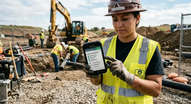
Field data capture has to work in busy, messy places. A form that feels fine on a laptop can feel painfully slow on a phone when someone is in a warehouse aisle, outside in the rain, or standing with a customer who wants an answer now.
Small screens are the first problem. Long forms force people to scroll, hunt for the right field, and switch between the keyboard and menus over and over. Even simple tasks start to feel heavy when every answer takes several taps.
Typing is another weak spot. Field workers often enter data with one hand, in poor light, or while moving between jobs. That makes mistakes more likely, especially for serial numbers, addresses, part names, and notes. One typo can create follow-up work later or make the record hard to trust.
Repeated entry wears people down too. If the app asks for the same customer, location, team, or equipment details on every visit, the worker ends up doing admin instead of the job itself. Someone who completes ten visits in a day should not have to re-enter the same details ten times.
Connectivity makes all of this worse. Weak signal shows up at the worst moments: basements, remote sites, elevators, plant floors, and rural roads. If a form needs a live connection to save progress or load important fields, work can stop halfway through. That frustration builds fast when the team already has the information and still has to wait or start again.
There is also a trust issue. Once people decide the app is slow, fragile, or easy to break, they avoid it. They keep notes on paper, send messages instead, or fill in the app later from memory. At that point, data quality drops and the app becomes one more chore.
Good form design is not just about collecting data. It is about collecting the right data quickly, accurately, and without getting in the way of the job.
Low-friction data capture should feel almost invisible. A technician, inspector, or delivery worker should be able to open the app, complete the next small step, and move on without thinking much about the form itself.
The simplest pattern is often the best: one screen, one job. If someone is confirming arrival, that screen should not also ask for parts used, customer feedback, and a final signature. Breaking work into small steps keeps the screen calm and reduces mistakes.
It also helps to show fields only when they matter. If the worker selects "equipment replaced," then show the serial number and part details. If they select "no replacement," keep those fields hidden. The process behind the form can still be detailed, but the screen stays simple.
Strong mobile forms usually share a few traits:
Auto-save matters more than many teams expect. Field work gets interrupted by calls, gates, customers, and travel. If the app loses data because someone forgot to tap Save, trust disappears quickly. A better approach is to save after each meaningful change and show a small status message so the worker knows progress is safe.
Think about a service worker standing next to a machine with one hand busy. They tap Arrived, add two photos, choose a status, and move on. No tiny buttons, no extra confirmations, and no long page to scroll through. That is what good mobile data capture looks like in real use.
A simple test works well here: can a new worker finish a common task quickly, with little training, and without stopping to figure out the form? If yes, the design is probably reducing friction instead of adding it.
Fast forms start before the first field is placed on the screen. Watch how the visit actually happens, then build the app around that flow. The goal is not to collect everything at once. It is to help someone finish the work without fighting the tool.
Most field visits follow a simple sequence. Someone arrives, confirms the location or asset, records the issue, does the work, captures proof or notes, gets approval if needed, and closes the visit. When the form follows that same order, people keep moving. When it jumps around, they miss steps, forget details, or leave blanks to fix later.
Put the must-have fields first. Ask what is really needed to complete the visit, create a usable record, and trigger the next step. Everything else should come later or stay hidden unless it becomes relevant.
This matters most when conditions are rough. A technician standing outside in the rain should not have to scroll past optional survey questions or rare repair codes just to mark a task as done.
Group fields by job stage, not by database structure. Labels such as "arrival," "work completed," and "customer sign-off" are easy to understand in the field. Back-office labels often slow people down because workers have to translate the job into system language before they can answer.
Rare fields should stay out of the way until they are needed. If someone reports a safety issue, open the extra notes and photo fields. If they replace a part, then ask for the part number and warranty details. Most visits stay simple, and unusual cases still have room for detail.
If you are building the workflow in a visual platform such as AppMaster, it helps to sketch the real job flow first and then turn that into sections, conditional fields, and business logic. The best form feels like part of the visit, not an extra layer placed on top of it.
Good defaults save time, but only when they are reliable. The safest defaults are the values the app already knows with high confidence: today's date, the current time, the assigned site, the signed-in worker, or the job type from a scheduled work order.
A useful rule is simple: pre-fill only what is very likely to be correct. If the app already knows the customer, location, and task type before the form opens, show them right away. That removes taps without creating confusion.
Typing is usually the slowest part of any field form, so replace free text wherever you can. A yes-or-no check should be a toggle, not a text box. A status should come from a short picker, not a sentence. Equipment details are often faster through barcode or QR scanning. Proof of work is often better as a photo than a written explanation.
Small choices matter too. Open a number pad for quantities, a phone keyboard for contact numbers, and an email keyboard for email fields. These details seem minor in design reviews, but they add up across a full day of work.
It can also help to remember the last safe choice. If a worker is logging several similar inspections in the same building, keeping the last floor, issue category, or work type ready for the next record can speed things up.
Defaults should never quietly create bad data. If the previous choice could easily be wrong on the next job, show it as a suggestion rather than filling it in automatically. A simple check is this: if the worker leaves this value unchanged by mistake, does it damage the record? If the answer is yes, do not default it. Site name, asset ID, and fault severity often need an extra confirmation because one wrong value can affect reporting, billing, or follow-up work.
The goal is not to automate everything. It is to remove the taps that do not help the worker make a real decision.
A lot of slow forms come from desktop habits. They are built on large screens, reviewed on large screens, and only tested on a phone at the very end. By then, the problems are obvious: labels are too long, buttons are too small, and the most common action is buried under extra fields.
Test early on a real device. Hold it in one hand. Walk around. Try it outdoors. Try it with poor signal. What feels easy with a mouse often feels clumsy next to a vehicle, in a hallway, or beside a machine.
A practical way to improve a form is to time one common task from start to finish. Watch how many taps it takes, how many screens it uses, and where people hesitate. Then cut one or two steps and test again. If a service tech always selects the same visit type, adds one short note, and takes one photo, those steps should feel almost instant.
Field work rarely happens with perfect signal. People work in basements, plant rooms, remote roads, and buildings with patchy coverage. If the app only works well online, the team will fall back to paper or memory.
Start by deciding what must work without a connection. In most field apps, that includes opening assigned jobs, viewing key customer details, filling in forms, taking photos, collecting signatures, and saving progress. Anything that blocks the main task when the signal drops is a real risk.
The safest pattern is to save each entry on the device first and sync later. Workers need to trust that a completed form will still be there if the app closes, the battery dips, or the network disappears. Even a short message such as "Saved on this device" can reduce a lot of stress.
Clear sync status matters too. People should be able to tell whether an item is saved locally, waiting to sync, fully synced, or failed and needs attention. Without that clarity, they tap Submit again and again, which often creates duplicate records when the connection returns.
Each record should also have a unique ID created on the device before sync starts. That way, when the app reconnects, the server can recognize the submission as the same record rather than a new one. It is a small design choice, but it prevents a lot of cleanup later.
Photos and attachments need special care because large files make syncing feel slow and unreliable. Resize images when full detail is not needed, limit the number of required uploads, and queue heavy attachments in the background so the form itself can save quickly.
One of the best tests is simple: put the phone in airplane mode and complete a real task. If the worker can still finish the job, save it, and understand what happens next, the app is much closer to being field-ready.
At 8:10 a.m., a technician pulls up at a customer site and opens the first assigned job on their phone. The app already shows the customer name, address, contact number, asset ID, and service task. They do not need to search messages, retype an address, or guess which machine they are working on.
The basics are already there too. The date is filled in, the technician name comes from the login, and the job status starts as "in progress." Those small defaults save time immediately.
Because the job is linked to the right asset, the technician can focus on the work itself. They add one meter reading in a number field, take a photo after the repair, and choose a status from a short list. If nothing unusual happened, they can finish without typing a long note.
That matters more than it sounds. A field worker may be wearing gloves, standing in bad weather, or trying to finish a visit between calls. When the form asks only for the details that prove the work was done, it feels fast instead of annoying.
Now imagine the same visit in a basement plant room with weak signal. The reading, photo, and status still save on the phone, so the visit does not stop. The technician can move on to the next job instead of waiting for a spinner or trying the same upload three times.
Later, when coverage improves, the record syncs in the background. The office gets the update, the service log is complete, and no one has to enter the same details again from memory. That is the standard to aim for: fewer taps, fewer errors, and a form that keeps working even when the network does not.
A field app can look great in a demo and still feel frustrating on the job. Most problems come from small choices that add extra taps, extra thinking, or extra rework.
One common mistake is making almost every field required. That sounds safe, but it often forces people to enter low-value details just to move forward. If the task can be completed safely without a serial number, secondary contact, or optional note, those fields should not block submission.
Another problem is asking for the same information twice. If the job is already assigned to a worker, the app should not ask them to re-enter the customer name, site address, or job type on the next screen.
Late error handling causes trouble too. Some forms wait until the very end to show what is wrong. That means the worker fills out everything, taps submit, and then has to hunt through multiple screens to fix one missing value. It is much faster to show simple feedback right next to the field that needs attention.
The physical setting matters more than many teams expect. Bright sunlight can wash out low-contrast text. Gloves make small buttons hard to tap. Wet conditions make swipe-heavy interactions frustrating. Good mobile forms use big controls, short steps, and input types that match the job.
A useful test is to hand the form to someone on a real phone and watch where they pause. If they keep zooming, retyping, or asking what a field means, the form is slowing real work down.
Before rollout, test the app in the same conditions people will face on a real shift: one hand busy, poor signal, little time, and no patience for extra steps.
The best final review is not a design review. It is a task review. Can someone finish the job quickly and correctly on a normal day?
A simple way to test this is to give the form to a new worker with one instruction: complete a routine visit and submit it. If they stop to ask what a field means, where to tap next, or whether they can skip something, the form still needs work.
A few checks reveal most of the remaining friction:
If it feels slow during a short test, it will feel much worse after twenty visits in a day.
The best way to improve field data capture is to start smaller than you think. Pick one job type, such as a service visit, inspection, or delivery check, and build one short form for that task only. A narrow first version is easier to test, easier to fix, and far more likely to be used.
Keep the first form focused on the few details people must capture every time. If a field is rarely needed, leave it out of version one. Teams usually adopt a simple tool much faster when it saves time on every visit.
Then watch real users complete the form during actual work. Office feedback helps, but the real issues show up on site: wet hands, bright sun, weak signal, rushed notes, and the need to finish a task in seconds. Pay close attention to where people pause, which fields they skip or mistype, whether the flow matches the real job order, and when saving or syncing causes delays.
After that, make small changes quickly. Reorder fields to match the way the job happens. Add defaults where the answer is usually safe. Replace typing with pickers, toggles, dates, photos, or number inputs when that is faster.
If the process also needs approvals, status changes, handoffs, backend logic, or links to other systems, a no-code platform such as AppMaster can help you build native mobile apps, backend services, and business workflows with visual tools instead of stitching separate pieces together by hand.
Start with one workflow, test it in real conditions, and improve it based on what people actually do.
 What makes a mobile form feel slow in the field?
Mobile forms usually feel slow when they ask for too much at once. Long screens, heavy typing, small buttons, repeated fields, and weak connectivity turn simple tasks into extra work.
How many fields should I show on one screen?Start with one screen for one job step. If a worker is confirming arrival, let them do that first, then move to the next step instead of mixing arrival, notes, photos, and sign-off on one screen.
Which values are safe to pre-fill?Pre-fill only values the app already knows with high confidence, such as date, time, assigned site, signed-in worker, or task type from a work order. If a wrong default could damage the record, show it as a suggestion instead of filling it automatically.
When should I use text input instead of pickers or scanning?Use text boxes only when a worker truly needs to write something new. For common actions, faster inputs work better, such as toggles for yes or no, pickers for status, number pads for readings, and barcode or QR scanning for equipment details.
How do I stop users from losing work offline?Save progress on the device after each meaningful change, not only when someone taps Submit. A clear status like Saved on this device helps people trust that their work is safe even if the app closes or the signal drops.
What should still work when there is no signal?The core task should still work offline. In most field apps, that means opening assigned jobs, viewing key job details, filling in forms, taking photos, collecting signatures, and saving everything locally until sync is available.
How can I reduce duplicate or wrong entries?Create a unique record ID on the device before sync starts and show clear sync status for each submission. That makes it easier to avoid duplicate records and helps workers see whether an item is local, waiting, synced, or failed.
Should every field be required?No. Only require fields that are needed to finish the job safely, create a usable record, or trigger the next step. Too many required fields force people to enter low-value data just to move forward.
How should I test a field form before rollout?Test on a real phone in real conditions, not just on a desktop. Time one routine task, watch where people pause, try it with one hand, and turn on airplane mode halfway through to see whether the workflow still holds up.
Can I build a field data capture app without coding?Yes. A no-code platform like AppMaster can help you build the mobile app, backend logic, and workflow in one place. That makes it easier to add conditional fields, defaults, offline-friendly flows, and updates without writing everything by hand.
Experiment with AppMaster with free plan.
When you will be ready you can choose the proper subscription.
 Jul 14, 20268 min
 Jul 13, 20268 min
 Jul 08, 20268 min