


 Jul 14, 2026
 6 min
6 minEquipment reservation app: prevent conflicts and track returns
Plan an equipment reservation app that prevents double bookings, records returns and damage, and places faulty items on maintenance hold.
Which screens should be mobile-first: use a simple decision list to pick what belongs on phones, with examples like check-ins, on-site photos, and quick updates.
Mobile-first means you design the screen for a phone first, then expand it for tablet and desktop. The phone version isn’t a “shrunk” desktop page. It’s the primary version, built for a small screen, touch input, and short sessions.
For real work screens, the goal is simple: help someone finish a task faster with fewer mistakes. When a screen matches how people actually work, you get fewer “I’ll do it later” notes, fewer missing fields, and less back-and-forth with the office.
Mobile-first also assumes messy reality. People are standing up, walking, wearing gloves, holding a coffee, or juggling equipment. Attention is split. They might have one hand free. They might have weak signal. A mobile-first screen respects that by keeping actions obvious, reducing typing, and making the next step hard to miss.
This isn’t about redesigning your whole product. It’s about deciding priority: which screens must work great on phones because they happen in the field, and which screens can be desktop-first because they happen at a desk.
A quick way to think about it: if a task is done on-site (check-ins, taking photos, quick status updates), the phone is usually the real device. If a task needs long focus (reporting, bulk edits, deep configuration), the phone is often just a backup.
Before debating layouts, sort your screens by what people are trying to do. Most apps have the same handful of screen types, even if the labels differ:
Next, use one split that ends most arguments: “in the field” vs “at a desk.” In the field usually means standing, walking, wearing gloves, weak signal, one hand, short attention. At a desk means a bigger screen, stable internet, longer sessions, and more tolerance for complex controls.
Then add one metric: time-to-action. Ask, “How quickly must a person finish this screen to keep work moving?” If the job stalls unless they complete it in 10 to 30 seconds, it’s a strong candidate for phone-first. If it can wait until later, it can be desktop-first or shared.
A practical rule: make the phone the core for anything frequent, urgent, and done away from a desk. Treat desktop as support for the same workflow, not a separate product.
For example, a technician might do a two-tap arrival check-in on a phone (time-to-action: 5 seconds), attach a quick photo, and add a short note. Later, a supervisor reviews the full history and edits details on desktop.
If you’re building in a tool like AppMaster, this “phone core, desktop support” idea maps cleanly: keep the mobile screen focused on the smallest set of inputs, and leave bulk editing and configuration for web screens.
When people ask which screens should be mobile-first, the simplest answer is: the ones that happen in the real world, not at a desk. If a task is done while moving, in a noisy place, or under time pressure, the phone is usually the default computer.
Use this decision list. You don’t need every point to match. If 2 to 3 match, treat the screen as mobile-first and design it for one-handed use, big tap targets, and short flows.
A quick sanity check: imagine the user with one hand holding a box, the other holding the phone. If the screen needs long typing, tiny controls, or three separate pages, it’s not ready yet.
Concrete example: a field tech arrives on site, takes two photos, adds a short note, and taps “Complete”. That’s a mobile-first flow. The full history of the customer, a long parts catalog, or a detailed report editor can still exist, but they usually belong on separate desktop-first screens.
If you’re building these screens in AppMaster, aim for the smallest possible capture screen on mobile, then let desktop handle review, edits, and deeper navigation.
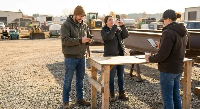
Check-ins are one of the clearest answers to what should be mobile-first. People do them at the job site entrance, in a parking lot, or walking between tasks. They need speed, not options.
A good check-in screen is mostly one big action: “Start shift” or “Arrived on site”. Add just enough context to make the record useful: auto-captured time, location, and an optional short note like “Running 10 min late”.
The best check-in UI is hard to misuse. Use large buttons, clear labels, and a success state you can’t miss (for example: a full-screen confirmation with the site name and time).
Keep inputs minimal:
Most check-in problems aren’t design problems. They’re real-world problems. Plan for wrong site selection, late check-ins that need a reason, and no signal.
If the phone is offline, save the check-in locally and show “Saved, will sync when connected” so people don’t tap five times.
If you’re building this in AppMaster, it’s a good fit for a simple mobile screen backed by a workflow that validates the site, stores GPS when available, and logs exceptions (late, wrong site) without turning the check-in into a form.
On-site photo screens are naturally mobile-first. If the job happens in the real world, the camera is the main input, not a long form.
Picture a property manager documenting water damage. They walk room to room, take 6 to 10 photos, add a quick note like “ceiling stain near vent,” and send it before the next appointment. If the screen starts with fields, they’ll skip steps, type less, or forget details.
A phone-first photo screen should open with one clear action: take a photo (or pick from the camera roll). After that, keep the form small and optional where you can. A reliable pattern is: photo first, then caption, then one tap to choose a category (Damage, Progress, Completed), and only then any extras.
A few details make a big difference in the field:
Quality matters too. If photos are used as proof of work, your screen should help people do it right without feeling strict.
Instead of long rules, use simple reminders and guardrails:
If you’re building this in AppMaster, you can model the photo record in the Data Designer, add draft logic in the Business Process Editor, and keep the mobile UI to the few controls people actually use on-site.
Quick update screens are a classic phone-first win. They exist for moments when someone has 10 seconds, not 10 minutes: a driver marking a delivery as done, a technician flagging blocked, or a coordinator asking for help while walking between sites.
The key is to keep the input tiny and the result clear. A good quick update screen is often just three things: a status, a short note, and (optionally) who to tag or assign. If the screen turns into a full form, people will skip it or type low-quality notes.
Aim for one-thumb use and low-effort choices:
A quick update only helps if it reaches the right person. Decide upfront who should be notified for each status, and what message they should receive. For example, “Blocked” can notify a supervisor and include the short note, while “Done” might only update the record.
In a tool like AppMaster, you can pair the screen with simple rules in a visual logic flow and send alerts through email/SMS or Telegram, so the update turns into action, not just data.
Some screens work better on a bigger display with a keyboard and a steady place to think. If the work is slow, careful, and done at a desk, forcing it into a phone layout can make people scroll more, miss details, and make mistakes.
A good clue is reading and comparing. If someone needs to scan long notes, review history, or compare multiple items, desktop-first usually wins. Phones are great for quick actions, but they’re not great for side-by-side context.
Common screens that are usually desktop-first include:
Approvals are the one that often causes debate. If approvals are routine and need careful review, desktop-first is safer. But if an approval must happen instantly to keep work moving (for example, a supervisor must approve an emergency purchase on-site), that specific action may still belong on mobile. The trick is to separate the “approve now” step from the “review deeply” work.
Rule of thumb: if a screen needs side-by-side context, prefer desktop-first. That includes comparing two requests, checking a customer record while reading a ticket, or editing a table while referencing a policy.
A simple example: a manager reviews a weekly schedule, notices two shifts overlap, checks each employee’s notes, and moves assignments around. On a phone, this turns into endless switching and scrolling. On desktop, it’s faster and clearer.
If you’re deciding which screens should be mobile-first, start by marking your “comparison and planning” screens as desktop-first, then pull out the one or two actions that truly must happen on the move. In AppMaster, that often becomes a small mobile screen for the urgent action and a fuller web screen for the deeper review.
Phone screens punish clutter. If you want an app to feel fast, treat every field, button, and sentence like it has to earn its place.
Start by deciding what the user is trying to finish in under 30 seconds. That question usually clarifies both what belongs on mobile and what the phone version should contain.
Separate what’s required to complete the action from what’s just helpful later. For a field check-in, the must-do path might be location, status, and one note. “Equipment details” and “follow-up tasks” can wait.
A quick way to spot bloat is to ask: if this field is empty, do we still accept the update? If yes, it probably shouldn’t be on the first view.
Keep it simple:
Instead of long typing, use choices and smart defaults. Turn repeated text into templates, pickers, and quick replies like “Arrived”, “Delayed 15 min”, or “Needs follow-up”. When a value can be guessed safely, prefill it.
Defaults that usually help on mobile are the current user, current time, last used site or project, and the last selection for common fields. If the user edits it once, remember that choice next time.
Progressive disclosure also keeps screens calm. Show the camera and one required caption for on-site photos, then reveal optional tags, categories, and extra notes only after the photo is taken.
If you build in AppMaster, you can model “must” vs “optional” fields in your Data Designer and keep the first screen lean, then use a second step for advanced fields without duplicating logic.
Most “bad mobile screens” fail for the same few reasons: they copy desktop habits onto a phone, then expect people in the field to be patient.
The fastest way to ruin a phone-first screen is to squeeze a big desktop form into a small display. Users end up scrolling, losing their place, and missing required fields. On mobile, aim for fewer inputs per step, smart defaults, and only the fields that matter in the moment.
Another common problem is hiding the main action to “save space”. If the whole point of the screen is Check in, Upload photo, or Save update, that button should be obvious and easy to reach with one thumb. A menu is fine for secondary actions, not for the one thing people came to do.
Field work also exposes authentication pain. If a technician has to re-login repeatedly (or re-enter a code) between quick tasks, they’ll delay updates or write notes elsewhere. Use longer sessions when safe, and keep re-auth for truly sensitive actions.
Five traps to watch for, and a good first fix:
A quick example: someone uploads on-site photos from a basement with poor reception. If the app doesn’t show progress or retries, they’ll tap “Submit” three times, then call support. Even a simple status plus automatic retry prevents duplicates and frustration.
If you’re building this in AppMaster, design the success state as part of the flow (not an afterthought), and plan for offline or flaky connectivity from the start.
When you’re deciding which screens should be mobile-first, don’t guess. Do a quick “phone reality” check on a real device, with one hand, in a slightly annoying environment (standing up, walking, bright light). If the screen survives that, it’s probably a good mobile-first candidate.
Use this short checklist before design polish:
Quick test: give the phone to someone new and time them. If they hesitate twice in a row, that’s your next fix. If you’re building in AppMaster, validate the flow early with a basic UI and real data before you invest in polish.
A site supervisor starts the day in the parking lot, coffee in one hand, phone in the other. The first screen they open is a check-in: tap the project, confirm location, and add a quick note like “crew on site, gate locked.” It takes 15 seconds, and it matters because it sets a timestamp everyone can trust.
Ten minutes later they’re walking the site. The phone-first photo screen is built around the camera, not a long form. They snap three photos, add a short label to each (“north wall crack,” “material delivered”), and hit save. The app grabs the time and GPS automatically, so they don’t need to type it while wearing gloves.
Before leaving the area, they open a quick update screen: two toggles and one short text field. They mark “inspection requested” and type “need electrician Thursday.” That update triggers a notification for the office team, without forcing the supervisor to write a full report on a small screen.
Here’s what stays on the phone versus what can wait until later:
The key is the data flow. Capture happens in the moment on the phone (fast, minimal typing). Review and reporting happens later on desktop, where you can compare days, spot patterns, and clean up wording.
Midweek, someone asks to add one more field to the photo screen: a simple dropdown for “Issue type.” If you build in a platform like AppMaster, that change doesn’t have to break the workflow. You update the screen, regenerate the app, and the supervisor still does the same three taps on site, just with one extra quick choice when it helps.
If you’re stuck debating which screens should be mobile-first, stop guessing and make a short, testable plan. The goal isn’t to redesign everything. It’s to pick a few screens that noticeably improve speed for people who are moving.
Start by listing your top 20 screens by daily use. Don’t use opinions. Use simple counts: how often each screen is opened, and by which role.
Then do a quick pass to mark the screens that are used away from a desk (warehouse, job site, retail floor, car) and the ones that depend on phone hardware like the camera, GPS, barcode scanning, or push notifications. Those two signals usually tell you where mobile matters.
Choose 3 to 5 screens as your first phone-first wins. Keep the selection small so you can ship, learn, and adjust.
A practical pattern is: phone for capture, desktop for review. A field worker checks in, takes photos, and posts a quick update on the phone. A supervisor later reviews the full history, edits details, and exports a report on desktop.
If you want to test fast without getting locked into early decisions, AppMaster (appmaster.io) is a no-code way to prototype complete workflows across mobile and web, then regenerate real source code as requirements change. Keep the first attempt small: build the first 3 screens, run them on a real phone, and measure whether the work gets faster.
 How do I quickly decide if a screen should be mobile-first?
Start with where and how the work happens. If a task is done on-site, under time pressure, or with one hand, make that screen phone-first and keep it focused on the minimum steps to finish the job. Put deep review, planning, and bulk changes on desktop where people have time and context.
What does “time-to-action” mean, and why does it matter?If the user needs to complete the main action in under a minute to keep work moving, treat it as mobile-first. Designing for speed forces you to cut extra fields, reduce typing, and make the next step obvious, which lowers mistakes in the field.
Which tasks are automatically good candidates for mobile-first?It’s a strong signal for mobile-first when the screen depends on camera, GPS, barcode/QR scanning, or push notifications. Those tasks are naturally tied to a phone, so design the UI around the hardware action first, then add only the smallest amount of form input after.
What makes a check-in screen actually work on a phone?Check-ins should feel like one big, clear action with a hard-to-miss success state. Auto-capture what you can (time, user, location), allow an optional short note, and include a brief undo window so people can fix a wrong tap without creating a support issue.
How should I design an on-site photo screen to avoid missing info?Open to the camera action first, not a long form. Auto-save after each photo, keep captions short, and make upload status obvious so users don’t submit multiple times in bad reception. If you need extra details, collect them after the photo is captured, not before.
What belongs on a quick update screen like “Done” or “Blocked”?Keep it to a few big status choices, a short note, and an obvious submit button near the bottom of the screen. The point is speed and clarity, so avoid dropdown-heavy forms and make sure the user sees a timestamp or confirmation after saving.
Which screens should usually be desktop-first?Dashboards with heavy filtering, schedules that need comparison, approval queues that require reading attachments, bulk edits, and admin settings usually belong on desktop-first screens. Phones can still support a small “approve now” or “confirm” action when something is urgent, but the deep review is better on a larger screen.
How do I handle offline or weak signal on mobile-first screens?Design for flaky connectivity by saving drafts locally and queuing submissions when the signal drops. Show a clear state like “saved” versus “syncing” versus “failed,” and make retries automatic where possible so users don’t re-enter data or tap repeatedly.
How do I trim a cluttered screen so it works on phones?Pick one primary outcome the user must finish, then remove or hide everything else behind an optional step. Replace typing with defaults and quick choices, and only ask for extra fields when they change the outcome or prevent real errors. A lean first screen beats a “complete” screen that nobody finishes.
What’s the fastest way to validate a mobile-first screen before polishing it?Test on a real phone with one hand and a small distraction, like standing or walking. If a new user can’t finish the main task in under 60 seconds without help text, simplify the flow and make the primary action more obvious. In AppMaster, you can prototype the mobile flow quickly, validate it with real users, then adjust the data model and logic without rebuilding everything from scratch.
Experiment with AppMaster with free plan.
When you will be ready you can choose the proper subscription.
 Jul 14, 20266 min
 Jul 13, 202611 min
 Jul 08, 20266 min