


 Jul 14, 2026
 6 min
6 minEquipment reservation app: prevent conflicts and track returns
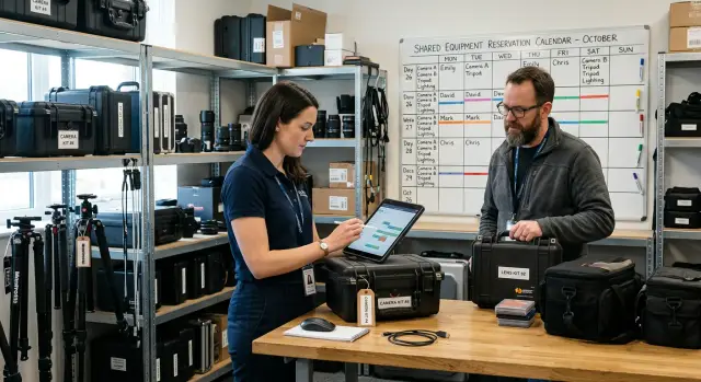
Plan an equipment reservation app that prevents double bookings, records returns and damage, and places faulty items on maintenance hold.
Set clear naming, variants, and layout rules for reusable UI components so teams build consistent screens fast in any visual builder.

Visual builders make it easy to ship screens fast. That speed can also hide a slow drift in how the UI looks and behaves. When several people build at once, small choices stack up: one person adds 12px padding, another uses 16px, and a third copies an older button from a different screen.
You usually notice the symptoms early: near-duplicate components, spacing that shifts between screens, and slightly different words for the same action (Save, Submit, Confirm). States often diverge too. One form shows a clear loading state, another doesn’t. Error messages vary, and “quick fixes” appear on one page but never make it back into the shared pattern.
That’s how UI debt starts. Each inconsistency feels minor, but over time it makes the product feel less trustworthy. It also slows teams down because people spend more time hunting for the “right” version, comparing screens, and fixing tiny differences late in review.
A component library in a visual builder is a shared set of building blocks (buttons, fields, cards, headers, empty states) that everyone pulls from instead of recreating. In a platform like AppMaster, that typically means creating reusable UI pieces inside the visual UI builders, then agreeing on how they’re named, configured, and placed so screens stay consistent even when different people build them.
The goal isn’t to remove creativity. It’s to make the everyday parts predictable so choices are intentional. The four levers that prevent drift are: clear naming, sensible variants, basic layout rules (spacing, alignment, grids), and team habits that keep the library healthy as the app grows.
Not every nice-looking element deserves to become a component. If you turn everything into a component, people waste time digging through a library and tweaking options that shouldn’t exist.
A good reusable component is something you expect to see across many screens, or something that must look and behave the same every time. Think of patterns users recognize instantly: a primary button, a text input with help text, a card that previews a record.
A small starter set usually covers most screens: buttons, inputs, cards, page headers, and a couple of modal types (confirm and form).
A practical extraction rule keeps decisions simple: if you use the same UI 2 to 3 times, or it’s critical to your brand and needs to be identical, extract it. If it shows up once, keep it local.
What should stay one-off? Highly specific layouts tied to a single screen, experimental sections you’re changing daily, and anything that’s mostly content. For example, a one-time onboarding banner with custom text and illustration is rarely worth componentizing.
Keep each component focused. One component should do one job. A “User Card” that also handles permissions, billing status, and admin actions becomes hard to reuse. A cleaner approach is a display-focused “User Card” plus separate action buttons and status chips.
When a team ships fast, names are the first thing to break. Someone duplicates “Button2,” another creates “CTA Button,” and a third uses “BlueButton.” A week later, nobody knows which one to reuse, so they make a new one. That’s how a library becomes a pile of near duplicates.
A simple pattern helps you stay consistent even when you’re tired: Component - Part - State. Most components don’t need all three, but the order stays the same.
Use words people actually say. If your team says “Customer card,” don’t name it “CRM Tile.” If the product calls it a “Plan,” don’t call it “SubscriptionBox.” Plain language wins because it’s searchable.
One rule prevents a lot of confusion: don’t mix “what it looks like” and “what it’s for” at the same layer. Pick one approach. If you name by purpose, avoid color words. If you name by visuals, avoid business meaning. Purpose-based naming usually scales better.
Examples that are easy to scan in a component list:
Decide formatting once and write it down: Title Case or sentence case, spaces around hyphens, and no abbreviations unless they’re universal (like “URL”). In visual builders where many people contribute, these small choices keep the library readable as the list grows.
Variants let a team reuse one component in many places without making a new copy each time. The trick is deciding upfront which differences matter and locking everything else down.
Start with a few variant dimensions that cover real needs. For many components, three are enough: size (S/M/L), intent (primary/secondary/danger), and state (default/hover/active). If a new option doesn’t fit those dimensions, treat it as a new component, not “one more variant.”
Defaults matter more than people think. New screens should look correct even when someone drags in a component and changes nothing. Set safe defaults (like size=M, intent=primary, state=default) so speed doesn’t turn into random styling.
For each component that has variants, write down and enforce:
Example: you have a “Submit” button across a customer portal. If one person makes a “Wide Submit Button” and another makes a “Rounded Submit Button,” drift shows up fast. With rules, you keep one Button component. You allow size and intent, forbid custom padding and corner radius, and define “Loading” once (show a spinner, lock clicks) so it behaves the same everywhere.
When someone asks for “just one more style,” ask what user problem it solves. If the answer is unclear, it’s probably chaos in disguise.
If layout rules are vague, every screen slowly turns into a one-off. The fastest way to keep components consistent is to make spacing and alignment boring: a few allowed choices, used the same way every time.
Start with a spacing scale and ban everything else. Pick a small set (for example 4, 8, 12, 16, 24) and treat it like a keyboard: you can play many songs, but only with those keys. If someone needs “18px,” it usually means the component or grid is off.
Be explicit about what spacing means:
Alignment rules remove endless “nudge it a bit” edits. A simple default works well: left-align text, line up labels and inputs on the same vertical line, and keep primary actions consistent (for example, bottom-right in a modal and right-aligned in a form footer). Use baseline alignment for text-heavy rows. Reserve centered alignment for icon-only rows.
Grids don’t need to be fancy, but they do need to exist. Decide columns and gutters, and define what happens on smaller screens (even a basic “12 columns on desktop, single column on mobile” helps). Set container widths and breakpoints once, then build screens inside those rails.
Common traps to watch for: nested containers that each add padding, inconsistent page margins, mixing fixed widths with responsive columns, and “magic numbers” that only fix one screen.
Style tokens are the shared choices everyone uses. When tokens are clear, reusable UI components stay consistent even when different people build screens.
Start with typography as a single source of truth. Pick a small scale for font size, weight, and line height, then stop. Most teams only need a few steps (for example: body, small, caption, title, and page heading). Put these choices in one place so new text starts from the same defaults.
Colors work best when named by meaning, not by paint codes. “Primary” signals a main action. “Success” means “it worked,” and “warning” means “check this.” Avoid names like “blue-500” unless your team already thinks in palettes.
Accessibility basics that prevent problems later:
Tokens should connect directly to component variants. A Button variant like Primary, Secondary, or Danger should swap approved tokens (color, border, text style), not introduce new one-off styling.
Keep the token list short enough that people actually use it. A good test: can someone pick the right token in 5 seconds? If not, merge or delete.
A simple starter set might include typography (text.body, text.small, text.title), color (color.primary, color.success, color.warning, color.danger), spacing (space.8, space.16, space.24), radius (radius.sm, radius.md), and focus (focus.ring).
A component library is less about “design perfection” and more about removing daily micro-decisions. When everyone picks the same building blocks, screens stay consistent even when different people build them.
Audit what you already have. Pick 5 to 10 real screens and note duplicates you see repeatedly: buttons, text inputs, section headers, cards, and empty states.
Choose a small first wave to standardize. Aim for the top 10 pieces that appear everywhere and cause the most mismatch. For many teams that means buttons, inputs, dropdowns, modal dialogs, table headers, and cards.
Write the rules down before you build. Keep it short: component name, when to use it, allowed variants, and the layout rules around it (spacing, alignment, width).
Rebuild once, then replace gradually. Create the new components in your visual builder and lock in the variants you agreed on. Replace old copies screen by screen. Don’t try to refactor everything in one sprint.
Add a lightweight review gate. One person (rotating weekly) checks new components and new variants. The goal isn’t policing. It’s preventing accidental forks.
You’ll know it’s working when a designer or PM can say, “Use the standard card with the compact header,” and two builders produce the same result. That’s the payoff: fewer one-off choices, fewer subtle inconsistencies, and faster screen building.
Keep your library small on purpose. If someone requests a new variant, ask one question first: is this a real new need, or can an existing variant cover it with different content?
Most inconsistency isn’t caused by bad taste. It happens because copying is easy, tweaks are quick, and nobody circles back. The result is a set of almost-the-same screens that are hard to update.
One common trap is creating near-duplicates instead of adding a variant. Someone needs a “primary button, but slightly taller” and duplicates the component. A week later, another person duplicates that. Now you have three buttons that look close but behave differently, and every change becomes a hunt.
Another slowdown is the over-configurable component: one mega component with dozens of toggles. It feels flexible, then becomes unpredictable. People stop trusting it and create “just for this case” versions, which defeats the point.
Layout mistakes cause just as much damage. The biggest one is mixing responsibilities: a component controls its own outer margins while the screen also adds spacing. You get random gaps that vary by page. A simple rule helps: components define internal padding, screens control spacing between components.
Problems that usually show up first: naming rules break when rushed, states get added late (loading, empty, error), one-off tweaks become permanent, and different people solve the same layout in different ways.
Before you add anything new, pause for 60 seconds and check the basics. A screen can look fine while quietly breaking the system, and those small breaks add up quickly when several people build in parallel.
Form/Input, Form/Input.HelperText, Table/RowActions). If the name won’t help someone search and place it quickly, rename it now.Maya and Leon are on a customer support team. They need two screens: a ticket list (to scan quickly) and a ticket details screen (to act on one ticket). They split the work and build in a visual builder.
Without rules, each person makes “a card” differently. Maya uses a white card with a thin border and a shadow. Leon uses a gray card with no border but extra padding. One screen has a rounded primary button, the other uses a square button and a text link. Status appears as a colored dot on one screen and a pill on the other. On the details page, fields don’t line up because labels are different widths, so the whole form feels wobbly.
The review meeting turns into a styling debate, and a simple update (like adding “Priority”) means touching multiple one-off layouts.
With rules, they start from shared, reusable UI components in a small library: a TicketCard for structure and spacing, a StatusBadge for status styles and contrast, and an ActionBar for consistent primary actions.
Now the list screen uses a compact TicketCard variant for key fields and a preview line. The details screen uses a detailed variant for the full description, timeline, and extra fields. The structure stays the same; the variant controls what appears.
The best part is what you don’t see: fewer review comments, fewer “why is this different?” questions, and faster updates later. When the team renames “Closed” to “Resolved” and adjusts its color, they change StatusBadge once and both screens update together.
Consistency isn’t a one-time setup. As soon as more people build screens, small “just for this page” choices multiply, and the library starts to drift.
A simple change process keeps the team moving without turning every button tweak into a debate:
Decisions need a home. A short “UI rules” doc is enough if it includes naming conventions, the official variant list (what exists and what doesn’t), and a do-not-do list (for example: “Don’t create a second ‘Primary Button’ with different padding”).
Schedule a monthly cleanup slot. Use it to merge duplicates, remove unused pieces, and mark older components as deprecated so people stop grabbing the wrong one.
Refactor when you see the same pattern twice (for example, two teams build slightly different empty states). Live with a one-off when it’s truly unique, time-sensitive, and unlikely to repeat.
If you’re building in AppMaster, one practical next step is to standardize a single workflow first (like “Create ticket” or “Checkout”), then expand. The UI builders make it easy to share the same components across screens, and appmaster.io is a useful reference point if your team wants a no-code approach that still supports full applications, not just page layouts.
 What’s the fastest way to start a component library without slowing the team down?
Start by standardizing the pieces you touch on almost every screen: buttons, inputs, cards, headers, and one or two modal types. Build those as reusable components first, set sensible defaults, then replace old copies screen by screen instead of trying to refactor everything at once.
How do I decide what should be a reusable component and what should stay one-off?A good default is to extract it when you’ve used the same UI two or three times, or when it must look and behave identically every time (like primary actions or form fields). If it’s truly one-off, tied to a single screen, or changing daily, keep it local so the library stays easy to use.
What naming convention works best when multiple people build screens?Use one simple naming pattern and keep it consistent, such as "Component - Part - State". Prefer words your team actually uses in conversations, and avoid names based on colors like "BlueButton" because they become misleading when styles change.
How many variants should a component have before it becomes chaos?Keep variants limited to differences that matter repeatedly, like size, intent (primary/secondary/danger), and state. Everything else should stay locked so people don’t "tune" components per screen and create drift. If a new request doesn’t fit your existing variant dimensions, it’s usually a new component, not “one more option.”
How do we stop spacing from drifting between screens?Pick a small spacing scale and use only those values across the app, then treat anything else as a signal that the grid or component is off. Prefer spacing handled by containers (gaps) instead of stacked margins so you don’t get accidental double-spacing when components are nested.
Do we really need style tokens, or can we just copy styles as we go?Use tokens that are named by meaning, not by raw color values, so teams choose "primary" and "danger" instead of inventing new shades. Then ensure component variants map to those tokens, so creating a “Primary Button” always pulls the same typography and colors everywhere.
Which UI states should be standardized across components?Make sure every shared interactive component has at least a disabled and loading state, and add error states when failure is possible (like forms and network actions). If states aren’t standardized, you’ll get screens that feel inconsistent even if they look similar, which hurts trust and increases review cycles.
Why are “mega components” a bad idea in a visual builder?Over-configurable components feel flexible at first, but people stop trusting them because behavior becomes unpredictable. Keep components focused on one job, and compose bigger UI from smaller pieces so reuse stays simple and changes don’t create side effects.
How do we keep the library consistent over time without turning it into bureaucracy?Use a lightweight gate: one rotating owner checks new components and new variants for naming, spacing rules, and required states. The goal is to prevent accidental forks early, because merging near-duplicates later is slow and usually breaks screens.
How would I implement this approach in AppMaster specifically?In AppMaster, create reusable UI pieces inside the web and mobile UI builders, then standardize how they’re named, configured, and placed so others can reuse them confidently. A practical approach is to standardize one workflow first (like “Create ticket”), get the components and variants right there, then expand the library as more screens adopt the same patterns.
Experiment with AppMaster with free plan.
When you will be ready you can choose the proper subscription.
 Jul 14, 20266 min
 Jul 13, 202611 min
 Jul 08, 20266 min