Role-Based Dashboards for Teams in One Shared System
Role-Based Dashboards help sales, operations, finance, and support work in one system while each team sees the tasks, data, and KPIs that matter.
Push notification permission UX made practical: timing, copy, and fallback flows that raise opt-in while keeping users in control and reducing annoyance.
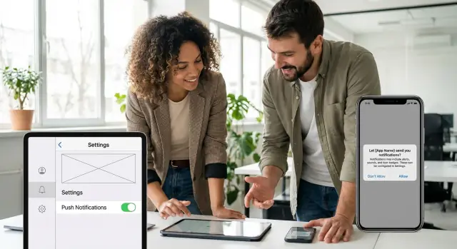
On iOS and Android, the system permission prompt is the official pop-up that asks whether your app can send push notifications. It is powerful because it is trusted and hard to ignore. It is also risky because users can only say yes or no, and many will never see the prompt again unless they go to Settings.
Bad push notification permission UX usually feels annoying for one simple reason: the app asks for access before it has earned a reason. When the prompt shows up on first launch, it looks like the app wants something, not that it is trying to help.
People decline for predictable reasons. Most are not anti-notifications, they are anti-noise.
It is tempting to define success as opt-in rate only. But a high opt-in rate can still be a failure if it leads to people muting you, unsubscribing later, leaving bad reviews, or uninstalling the app. Real success looks like this: notifications that get used, improve return visits, and do not cause churn.
A simple goal keeps teams honest: ask only when it helps the user right now. If the user cannot immediately connect the permission to something they are trying to do, wait.
For example, a delivery app asking on the welcome screen feels pushy. Asking right after the user places an order, with a clear promise like "Get delivery updates and delays" feels helpful because the user already wants that information. That difference, more than clever wording, is what separates respectful permission flows from annoying ones.
People say yes to notifications when they can picture the value. Before you think about timing or wording, decide what you will send and why it helps the user right now, not your metrics.
Most apps end up with the same core notification types. The difference is whether each one is tied to a clear benefit the user would miss without it.
Here are common types, with plain-language benefits you can use to shape your push notification permission UX:
If you cannot finish the sentence “This helps you because…”, do not send it, and do not ask permission for it.
Push is best when waiting would make the message less useful. Alerts and some status updates are usually time-sensitive. Most offers and tips are not. If a message can sit in an inbox, show up in an in-app feed, or wait until the next session, it probably should.
A practical test: if the user sees it 3 hours later, is it still a win or just noise?
Begin with the smallest set that proves value. You can always expand later once trust is earned.
Example: A customer support app might start with “Replies to your ticket” and “Account security alerts” only. After users see those are helpful, you can offer optional reminders like “Rate your support chat” or occasional offers.
If you are building the app in a no-code tool like AppMaster, define these categories early as separate toggles or topics. That makes it easier to start small and add more choices later without turning notifications into an all-or-nothing decision.
Most people do not hate notifications. They hate being interrupted before they understand the app. Good push notification permission UX is mostly about timing: ask when the request feels like the next logical step.
A simple rule: match the prompt to the user’s intent. If someone just did something that would clearly benefit from an alert, your ask feels helpful instead of pushy. If they are still exploring, it feels like a tax.
Avoid asking on first launch unless the value is immediate and obvious in the first 10 seconds. Examples where it can work: a delivery tracker app, a security alert app, or anything where missing the first notification would genuinely break the core experience. For most products, first launch is too early.
Progressive permission usually wins. Give silent value first (clear status updates in the UI, an activity screen, email receipts, in-app reminders), then ask for notifications when the user has seen the pattern and wants it to continue when they are away.
Here are timing moments that tend to earn a yes:
If you are unsure, wait. A late prompt beats an early one because it is anchored to real behavior. You can even trigger the request only after the user has completed one meaningful action (for example: created their first item, followed their first topic, or finished onboarding).
Concrete scenario: in a customer portal, do not ask during signup. Ask after the user submits a support request, when you can say, "Want a notification when we reply?" That moment is about them, not you, and it makes the prompt feel earned.
A soft ask is your own screen (or small modal) that appears before the operating system permission prompt. It gives people context in plain language, so the system dialog does not feel like a surprise. Done well, this is the fastest way to improve push notification permission UX without resorting to tricks.
The key idea is simple: explain the value first, then ask for a clear choice. Only people who say yes should see the system permission prompt.
Most apps get better results with this sequence:
That “only on yes” rule matters. If you show the system prompt no matter what they tap, people learn not to trust your UI.
Keep the soft ask tight: one sentence on the benefit, one sentence on what to expect. For example: “Get an alert when your order ships or if there’s a delivery issue. No promos.” Then offer two equal options:
Make “No thanks” look like a normal choice, not a tiny link or a guilt line like “I don’t care about updates.” People are more likely to say yes later if they do not feel pushed.
A soft ask should also reduce future friction. If someone declines, they should still have a simple way to revisit the choice. Add a clear entry point such as “Notifications” in your in-app settings, and when they tap it, show the soft ask again (then the system prompt only after they agree).
A realistic moment to use this: after a user tracks their first delivery, you show the soft ask: “Want updates when your package is out for delivery?” If they say yes, you ask the OS for permission right then, when the benefit is obvious.
Good permission copy answers one simple question: "What do I get if I say yes?" If the screen can’t explain that in a few seconds, people assume the notifications are for you, not for them.
For strong push notification permission UX, write a one-sentence value statement that includes three things: what they’ll receive, when it happens, and why it helps. Aim for concrete moments the user already cares about.
Avoid foggy lines like “Stay updated” or “Don’t miss out.” Those phrases sound like marketing because they don’t name a real benefit. Specific beats clever every time.
Keep the message small enough to scan. A reliable pattern is:
For example, if you’re a delivery app:
“Get delivery updates”
“We’ll notify you when your driver is 5 minutes away.”
Button: “Notify me”
That copy tells the user exactly what will happen and when, and it doesn’t pretend notifications are universally valuable.
Tone matters too. Match the context of your app and the moment. A finance app should sound calm and precise. A fitness app can be friendly and upbeat. Whatever you choose, keep it consistent with the rest of the UI so it doesn’t feel like a pop-up ad.
Here are a few quick rewrites that show the difference:
Vague: “Enable notifications to stay updated.”
Specific: “Get an alert when your payment goes through.”
Vague: “Turn on push notifications.”
Specific: “We’ll remind you 1 hour before your appointment.”
If you’re building flows in a tool like AppMaster, treat the permission screen like any other product screen: one job, one message, one action. You can always offer more settings later, but this moment needs clarity.
Before you ship, check your copy against these questions:
A “No” is not a dead end. It is a signal: the person is not convinced yet, or they do not trust what will happen next. The fastest way to lose them is to keep interrupting with the same prompt. Repeated prompts feel like punishment for saying no, and people learn to ignore your app.
After a denial, keep the experience calm and useful. Avoid popups that block the screen. Instead, show a small, non-urgent note inside the relevant screen (like an order status page) that explains how they will still get updates.
Here are good fallback paths that respect the choice and still deliver value:
If your product has more than one type of notification, offer granular choices. People often say no because they fear noise, not because they hate all alerts. A simple preference screen can turn a hard no into a partial yes.
Keep choices clear and human, for example:
Your re-ask rule matters as much as the copy. Re-ask only after a new, proven value moment, not after a timer.
A simple rule of thumb for push notification permission UX: ask again only when (1) the user just used a feature that truly benefits from alerts, and (2) you can name that benefit in one short sentence. For example, after someone saves a delivery address and places an order, you can offer: “Turn on shipping updates so you don’t miss the delivery window.” If they still say no, stop asking and rely on the fallback you already provided.
If you are building this in a tool like AppMaster, treat the preference screen and inbox as first-class features, not a backup plan. They often become the main way users stay informed, even when they never opt in to push.
Imagine a delivery app. People care about one thing right after they place an order: “Tell me if something changes.” That is the perfect time for push notification permission UX, because the benefit is obvious and immediate.
Here’s the exact moment to ask: the user taps “Place order” and lands on the order confirmation screen that shows the ETA and tracking. Wait until the screen is loaded and the order is real. Then show a small in-app message (a soft ask) that explains the value in plain words.
Keep it short and specific to the order they just placed. Example copy:
“Want delivery alerts for this order? We’ll notify you when it’s accepted, out for delivery, and delivered.”
Button labels that work well:
If the user taps “Turn on alerts,” then trigger the system permission prompt. If they tap “Not now,” don’t show the system prompt at all. You have learned something without burning trust.
When the system prompt is declined, the app should still feel complete. Show a small confirmation message inside the app:
“Okay, we’ll keep updates here. You can turn on alerts anytime in Settings.”
Then deliver the same value without push:
This flow avoids nagging, keeps the user informed, and gives them a clear path to enable notifications later when they see the benefit.
Most opt-in problems are not about the button text. They come from moments where the app feels pushy, vague, or sneaky. Good push notification permission UX is mostly about keeping your promise: ask when it makes sense, say what you will send, and respect the answer.
A first-launch prompt is like tapping someone on the shoulder before you have said hello. Users have not seen value yet, so the safest choice is “Don’t Allow.” Wait until the user completes an action where a notification is clearly helpful, like tracking an order, getting a reply, or a security event.
If your prompt implies “important updates” but you later send discounts, users feel tricked. That hurts trust and leads to more disables, not just for marketing but for everything.
A simple rule: describe the 1-2 notification types you will actually send in the next week of normal use. If you cannot name them, you are not ready to ask.
Repeated re-prompts train people to ignore you. After a “No,” treat it as a preference, not a challenge. Use a long cooldown and only try again when the user has clearly opted into a feature that needs notifications.
If users cannot find notification settings later, they will assume the app is not in their control. Always offer an easy way to:
For example, if you build your app in AppMaster, include a simple in-app “Notifications” screen in your UI so people can manage categories without hunting.
Mixing “security sign-in alerts” with “weekly deals” creates a lose-lose choice. Many users will block everything to avoid spam, then miss the alerts that matter.
Separate categories early. If you truly need critical alerts, keep them rare, specific, and tied to an action the user cares about. Marketing can be offered later as an optional add-on, not the default.
Before you launch, do one last pass focused on real user intent. The goal of good push notification permission UX is not a higher opt-in number at any cost. It is a flow that feels fair, stays useful after “No”, and builds trust over time.
Run through this checklist in a staging build on a real device (and with a few people who did not help design it):
A quick reality check: if you send only one type of notification, your soft ask should name that one thing. If you plan multiple types, start with the most valuable category and let people add the rest later.
If you are building your app in AppMaster, treat this like any other user journey: map the trigger in your UI, define the “yes” and “no” paths in your business logic, and make the Settings screen easy to find. Then ship, measure, and adjust the timing before you increase volume.
Treat notification permission as a product decision, not a one-time setup. You are balancing opt-in rate with trust. The safest way to improve both is small, controlled experiments with clear measurement.
Start by defining 2-3 variants that change only one thing at a time. Keep the rest of the experience identical so you can learn what actually moved the result.
Next, track events that show the full story, not just the initial “Allow” rate. A high opt-in that leads to quick disables can mean you asked at the wrong moment or over-promised.
Segment results so you do not optimize for the wrong users. New users often need context, while active users respond to usefulness. Also segment by the feature that triggered the ask (for example: order updates vs messages) because different value props behave differently.
When you see a winner, document it as a simple rule set: when to show the soft ask, what copy to use, when to retry, and what the fallback looks like after “Don’t Allow.” Then implement the rule as a repeatable flow so it stays consistent as the app changes.
If you want a low-friction way to build and iterate, you can model the screens (soft ask, education, settings), the logic (when to show, when to back off), and the settings UI in AppMaster without code, while still generating real source code for production apps. That makes it easier to run careful tests, ship small updates, and avoid breaking the experience each time you adjust the flow.
Experiment with AppMaster with free plan.
When you will be ready you can choose the proper subscription.