


Equipment reservation app: prevent conflicts and track returns
Plan an equipment reservation app that prevents double bookings, records returns and damage, and places faulty items on maintenance hold.
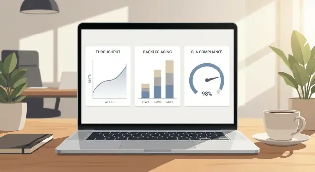
Learn operations dashboard metrics that reflect throughput, backlog, and SLA. Decide what to measure, how to aggregate, and which charts drive action.
An operations dashboard isn’t a wall of charts. It’s a shared view that helps a team make the same calls faster, without arguing about whose numbers are “right.” If it doesn’t change what someone does next, it’s decoration.
The job is to support a small set of repeat decisions. Most teams come back to the same ones every week:
Different people use the same dashboard differently. A frontline lead might check it daily to decide what gets attention today. A manager might review it weekly to spot trends, justify staffing, and prevent surprises. One view rarely serves both well; you usually need a lead view and a manager view.
“Pretty charts” fail in a simple way: they show activity, not control. A chart can look impressive while hiding the reality that work is piling up, aging, and missing promises. The dashboard should surface problems early, not explain them after the fact.
Define what “good” looks like before you pick visuals. For most operations teams, good is boring:
A small example: a support team sees “tickets closed” rising and celebrates. But the backlog is aging, and the oldest items are drifting past the SLA. A useful dashboard shows that tension immediately, so the lead can pause new requests, reassign a specialist, or escalate blockers.
Most operations dashboard metrics fall into three buckets: what you finish, what’s waiting, and whether you’re keeping your promises.
Throughput is how much work gets to “done” in a time period. The key is that “done” must be real, not halfway. For a support team, “done” might mean the ticket is solved and closed. For an ops team, “done” might mean the request is delivered, verified, and handed off. If you count work that still needs fixes, you’ll overestimate capacity and miss problems until they hurt.
Backlog is the work waiting to be started or finished. The size alone isn’t enough, because 40 new items that arrived today is very different from 40 items that have been sitting for weeks. Backlog becomes useful when you add age, like “how long items have been waiting” or “how many are older than X days.” That’s what tells you whether you have a temporary spike or a growing blockage.
SLA is the promise you make about time. It can be internal (to another team) or external (to customers). SLAs usually map to a few clocks:
These three metrics connect directly. Throughput is the drain. Backlog is the water in the tub. SLA is what happens to wait time while the tub fills or empties. If backlog grows faster than throughput, items sit longer and SLA breaches rise. If throughput rises without changing intake, backlog shrinks and SLA improves.
A simple example: your team closes about 25 requests per day. For three days, new requests jump to 40 per day after a product update. Backlog increases by about 45 items, and the oldest items start crossing your 48-hour resolution SLA. A good dashboard makes that cause-and-effect obvious so you can act early: pause non-urgent work, reroute a specialist, or temporarily adjust intake.
A useful dashboard starts with the questions people ask when things feel off, not with whatever data is easiest to pull. Start by writing the decisions the dashboard should support.
Most teams need to answer these every week:
From there, limit yourself to 1 to 2 primary measures per area. It keeps the page readable and makes “what matters” obvious.
Add one leading indicator so you don’t misread the chart. Throughput dropping can mean slower work, but it can also mean fewer arrivals. Track arrivals (new items created/opened) alongside throughput.
Finally, decide what you must slice by. Slices turn one average into a map of where to act. Common ones are team, queue, customer tier, and priority. Only keep slices that match ownership and escalation paths.
A concrete example: if overall SLA looks fine but you slice by priority, you might find P1 work breaches twice as often as everything else. That points to a different fix than “work faster”: on-call coverage gaps, unclear definitions of P1, or slow handoffs between queues.
Most dashboard fights aren’t about numbers. They’re about words. If two teams mean different things by “done” or “breached,” your metrics will look precise and still be wrong.
Start by defining the events you measure. Write them as simple rules that anyone can apply the same way, even on a busy day.
Pick a small set of events and pin each one to a clear system moment, usually a timestamp change:
Also define what counts as breached for SLA reporting. Is the SLA clock based on “created to first response,” “created to done,” or “started to done”? Decide whether the clock pauses while blocked, and which blocked reasons qualify.
Rework is where teams accidentally cook the numbers. Decide one approach and stick to it.
If a ticket is reopened, do you count it as the same item (with extra cycle time) or a new item (a new created date)? Counting it as the same item usually gives better quality visibility, but can make throughput look lower. Counting it as a new item can hide the real cost of mistakes.
A practical compromise is to keep one unit of work, but track a separate “reopen count” and “rework time” so the main flow stays honest.
Now agree on your unit of work and status rules. A “ticket,” “order,” “request,” or “task” can all work, but only if everyone uses the same meaning. For example: if an order splits into three shipments, is that one unit (order) or three units (shipments)? Throughput and backlog change based on that choice.
Document the minimum fields your system must capture, or the dashboard will be full of blanks and guesses:
Aggregation is where useful dashboards often go wrong. You compress messy reality into a few numbers, then wonder why the “good” trend line doesn’t match what the team feels every day. The goal isn’t a prettier chart. It’s an honest summary that still shows risk.
Start with time buckets that fit the decisions you make. Daily views help operators spot today’s pileups. Weekly views show whether a change actually helped. Monthly rollups are best for planning and staffing, but they can hide short spikes that break SLAs.
For time-based measures (cycle time, first response time, time to resolution), don’t rely on averages. A few very long cases can distort them, and a few very short ones can make things look better than they are. Medians and percentiles tell the story teams care about: what is typical (p50) and what is painful (p90).
A simple pattern that works:
Segmentation is the other lever. A single overall line is fine for leadership, but it shouldn’t be the only view. Split by one or two dimensions that match how work actually flows, such as queue, priority, region, product, or channel (email, chat, phone). Keep it tight. If you slice by five dimensions at once, you’ll end up with tiny groups and noisy charts.
Edge cases are where teams accidentally lie to themselves. Decide up front how to treat paused work, “waiting on customer,” holidays, and after-hours windows. If your SLA clock stops when you’re waiting on a customer, your dashboard must reflect the same rule or you’ll chase problems that aren’t real.
One practical approach is to publish two clocks side by side: calendar time and business time. Calendar time matches what customers experience. Business time matches what your team can control.
Finally, sanity-check every aggregation with a small sample of real tickets or orders. If the p90 looks great but operators can name ten stuck items, your grouping or clock rules are hiding the pain.
Good metrics do one thing well: they point to what to do next. If a chart makes people argue about definitions or celebrate a number without changing behavior, it’s probably vanity.
A line chart for throughput (work items completed per day or week) becomes more useful when you add context. Put a target band on the chart, not a single target line, so people can see when performance is meaningfully off.
Add arrivals (new items created) on the same time axis. If throughput looks fine but arrivals jump, you can spot the moment the system starts falling behind.
Keep it readable:
A single backlog count hides the real problem: old work. Use aging buckets that match how your team feels pain. A common set is 0-2 days, 3-7, 8-14, 15+.
A stacked bar chart by week works well because it shows whether the backlog is getting older even if the total volume is flat. If the 15+ segment is creeping up, you have a prioritization or capacity issue, not “just a busy week.”
SLA compliance over time (weekly or monthly) answers, “Are we meeting the promise?” But it doesn’t tell you what to do today.
Pair it with a breach queue: the number of open items that are inside the SLA window but close to breaching. For example, show “items due in the next 24 hours” and “already breached” as two small counters next to the trend. That turns an abstract percent into a daily action list.
A practical scenario: after a new product launch, arrivals spike. Throughput stays steady, but the backlog aging chart grows in the 8-14 and 15+ buckets. At the same time, the breach queue jumps. You can act immediately: reassign work, narrow intake, or adjust on-call coverage.
A dashboard spec should fit on two pages: one page for what people see, one page for how the numbers are calculated. If it’s longer, it’s usually trying to solve too many problems at once.
Sketch the layout on paper first. For every panel, write one daily question it must answer. If you can’t phrase the question, the chart will turn into a “nice to look at” metric.
A simple structure that stays usable:
Next, define every metric in one sentence, then list the fields you need to calculate it. Keep formulas explicit, like: “Cycle time is closed_at minus started_at, measured in hours, excluding items in Waiting status.” Write down the exact status values, date fields, and which table or system is the source of truth.
Add thresholds and alerts while you’re still writing, not after launch. A chart without an action is just a report. For each threshold, specify:
Plan drill-down paths so people can move from trend to cause in under a minute. A practical flow is: trend line (week) -> queue view (today) -> item list (top offenders) -> item detail (history and owner). If you can’t drill down to individual items, you’ll get arguments instead of fixes.
Before you ship, validate with three real weeks of historical data. Pick one calm week and one messy week. Check that totals match known outcomes, and spot-check 10 items end-to-end to confirm timestamps, status transitions, and exclusions.
A support team ships a big product update on Monday. By Wednesday, customers start asking the same “how do I…” question, plus a few new bug reports. The team feels busier, but nobody can tell if this is a temporary spike or an SLA disaster.
Their dashboard is simple: one view per queue (Billing, Bugs, How-to). It tracks arrivals (new tickets), throughput (tickets solved), backlog size, backlog aging, and SLA risk (how many tickets are likely to breach based on age and remaining time).
After the update, the metrics reveal:
This doesn’t look like a general performance problem. It looks like a routing and focus problem. The team has three real decisions, and the dashboard makes them clear:
They choose a mix: one extra agent on “How-to” during peak hours, plus a canned response and a small help article.
The next day, they check again. Throughput isn’t dramatically higher, but the important signals move in the right direction. Backlog aging stops climbing and starts bending down. The SLA risk chart drops first, then actual breaches fall later. Arrivals to “How-to” start trending down, confirming the root-cause fix helped.
A dashboard should help you decide what to do next, not make yesterday look good. Many teams end up with busy charts that hide risk.
The classic one is “tickets closed this week” shown alone. It can go up even when the work is getting worse, because it ignores arrivals, reopenings, and aging.
Watch for these patterns:
A simple fix: pair every output number with a demand number and a time number. For example, closed vs created, plus median cycle time.
Average time-to-resolve is a fast way to miss customer pain. One stuck case that takes 20 days can be invisible when the average is pulled down by lots of quick wins.
Use medians and percentiles (like p75 or p90) alongside an aging view. If you can only pick one, pick median. Then add a small “worst 10 open items by age” table so the long tail stays visible.
If Team A counts “done” as “first response sent” and Team B counts “done” as “fully resolved,” your charts will spark arguments, not decisions. Write definitions in plain words and keep them consistent: what starts the clock, what stops it, and what statuses pause it.
A realistic example: support changes a status from “Waiting on customer” to “On hold,” but engineering never uses that status. SLA time pauses for one group and not the other, so leadership sees “SLA improving” while customers see slower fixes.
Filters help, but a dashboard with 12 filters and 20 charts becomes a choose-your-own-adventure. Pick a clear default view (last 6-8 weeks, all customers, all channels) and make exceptions intentional.
Missing timestamps, backfilled status changes, and inconsistent status names silently poison results. Before you build more charts, validate that key fields are present and ordered correctly.
Before you call it “done,” check whether the dashboard answers real questions on a busy Monday morning. Good operations dashboard metrics help you spot risk early, explain what changed, and decide what to do next.
A quick one-screen check:
If any answer is “no,” do a small fix first. Often it’s as simple as adding a comparison to last week, splitting one view by priority, or showing a 7-day rolling view next to the weekly total. If you need to pick one improvement, choose the one that prevents surprises: backlog aging by priority, or an SLA countdown view.
Turn the checklist into a short spec someone can implement without guessing. Keep it tight, and focus on definitions and decision rules.
If you want a fast way to prototype the full workflow (data model, business rules, and a web dashboard UI), AppMaster (appmaster.io) is built for creating complete applications without hand-coding, while still generating real source code behind the scenes. The key is to start small, ship, and only add metrics that earn their place by changing a decision.
Start with the repeat decisions your team makes (staffing, priority, escalation, and process fixes), then choose the few measures that directly support those calls. If a metric doesn’t change what someone does next, leave it out.
Track three core signals together: throughput (what gets to truly done), backlog with aging (what’s waiting and how long), and SLA performance (whether promises are being kept). Most “we’re fine” dashboards fail because they show activity without showing risk.
Define “done” as the moment work meets your acceptance rule, not a halfway status like “sent to review” or “waiting on someone else.” If “done” isn’t consistent, throughput will look better than reality and you’ll miss capacity problems until SLAs slip.
Backlog size alone can be misleading because new work and old work feel very different. Add at least one age signal, such as “how many items are older than X days,” so you can see whether you have a temporary spike or a growing blockage.
SLA is the time promise you make, usually tied to first response, resolution, or time in key statuses. Pick one clear clock per promise and document when it starts, when it stops, and whether it pauses in blocked or waiting states.
Put arrivals (new items created) next to throughput on the same time axis. A throughput dip can mean slower work, but it can also mean fewer arrivals; seeing both prevents the wrong conclusion.
Use medians and percentiles (like p50 and p90) for time-based metrics because averages get distorted by a few extreme cases. This keeps the long tail visible, which is where most customer pain and escalation comes from.
Decide upfront whether a reopened item stays the same unit of work or becomes a new one, then stick to it. A common default is to keep it as the same item for honesty, while also tracking reopen count or rework time so quality issues don’t disappear.
Aggregation hides problems when your buckets don’t match your decisions or when you roll up too much. Use daily views for today’s control, weekly for trend checks, and only go monthly for planning; then sanity-check results against a small sample of real items.
Build a short spec with one page for what users see and one page for how metrics are calculated, including exact status and timestamp rules. If you want to prototype the workflow quickly, AppMaster can help you model the data, implement business rules, and build a web dashboard UI without hand-coding, while still generating real source code.
Experiment with AppMaster with free plan.
When you will be ready you can choose the proper subscription.


