


Equipment reservation app: prevent conflicts and track returns
Plan an equipment reservation app that prevents double bookings, records returns and damage, and places faulty items on maintenance hold.
Offline evidence capture helps field teams record photos and notes without signal, then sync later. Learn queued uploads, metadata capture, and completeness checks.
Field work rarely happens in ideal conditions. You might be in a basement, a rural site, or inside a steel-framed building where the connection drops. People are also rushed: a customer is waiting, a supervisor wants updates, and you still need proof for compliance, billing, or a dispute later.
In that moment, the app has one job: let someone capture evidence instantly, without thinking about Wi-Fi. Offline evidence capture isn't really about an "offline mode" toggle. It's about removing hesitation: tap, record, save, move on.
Evidence usually means more than a photo. A usable record often needs a few parts to stand up later:
What can go wrong is predictable, and the UX should assume it will happen. Items get captured under the wrong job, a photo is saved but not attached to the report, or an upload fails silently and nobody notices until days later. Even worse, people think they're done because the screen looks fine, but the evidence never reaches the office.
The UX goal is simple: fast capture now, reliable sync later, and clear confirmation when the record is complete. That confirmation should be hard to miss and easy to trust, especially after reconnection.
If you don't write down your offline rules first, the UI will argue with reality. Field work happens with gloves on, in rain, in bright sun, and often one-handed while holding a ladder or a clipboard. Add low battery and shaky connectivity, and even a "simple" capture screen can fail.
Start by listing the constraints your design must survive. Keep it short and specific, because these become your non-negotiables:
Next, define the offline boundaries as product rules, not UI ideas. Decide exactly what users can do with no signal: view previously downloaded jobs, create new evidence, edit notes, re-tag photos. Also decide what must be blocked offline because it creates risk. A common example is submitting a final report or closing a job, since that may require server-side checks, approvals, or server-verified timestamps.
Finally, set expectations about syncing. People need to know what happens automatically and what needs action. "It will sync later" isn't a rule.
Write it down in plain language:
When these rules are clear, the screens get easier to design: capture stays fast, queued items are visible, and "done" only means done after the app can verify completeness.
In a basement, on a roadside, or in a noisy plant room, the best offline evidence capture flow is the one people can do with one hand and almost no thinking. Keep the path short and predictable: choose the job, take the photo, add a quick note, save.
A simple pattern that works well is a single capture screen tied to the current job, with the camera button as the main action. After the photo is taken, show a quick review with the smallest set of fields needed to make the evidence useful.
Language matters because it prevents mistakes. Avoid using "Sync" as your only verb. People understand choices like:
Typing is the slowest part, so treat it as optional. Use presets for issue types, tags, and common notes, and let the person add detail only when it truly helps. A tap-to-add note like "Leak confirmed", "Before repair", or "Access blocked" beats a blank text box.
Add guardrails so people don't lose work under stress. If they try to leave, switch apps, or close the job, show a clear prompt that forces a choice: save draft, save evidence, or discard. After saving, show an obvious "Saved on this device" confirmation.
A small real-world moment: a technician snaps three photos of a damaged meter and adds the preset note "Seal broken". The app immediately marks each item as "Saved to device" so they can move on, and the job screen shows "3 items ready to send later" so nothing gets forgotten.
Good offline evidence capture depends on metadata you can trust, but people in the field will skip anything that feels like paperwork. The trick is to collect the essentials automatically, then make the rest quick to confirm.
Start by deciding what's truly required for each piece of evidence. Most teams need a clear link to the work and a clear who/when record. Capture time and user identity automatically, and let the person pick the work context with as few taps as possible.
A practical must-have set:
GPS is useful, but it's also unreliable indoors and can raise privacy concerns. If location is available, store it quietly and show it as a small detail. If it's missing or wrong, allow a manual override like "Warehouse A, Bay 3" without forcing a map.
When people need before/during/after proof, don't make them invent labels. Offer guided prompts right after each photo: "Before", then "During", then "After", with a one-tap next button. Keep notes optional, but provide fast presets like "Damage found", "Replaced part", "Test passed", plus an "Other" field.
Make metadata visible but not annoying. A good pattern is a collapsed "Details" row under each queued item that shows Job ID plus Step, with a quick edit icon. For example: a technician snaps three photos in a basement with no signal, assigns them to Job 1842 and "Leak check" once, and the app applies it to the whole series, while still letting each photo be edited if needed.
A queue is where trust is won or lost. When people do offline evidence capture, they need to know one thing fast: is this proof safe, and will it reach the server later?
Start with a small, consistent status label on every photo and note. Avoid clever icons that need learning. A simple three-state model works well:
Show progress at two levels. On each item, display what's happening right now (waiting, uploading, failed) plus a clear percent or step count. At the job level, show overall progress like "12 of 18 uploaded" so a supervisor can glance once and move on.
People also need control, but only the safe kind. Give actions that don't risk losing evidence by accident, and keep the common ones close to the queue:
When something fails, say why in plain language and what to do next. "Upload failed" isn't enough. Good reasons are specific and non-blaming: file too large, sign-in expired, server rejected the file, storage is full. Pair each reason with a single next action like "Compress and retry" or "Sign in again".
Finally, keep the queue visible even after success. A short "Uploaded just now" confirmation helps people trust the system without forcing them to open every record.
When a device gets signal back, people want reassurance that nothing was lost. Good offline evidence capture UX makes syncing feel automatic, but still predictable and under the user's control.
Be clear and consistent about triggers:
Flaky networks are normal in the field. Treat sync as a resumable queue, not a one-shot upload. Keep each upload idempotent (safe to repeat) and show "paused" vs "retrying" states, so people don't panic and re-capture the same photo. Use short retries first, then back off. If the user leaves the app, keep progress and pick up where you left off.
Authentication often breaks at the worst time. If a session expires, keep evidence stored locally and queued. Ask for re-login only when needed to continue syncing, and confirm "Your items are saved on this device" before showing a sign-in screen.
Respect device and user settings, and surface them in the sync area so the user understands why nothing is moving:
After reconnection, the app should either sync quietly or explain, in plain language, why it can't yet.
After the connection comes back, people want confidence that nothing is missing. Offline evidence capture is only useful if the app can quickly prove that each job is truly done.
Completeness should be a rule, not a feeling. Tie it to the job type and make it visible: required photos, required notes, and required fields (like location, asset ID, and time).
A good per-job view answers two questions in seconds: what's already uploaded, and what's still missing. Instead of a long activity feed, use a simple status line and a short "missing items" area.
A small checklist that updates live after sync can work well:
When everything is done, show a single, unambiguous state: "Synced and verified" with a timestamp and the job ID. Avoid vague labels like "Updated" or "Processed". If verification fails, say why (for example, "2 photos uploaded but not confirmed yet") and what the user can do.
Field teams often need to show proof before they leave. Offer a simple summary view that can be shown on-screen: job details, item counts, and the "Synced and verified" timestamp.
Example: a technician reconnects in the parking lot. The app syncs, then the job card turns green with "Synced and verified 14:32". Tapping it shows "Photos: 6/6, Notes: added, Location: captured", so the customer can confirm on the spot.
Conflicts happen when people keep working while the app is offline. If you don't plan for them, you end up with missing notes, doubled photos, and arguments about what is "the real" record. A good offline evidence capture app treats conflicts as normal and makes the safe choice by default.
Common patterns:
Pick a default rule and be clear about it in the UI. "Last edit wins" is fast and works for low-risk metadata, but it can silently overwrite important details. For higher-risk items, default to "needs review" so nothing is lost. A simple compromise is: last edit wins for metadata fields like tags, manual review for notes and status.
When a conflict needs review, show one screen that compares versions in plain language. Avoid timestamps only. Use labels like "Edited on Alex's phone at 3:42 PM" vs "Edited on Sam's tablet at 3:45 PM", and highlight what changed. Then give two clear actions: "Keep this version" and "Merge into one note" (with an editable result).
Keep an audit trail that users can trust, even if they never open it. Capture who changed it, what changed, when it changed, and the resolution choice (kept A, kept B, merged). Device is optional.
Field staff don't read long security text. They decide in seconds whether an app is safe and whether their evidence will hold up later. In offline evidence capture, trust is mostly built through small, visible signals at the right moment.
People accidentally record more than they should: faces, license plates, medical notes, screens. A simple warning helps more than a policy page. If the camera is pointed at a contact card, an ID, or a document, show a quick prompt like "Sensitive info detected, confirm you want to save this." Keep it optional, but clear.
Also be explicit before sharing. When a user taps "Send" or "Sync now," show who will be able to view it (team, customer, supervisor) in plain words.
Most users look for proof that the app didn't lose anything and that the record wasn't edited quietly. Strong signals are visible and consistent:
Encryption and roles matter, but users need to see outcomes. Give admins a simple choice like "Auto-delete from device after successful sync" (with a safety window), and make access control obvious: "Captured by field tech," "Approved by supervisor," "View-only for client."
The easiest way to lose trust is to make people guess what happened to their proof. In offline evidence capture, "it's syncing" isn't a status. A single spinner hides the two things users care about: what is safely saved on the device, and what is already uploaded.
Another common failure is treating GPS as the only way to attach evidence to a job. GPS can be slow, blocked indoors, or denied by permissions. If location is missing, the photo should still be tied to the right task using a clear fallback (job number, QR code, or a quick pick list).
Data loss often happens when the app lets people move on too fast. If someone closes the app mid-save, puts the phone in their pocket, or the OS kills the app, you need a visible "Saved locally" moment and a warning when a capture is still being written.
Errors should tell people what to do next, not what went wrong in developer terms. Avoid codes and vague banners. Provide the next step in plain words:
Be careful with deletion. If a job requires specific evidence (for example, "2 photos + note"), letting users delete items without seeing the impact creates accidental non-compliance. Use a required-evidence indicator and block final submission until the minimum is met.
If your offline evidence capture flow works only in a quiet office, it will fail in the field. Use this quick test on a real device, with airplane mode on, a low battery, and a spotty connection.
Run the checklist on a single job from start to finish, then repeat it with interruptions (app backgrounded, phone restarted, switching between Wi-Fi and cellular). You're looking for clear feedback, safe retry, and a confident "we are done" moment.
After you pass the test, do a quick stress lap: capture 20 photos quickly, add notes, then reconnect and watch what happens. If people can't tell whether their evidence is safe, they'll take backups in other apps, which breaks your chain of custody.
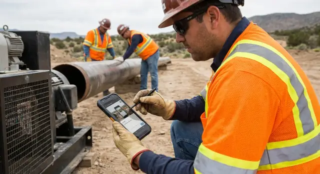
Maya is a safety inspector visiting three sites in one day. Site A is in town, but Sites B and C are in a basement and a remote yard with no signal. She needs offline evidence capture that doesn't make her think about connectivity.
At Site A, she opens Job 1042, takes two photos, and adds a 10-word note. The app auto-fills the time, GPS, and her name, and tags everything to Job 1042. A small badge shows "Saved on device" so she can move on without waiting.
At Site B, she's under pressure. She taps "Add photo" four times in a row, then speaks a short note that becomes text. The app suggests the last-used job, but she quickly switches to Job 1047 before saving. Each item lands in a queue with a simple count: "6 waiting to upload."
At Site C, she captures a final photo and checks the job timeline. She can see every item, even though nothing has synced yet. One photo is marked "Needs review" because it's blurry, so she retakes it on the spot.
When Maya drives back into coverage, the app starts syncing in the background. Five items upload fast, but one photo fails with "Upload paused: retrying." She doesn't lose it. The app retries automatically, and she can also tap "Retry now" if she wants.
By the time her supervisor opens Job 1047, the evidence set looks complete:
Turn the UX outline into simple, testable requirements. Write down your data model (Job, Evidence Item, Attachment, Sync Attempt), which fields are required (timestamp, job ID, author), and the status states you'll show users (Saved offline, Queued, Uploading, Uploaded, Needs review). Keep the list small, and make sure every state has one clear meaning.
Then lock the minimum set of screens you need for a pilot. You don't need a perfect app to learn whether offline capture holds up in the real world:
Plan analytics early so you can fix the right problems. Capture events like save success, upload success, upload failure reason (no network, file too large, auth expired), time-to-first-save, and "job marked complete" with missing items. This is how you find hidden pain, like people abandoning metadata or retrying uploads all day.
If you want to build and iterate quickly, AppMaster (appmaster.io) is one option for creating a full solution: backend, web admin for supervisors, and native mobile apps, while keeping the offline-first workflow and the queued sync states visible to users.
Run a pilot with one team and one workflow for 1 to 2 weeks. Pick a single evidence type (for example, "arrival photo + note"), review completeness reports daily, and only then expand to more jobs, more metadata, and more complex conflict rules.
Aim for three things: instant local saving, reliable sync later, and a clear “complete” confirmation after the server verifies everything. If any of those is vague, people will hesitate, re-capture, or assume work is done when it isn’t.
Avoid a single “offline mode” switch as the main concept. Instead, make “Save to device” the default outcome of every capture, and treat uploading as a separate, visible step that happens automatically when possible.
Keep the flow short: select the job, capture, add an optional quick note, and save. Use big tap targets, minimal typing, and clear confirmations like “Saved on this device” so users can move on without waiting.
Require only what’s needed to make the evidence usable later, then auto-fill the rest. Auto-capture the author and captured time, attach to a job with as few taps as possible, and let people confirm or adjust details only when necessary.
Store GPS quietly when it’s available, but don’t block capture when it isn’t. Provide a manual fallback like a simple text location or a quick pick so evidence can still be tied to the right place indoors or when permissions are denied.
Use plain, consistent statuses that answer “is it safe?” and “did it reach the server?” A simple model like “Saved on device,” “Pending upload,” and “Uploaded” is easier to trust than icons or a spinner.
Give safe controls that reduce panic without risking data loss, such as pause/resume, retry, and a clear explanation when something fails. If you allow deletion, make the consequence obvious and prevent final submission when required evidence would be missing.
Treat sync as resumable and idempotent, so retries don’t create duplicates and interruptions don’t lose progress. If sign-in expires, keep items stored locally, clearly say they’re safe, and ask for re-login only when upload must continue.
Define completion as explicit rules for that job type, such as required photo counts, required notes, and required fields. After sync, show a single trustworthy state like “Synced and verified” with a timestamp and job ID so users know they can leave the site.
Start with a data model that includes evidence items, attachments, and sync attempts, plus visible states users can understand. A no-code platform like AppMaster can help you ship a working pilot faster by generating the backend, admin web app, and native mobile apps while keeping the offline-first queue and verification states consistent.
Experiment with AppMaster with free plan.
When you will be ready you can choose the proper subscription.


