


 Jul 14, 2026
 9 min
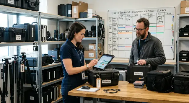
9 minEquipment reservation app: prevent conflicts and track returns
Plan an equipment reservation app that prevents double bookings, records returns and damage, and places faulty items on maintenance hold.
A practical localization workflow: organize translation keys, set clear ownership, handle plural forms, and run QA so web and native UI never breaks.

Unmanaged localization usually fails in small, irritating ways first, then in expensive ways later. A label that fit yesterday overflows today. A missing key shows up as a raw identifier. A plural that sounded fine in English becomes wrong, or even rude, in another language.
Most teams end up fixing the same problems under pressure:
Web and native screens often fail in different ways. On the web, flexible layouts can hide issues until a specific viewport or browser exposes them. Text can wrap unexpectedly, push buttons down, or break a grid. On native apps, spacing is stricter. A long translation can push important elements off-screen, collide with accessibility font sizes, or get cut off because a component doesn’t auto-resize.
A solid localization workflow prevents most of this by making keys stable, translations reviewable, and UI checks routine. It helps you ship updates with fewer surprises. What it can’t fix is unclear source text. If the original copy is vague (like "Open" or "Apply" with no context), the translation is still a guess.
A simple definition of success isn’t "everything is translated." It’s:
Example: if a cart screen shows "{count} item(s)", unmanaged strings lead to awkward plurals and broken spacing. A managed approach forces proper plural rules and catches the button that grows by 30% in German before release.
A localization workflow breaks down fastest when nobody can answer one question: “Which text is the real one?” Pick a single source of truth for strings and make it boringly clear. That source might be a repo file, a translation platform, or an internal table, but it has to be one place that wins every dispute.
Define roles by decisions, not job titles. Someone needs to approve meaning and tone (often Product or Marketing). Someone needs to keep keys stable and usable in code (often Engineering). Someone needs to protect UI constraints (often Design), especially when web and native screens behave differently.
One split that avoids most conflicts:
Set response-time expectations so releases don’t stall. For example: new key requests acknowledged within 1 business day, source wording approval within 2 days, and critical fixes (broken UI, wrong legal text) within hours.
Concrete example: your team builds a new “Reset password” flow with both web and native screens. The developer adds keys, the PM approves the final English text, and translators fill in other languages. If a translator notices “Reset” should be “Change,” they update translations, but the key stays the same. If the PM wants to reuse text across screens, only the key owner makes that structural change so nothing silently breaks.
A good localization workflow starts with one rule: keys are identifiers, not English sentences. Treat them like part numbers. If you change the wording later, the key should usually stay the same.
Create a new key when the meaning is different. Reuse a key when the meaning is the same, even if the screen is different. “Save” on a profile screen and “Save” on a settings screen can share a key if they both mean “store changes.” But “Save” meaning “bookmark” should be a different key, because translators may need a different verb.
Separate short UI labels from longer content. A button label, a helper hint, and an error message often translate differently and have different length limits. Keeping them as separate keys makes it easier to adjust tone and punctuation without breaking other screens.
Aim for reuse across web and native, but don’t force it when platforms need different language. A native permission prompt often needs clearer, more formal text than a web tooltip. In that case, keep the same concept but use platform-specific keys so each UI reads naturally.
A practical pattern is to group keys by feature and UI type, then reuse within those boundaries:
For example, the same “Delete customer” action may exist in a web admin panel and a native field app. You might reuse the core action label, but keep a separate key for the native confirmation text if it needs stronger warnings or shorter lines.
A good naming system makes localization boring in the best way. People can find strings quickly, translators get context, and keys stay stable even when copy changes.
Use a readable convention that answers four questions: where is it, what is it, what is it for, and is it a variant. A simple pattern that works across web and native screens is:
<product_or_domain>.<screen_or_flow>.<component>.<purpose>[.<variant>]
For example, in a customer portal: portal.login.button.submit or portal.orders.empty_state.title. This keeps keys grouped by screen or flow while still easy to search by component.
Bad keys are either too vague or too tied to the current English text:
portal.profile.field.email.labelemailText (no scope, no intent)please_enter_your_email (breaks when copy changes)portal.checkout.error.payment_failederror_12Variants should be explicit, not hacked with punctuation or mixed casing. If you need a shorter label for a tight mobile header, add a variant suffix: ...title.short vs ...title.long. If you need case differences, prefer separate keys like ...button.save and ...button.save_titlecase only when the platform can’t transform text safely.
Placeholders also need rules so translators don’t guess. Keep placeholders consistent across platforms and avoid positional confusion.
{user_name}, {count}, {date}{count} items not {count} + " items"{count} can be zero)Pluralization is where workflows usually crack first. Many teams assume every language has only “one” and “many,” then discover the UI sounds wrong or needs last-minute fixes.
Languages can have several plural categories. English mostly uses one and other, but languages like Russian, Polish, Arabic, and Czech can use forms like few, many, or zero. If you hardcode a single pattern early, you end up rewriting strings across web and native later.
Pick one standard for plural strings and stick to it everywhere (web, iOS, Android, backend-rendered text). A practical approach is to store a single key with plural forms instead of separate keys per form. Base the set of forms on CLDR categories so it matches real language rules.
A rule that prevents rework: never build UI sentences from pieces like "You have " + count + " messages". Word order can change, and some languages require different endings or cases based on the number.
For a message counter, define one stable key and include the number as a parameter. Then provide the forms translators need for each language.
inbox.message_count){count}) inside the full sentenceSometimes plural rules aren’t enough. If your UI addresses a person ("Welcome, Alex") or refers to roles ("assigned to him/her"), some languages need different words based on gender. Other languages change endings depending on grammatical case (for example, after certain prepositions).
When that happens, create separate strings for genuinely different grammar, not just style. The goal is fewer keys, but also fewer surprises during QA when a “correct” translation still reads wrong in context.
A translation can be correct and still break the UI. Web and native apps render text differently, so your workflow should include formatting rules and layout checks, not just translated strings.
Standardize how you display numbers, money, and dates. Avoid building these with concatenation like "$" + amount or hardcoding a date format in a label. Use locale-aware formatting so separators and order match expectations (1,000.50 vs 1 000,50; day-month-year vs month-day-year). Time zones are a common trap: store timestamps in UTC, format them in the user’s local zone, and be clear when a time is in a specific zone (like a store pickup time).
Text direction is another silent breaker. If you support right-to-left languages, plan for mirrored layouts and punctuation that appears to “move.” Icons that imply direction (arrows, back buttons, progress steps) often need to flip. Make a quick RTL pass part of review, even if you don’t fully support RTL yet.
On mobile, fonts and spacing can shift more than on web. A string that fits in a web UI can wrap awkwardly in SwiftUI or Kotlin. Decide a safe minimum font size, allow labels to wrap where it makes sense, and define fallback fonts for scripts your default font doesn’t cover.
Accessibility needs localized checks too. Screen readers can read numbers, abbreviations, and mixed-language text in surprising ways.
Layout guardrails that prevent most issues:
Example: a “Total: $1,234.50” label might need to become “1 234,50 €” with the symbol after the value, different spacing, and a screen reader-friendly pause between “Total” and the amount.
A localization workflow needs to start earlier than most teams expect: while the screen is still being designed. If you wait until the UI is “done,” you end up rushing translations, shipping clipped text, or hardcoding strings “just for now.”
Start by adding a translation key as you design each label, button, and message. Write the default text in your base language, and attach quick context like where it appears and what the action does. A key like checkout.pay_button is only useful if translators know whether it’s a verb (“Pay”) or a label (“Payment”).
Implement the UI using placeholders and the default language as a fallback. Keep variables explicit (like {name} or {count}) and avoid stitching sentences together. That’s one of the fastest ways to break grammar across languages.
When you send strings for translation, include what translators need to be accurate: a screenshot per screen (or a short video if the text changes), character limits for tight spots (tabs, buttons, badges), notes for tone and terminology, and a list of dynamic placeholders and what they mean.
After translations come back, merge them early and build both web and native versions. Do quick UI checks on the highest-risk screens: login, onboarding, checkout, and settings. Look for clipped text, overlapping elements, missing keys, and wrong plural forms.
Finally, release and monitor. Track missing keys, fallback-to-default events, and screens where text frequently overflows.
Accurate translations start before a single word is translated. If translators only see a key and an English phrase, they guess. That’s how you get the right words in the wrong place, and UI that feels odd or rude.
A simple “context pack” removes most guesswork. For every string, add where it appears (screen and component), what the user is trying to do, and the tone (friendly, formal, urgent). Also note whether it’s a button label, an error message, a menu item, or helper text. Those categories translate differently.
When space is tight, say so upfront. Web and native screens break in different ways, so define limits when they matter: short button labels, tab titles, toast messages, and anything inside a fixed card. If a string must stay on one line, call that out. If line breaks are allowed, say where they’re safe.
Mark “do not translate” parts clearly. Product names, plan names, coupon codes, API fields, and placeholders like {name} must stay intact. Without guidance, translators may localize them and your app stops making sense.
A practical package per string:
{amount})Treat legal text and support content as separate streams. Legal copy often has approval requirements and slower updates, so keep it separate from product UI strings and version it carefully. Support articles and help snippets usually need longer-form translation and can live in a different system or file set.
Example: a “Continue” button on mobile might need a stricter limit than web. If translators know that, they can choose a shorter verb in languages that expand instead of forcing a late UI redesign.
UI breaks from localization rarely look like a “bug” at first. They look like a missing label, a button that wraps into two lines, or a placeholder that shows the wrong value. A good workflow includes QA steps that surface those problems before users do.
Start with pseudo-localization in development builds. Replace real strings with longer, accented versions (like "[!!! Šéttïñĝš !!!]") and inflate length by 30-50%. This quickly exposes truncation, overlap, and hard-coded strings on both web and native screens.
Add automated checks on every build. They catch boring mistakes that humans miss when reviewing hundreds of lines:
Then use a clear manual sign-off loop. Product verifies meaning and tone for key screens, while QA checks layout and interaction.
Keep the test matrix small but strict. Don’t test everything. Test what breaks first: login/signup, password reset, checkout or payment confirmation, settings and profile edit, notifications and empty states, and any screen with tables, badges, or small buttons.
When reporting issues, make fixes easy by being specific. Include locale, device and OS version (or browser and width), expected text, actual text, and a screenshot showing the clipped area. If it involves pluralization or placeholders, paste the exact key and the rendered string.
Most localization bugs aren’t “translation problems.” They’re workflow problems that show up as broken UI, missing text, or confusing messages.
A common trap is renaming keys when you only want to change the wording. Keys should be stable IDs, not the text itself. If you change checkout.button.pay to checkout.button.pay_now, every old translation becomes “missing,” and you lose history. Keep the key, update the default-language string, and add context if the meaning changed.
Another frequent issue is hardcoding strings on one platform. The web team uses keys, but the mobile team slips in literal text for a quick fix. A month later, users see English-only alerts on iOS. Make “no hardcoded user-facing strings” a shared rule for web and native.
Placeholders cause subtle mistakes when you assume word order. English works with "{count} items", but other languages may need a different order or extra words. Use named placeholders (not positional) and keep them consistent across platforms.
Mistakes worth catching early:
Testing just one “long language” isn’t enough. German often expands UI, while Chinese can hide spacing issues. Do a quick pass on both, and also test plural edge cases like 0, 1, and 2.
Agree on fallback behavior before release. For example: if French is missing, fall back to English, log missing keys, and block the release only if critical screens have gaps.
A localization workflow stays healthy when the checks are small and repeatable. The goal is straightforward: fewer surprise strings, fewer broken layouts, fewer last-minute translation rushes.
Before you merge a UI change, do a fast pass for the common “oops” issues:
Before you ship, run a short release QA focused on the places localization breaks first. Keep it time-boxed, but consistent: top user flows on every platform you ship, one RTL spot check, long-text screens (settings, legal, onboarding, tables, narrow buttons), and date/number/currency formatting in a couple of locales.
Set a cadence that matches your team. Many teams update translations weekly, then freeze strings 1-2 days before a release. The point is to avoid mixing last-minute copy edits with final QA.
Next steps that pay off quickly: write down your conventions (key naming, placeholders, plural rules, ownership), then run one pilot screen end-to-end and adjust based on what breaks.
If you’re building across backend, web UI, and native mobile in a single platform like AppMaster, it’s easier to keep keys and placeholders consistent because the same screens and logic can share a single convention. Keeping that convention stable is what makes localization feel routine instead of fragile.
 What’s the simplest way to stop localization from breaking my UI?
Start with one stable place where strings live, one agreed key naming convention, and a rule that keys don’t change just because the English wording changes. Then add a small QA routine that catches missing keys, overflow, and plural issues before release.
What does “single source of truth” mean for translations?Pick one system that always wins when there’s a conflict, such as repo translation files or a translation platform export. Make it clear that everyone edits content through that source, and code only consumes it.
Who should own keys, wording, and translations?Make decisions by responsibility, not title: one person approves meaning and tone in the base language, one person owns key structure and deprecations, and translators only edit translation values. This avoids silent key renames and last-minute copy changes that break builds.
When should I reuse a translation key vs create a new one?Create a new key when the meaning changes, even if the English text looks similar. Reuse a key when the meaning is truly identical across screens, because it keeps translations consistent and reduces maintenance.
How should I name and organize translation keys so they stay stable?Use keys as identifiers, not English sentences, and include scope like feature, screen/flow, component, and purpose. A key like portal.checkout.button.pay stays useful even if the button copy changes later.
What’s the right way to handle plurals across languages?Pluralization usually fails because many languages have more than just singular and plural. Store one key per concept with proper plural categories and keep {count} inside the full sentence so translators can reorder words safely.
How do I avoid placeholder bugs like wrong names or broken grammar?Don’t build sentences by concatenating pieces like "Hello " + name, because word order and endings can change by language. Use named placeholders like {user_name} consistently everywhere, and document what each placeholder represents.
How do I prevent truncated buttons and overlapping text on web and mobile?Assume text will expand by 30–50% and design components that can wrap or grow where appropriate. Then test one “long text” locale and accessibility font sizes on both web and native so you catch clipping and overlap early.
What QA steps catch localization issues before users do?Pseudo-localize in development to expose hardcoded strings and layout failures, then add build checks for missing keys, unused keys, placeholder mismatches, and invalid plural forms. Keep manual review focused on the flows that break first, like login, checkout, and settings.
What should we do when a translation key is missing right before release?Default to falling back to your base language while logging missing keys so you can fix gaps quickly without blocking every release. For critical screens or legal text, it’s safer to block release if translations are missing or outdated.
Experiment with AppMaster with free plan.
When you will be ready you can choose the proper subscription.
 Jul 14, 20269 min
 Jul 13, 20268 min
 Jul 08, 20268 min