


 Jul 14, 2026
 9 min
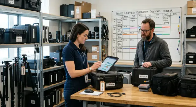
9 minEquipment reservation app: prevent conflicts and track returns
Plan an equipment reservation app that prevents double bookings, records returns and damage, and places faulty items on maintenance hold.
Design tokens in no-code UI builders help teams define colors, type, spacing, and variants once, then ship consistent UI without guesswork.

Inconsistent UI rarely starts as a “design problem.” It starts as a time problem. Someone needs a button now, so they copy one from another page and tweak it until it looks close enough.
That’s how tiny differences sneak in: two blues that are almost the same, a corner radius that changes from 6 to 8, a heading that’s “kind of bold,” and padding that depends on who built the screen. In no-code builders, it’s even easier to make small one-off edits because controls are right there and changes feel harmless.
As the product grows, the drift accelerates. More pages means more repeated patterns. More builders means more personal taste. More teammates means more “quick fixes” made in isolation. If one person builds the customer portal and another builds the admin panel, you end up with two different interpretations of the same brand.
“Eyeballing” shows up in everyday work: picking a color until it “looks right,” nudging spacing by a couple pixels because the screen feels “too tight,” creating a new button style instead of using an existing one, mixing font sizes because the default feels “a bit small,” or fixing one screen without checking the rest.
The cost shows up later. Reviews slow down because feedback becomes subjective (“make it feel more like the other page”). Rework piles up because changes are hard to apply everywhere. Web and mobile diverge because different people make similar but not identical choices.
Design tokens solve this by replacing “close enough” decisions with shared values. The UI stays consistent even as the team and the app grow.
Design tokens are named decisions about your UI. Instead of saying “use this blue” or “make buttons feel roomy,” you give those choices clear names that anyone can reuse.
A token is not the raw value. The raw value might be 16px, #2563EB, or 600 (font weight). The token is the label that explains what that value means in your product, like space-4, color-primary, or font-weight-semibold.
That shift stops the eyeballing problem. When people pick values by feel, you slowly collect five different blues, three slightly different headings, and spacing that changes from screen to screen.
Tokens work best as a single source of truth. If every screen and component references the same set of names, you can change the look across the whole app by updating a few token values, not by hunting through dozens of screens.
Tokens also bridge design and build. Designers use token names in specs, and builders use the same names in a no-code UI builder, so the design survives the handoff.
Most token sets fall into a few categories: color roles (primary, background, text, danger), typography (font family, sizes, weights, line height), spacing steps (padding, margins, gaps), shape and depth (radius, border widths, shadows), and sometimes motion (durations and easing).
Most teams don’t need a huge token library. They need a small, clear set that covers most screens so people stop guessing values. This matters even more in no-code tools, where “just this once” tweaks spread fast.
A practical starter set covers five groups:
One rule keeps the library sane: if a value shows up in three or more places, make it a token. If it shows up once, treat it as suspicious before it becomes “the new normal.”
Good token names prevent arguments before they start. If people can guess a token without searching, they’ll reuse it. If they can’t, they’ll create a new one, and your theme will split.
Prefer names that describe the job a value does in the UI, not what it looks like. text-primary tells everyone when to use it. blue-600 is just a paint bucket.
A useful pattern is two layers:
color-blue-600, space-16, font-14text-primary, bg-surface, border-mutedIn a no-code UI builder, semantic tokens are what help non-designers pick the right value quickly without eyeballing.
Most token libraries get messy because “new” is the default. Make “reuse” the default.
Keep rules simple:
Then standardize naming. Pick one casing style (kebab-case works well), use stable prefixes (text-, bg-, border-, icon-, space-), and keep number scales consistent (space-4, space-8, space-12, space-16).
Treat your current UI as evidence. Before creating anything new, do a quick inventory: gather screenshots, inspect styles, and write down every color value, font size, and spacing value you actually see in production (including “one-off” values that only appear on one screen).
Next, reduce duplicates on purpose. You’ll usually find the same gray used in five slightly different hex values, or spacing that jumps between 14, 15, and 16. Pick one value to keep, then map the old values to it. This is where tokens become practical: you stop arguing about taste and start agreeing on a small set of shared choices.
A solid first version can be built in one pass:
For each token, add one sentence of guidance: where to use it and where not to use it. Example: “text-muted is for helper text, not for primary buttons.”
Finally, decide ownership. It helps to name one person (or a small group) to approve changes, with a simple rule: “Add a new token only if an existing one can’t fit.” That keeps the system stable while the product grows.
Start with defaults every screen inherits: a base text style (font, size, line height, color), heading styles (H1-H3), and a small set of layout spacing rules so pages don’t feel random.
Next, map tokens to whatever your tool calls theme settings: theme variables, global styles, style presets, or design system settings. The goal is that choosing “Primary” or “Space/16” selects a token, not a one-off value.
Keep reusable styles focused on patterns you use every day. A starter set might include a card style (background, border, radius, padding, shadow), a form field style (label, input, help text), button styles, and table row density and hover states.
States are where inconsistency sneaks in, so define them early. Each interactive component should have token-driven values for hover, focus, disabled, and error. Focus should use the same ring color and thickness everywhere. Error should use the same border and text color pairing.
Finally, plan sharing. If your workspace supports templates or reusable modules, put tokens and base styles in a “starter app” new projects copy from. That way, new screens start consistent by default.
Variants are where a UI system either becomes calm and predictable or turns into a pile of one-off tweaks. Variants work best when they’re a thin layer that maps to tokens for color, type, and spacing.
Start with a small set of key components you use everywhere: buttons, inputs, badges, alerts, and cards. Give each of them the same two dimensions of choice: size and intent. Size should be mechanical (typography and spacing). Intent should be meaning (semantic colors).
Size variants stay consistent when they only change a few token-based properties: font size, padding, and border radius. Intent variants should primarily change color roles (background, text, border) and never quietly change spacing.
A set that covers most products:
Define state rules that apply to every component, not just buttons. For example: focus always shows a visible ring, hover increases contrast in a consistent way, and disabled uses the same opacity and blocks clicks.
Add a new variant only when it represents a recurring meaning (like “danger”). If it’s a one-time layout need, it’s usually a new component or a wrapper, not a variant everyone will misuse later.
When a product ships on web and mobile, “same brand” doesn’t always mean “same pixels.” The goal is for screens to feel like one family, even when platforms have different defaults.
Start with shared tokens that travel well: color roles (background, surface, text, primary, danger), a typography scale (sizes and weights), and spacing tokens (4, 8, 12, 16, 24). These remove guesswork and make updates predictable.
Then accept real differences. Mobile needs larger touch targets and often a bit more spacing. Web needs denser tables, sidebars, and multi-column layouts. Fonts can differ too: you might use a brand font on web but prefer platform defaults on iOS/Android for readability and performance.
A practical approach is two layers: global tokens that define meaning, and platform tokens that define how that meaning is rendered.
color.text, color.primary, space.md, radius.sm, type.bodytype.family.web, control.height.web, space.tableRowtype.family.mobile, control.height.mobile, space.touchKeep component names consistent (Button/Primary) even if sizes differ. Require contrast checks for both themes before release.
Tokens only work if they stay stable and understandable. Without lightweight governance, teams quietly add “one more blue” or “one more padding,” and you’re back to eyeballing.
Keep the process small, but real:
Maintain a simple changelog with deprecations. If an old token is being replaced, say what to use instead, keep it working for a while, and mark it clearly so new screens don’t adopt it.
Cleanup is part of the job. Once a month, remove unused tokens and component variants (or at least flag them).
Non-designers need examples, not theory.
Do: use the spacing ladder for gaps, and use the Primary Button variant for the main action.
Don’t: set padding to “13px because it looks right,” or create a new button style to match one screen.
Tie token work to product priorities: new features, rebrands, and accessibility fixes should drive token updates, not personal preference.
The fastest way to lose the benefits of tokens is to treat them like a dumping ground. You start with good intent, then a few quick fixes pile up, and the team is back to eyeballing.
A common trap is creating too many tokens too early. If every screen gets its own color or spacing token, you’re not building a system - you’re cataloging exceptions. Only add a new token when you can point to at least two places it will be used.
Another quiet problem is letting raw values sneak into components. Someone sets button padding to 14px “just this once,” or uses a hex color directly in a card. Weeks later, nobody remembers why it’s different. Make it a habit: if it’s visible and repeatable, it should be a token.
Also watch out for mixing token types. Base tokens (like gray-900 or space-4) describe raw values. Semantic tokens (like text-primary or surface-muted) describe meaning. Problems start when one component uses base tokens and another uses semantic tokens for the same role.
States are another late-stage pain. Teams often define normal styles, then patch focus, hover, disabled, and error right before release. That’s how you end up with inconsistent focus rings and three different “error” reds.
Before you scale, do a quick trap check:
Before you roll your UI out to more screens, teams, or products, check whether your foundation is clear enough to copy without guessing.
A small team is building two apps at once: a customer portal and an internal admin panel. Different people touch different screens, and they build fast inside a no-code UI builder. After a few weeks, the UI starts to feel “off,” even though no one can name a single problem.
Before tokens, review comments pile up: buttons are almost the same but not quite, spacing shifts from screen to screen, form fields don’t match, and the portal feels “friendly” while the admin panel feels “strict” by accident.
They fix it by introducing a small, practical token set. They define semantic colors (Primary, Success, Danger, TextMuted), a spacing scale (4, 8, 12, 16, 24), and button variants (Primary, Secondary, Ghost) with one radius and consistent states.
Now contributors stop picking random hex values and font sizes in each screen. They choose tokens and variants, so every new page inherits the same decisions.
Building gets faster because the choices are already made. Reviews shift from tiny visual nits to real UX issues. “Make this button the primary variant” replaces “Can you make it a bit more blue and slightly taller?”
Then a small rebrand hits: the primary color changes and the font scale tightens. With tokens, the team updates a few values once, and both the portal and admin panel refresh together.
Pick one flow people use a lot and that has obvious drift, like onboarding, a settings page, or a simple form. Converting a single flow is the fastest way to prove the idea and stop eyeballing.
Start with a small, safe token set: primary/background/text/border/danger, a short type scale, a spacing ladder, and 2-3 radius and shadow levels. Then create a tiny component set that uses only tokens: one button, one input, one card, one alert. Add variants only when they solve a real need.
Run a short review with the team using two screenshots: one “before” screen with inconsistent padding and fonts, and one “after” screen built from tokens and variants. Agree on a couple rules (like “no hard-coded colors” and “spacing must be a token”) and fix the top inconsistencies first.
For rollout, convert new screens first, then backfill older ones as you touch them. When support asks for a new admin filter, rebuild that panel using token-based components and replace only what you’re editing.
If you’re building full products (backend, web, and mobile) in AppMaster, it helps to set tokens and reusable UI styles early so new screens inherit the same decisions. That way, visual consistency and app logic can move forward together without repeated cleanup later.
 Why does UI inconsistency keep happening even when we have a designer?
UI drift usually starts with small “just this once” edits: copying a component, tweaking padding, or picking a color by eye. Over time, those tiny differences stack up across pages and teammates, and reviews turn into subjective debates instead of quick checks against shared rules.
What exactly is a design token (without the theory)?Design tokens are named UI decisions that people reuse instead of guessing raw values. The value might be 16px or #2563EB, but the token name explains purpose, like space-16 or color-primary, so everyone reaches for the same choice every time.
Which token categories should we define first for a real product?Start with color roles, typography, spacing, and a small set of radius and shadow values. That covers most screens and stops the most common “eyeballing” problems, while keeping the token set small enough that people will actually use it.
When should we add a new token versus keep a one-off style?A practical default is to create tokens when a value appears in two or more places, or when it supports a real state like hover, focus, disabled, or error. If a value is truly one-off, keep it local to the component so it doesn’t become a new global standard by accident.
Should our token names be semantic (like text-primary) or raw (like blue-600)?Semantic names describe what the token is for, like text-primary or bg-surface, so people can pick correctly without memorizing a palette. Raw names like blue-600 are fine as base building blocks, but relying on them in components makes it easier to misuse colors across the app.
How do we create tokens from an existing inconsistent UI without breaking everything?Audit what you already ship: collect the colors, font sizes, and spacing values you actually see in production, then merge near-duplicates on purpose. Once you have a small, clean set, map old values to the nearest token so future screens reuse tokens instead of reintroducing “almost the same” values.
How do we apply tokens inside a no-code UI builder in practice?Set global defaults first, then map tokens to whatever the builder calls theme variables or global styles so components reference names, not hex codes and pixel values. After that, create a small set of reusable styles for the components you use daily, and make sure their hover, focus, disabled, and error states also use tokens.
How do we build component variants (buttons, inputs) without creating chaos?Keep variants simple and predictable by limiting them to size and intent. Size should only change a few token-driven properties like font size and padding, while intent should primarily swap semantic color roles, so a “danger” button doesn’t secretly change spacing or typography.
How can we keep web and mobile themes aligned without forcing identical pixels?Share global semantic tokens across platforms so the meaning stays the same, then allow platform-specific tokens to handle differences like touch target sizes and density. The goal is “same family, not same pixels,” so web and mobile can feel consistent while still respecting their constraints.
How do we govern tokens so the system stays clean over time?Assign clear ownership and use a small review flow for changes so new tokens aren’t added as quick fixes. A steady cadence for updates, plus deprecating old tokens instead of quietly replacing them, keeps the system stable as more people build screens, including in AppMaster projects where many contributors can move fast.
Experiment with AppMaster with free plan.
When you will be ready you can choose the proper subscription.
 Jul 14, 20269 min
 Jul 13, 20269 min
 Jul 08, 20267 min