


Equipment reservation app: prevent conflicts and track returns
Plan an equipment reservation app that prevents double bookings, records returns and damage, and places faulty items on maintenance hold.
Learn practical patterns for background tasks with progress updates, including queues, status models, UI messaging, cancel and retry actions, and error reporting.
Long actions shouldn't block the UI. People switch tabs, lose connection, close their laptop, or just wonder if anything is happening. When the screen is frozen, users guess, and guessing turns into repeated clicks, duplicate submissions, and support tickets.
Good background work is really about confidence. Users want three things:
Without those, the job might be running fine, but the experience feels broken.
One common mix-up is treating a slow request like real background work. A slow request is still one web call that makes the user wait. Background work is different: you start a job, get an immediate confirmation, and the heavy processing happens elsewhere while the UI stays usable.
Example: a user uploads a CSV to import customers. If the UI blocks, they might refresh, upload again, and create duplicates. If the import starts in the background and the UI shows a job card with progress and a safe Cancel option, they can keep working and return to a clear outcome.
When people talk about background tasks with progress updates, they usually mean four pieces working together.
A job is the unit of work: "import this CSV," "generate this report," or "send 5,000 emails." A queue is the waiting line where jobs sit until they can be processed. A worker pulls jobs from the queue and does the work (one at a time or in parallel).
For the UI, the most important piece is the job's lifecycle state. Keep states few and predictable:
Every job needs a job ID (a unique reference). When the user clicks a button, return that ID immediately and show a "Task started" row in a tasks panel.
Then you need a way to ask, "What's happening now?" That's usually a status endpoint (or any read method) that takes the job ID and returns the state plus progress details. The UI uses it to show percent complete, current step, and any messages.
Finally, status must live in a durable store, not only in memory. Workers crash, apps restart, and users refresh pages. Durable storage is what makes progress and outcomes reliable. At minimum, store:
If you're building in a platform like AppMaster, treat the status store like any other data model: the UI reads it by job ID, and the worker updates it as it moves through the job.
The queue pattern you pick changes how "fair" and predictable your app feels. If a task sits behind a pile of other work, users experience it as random delays, even when your system is healthy. That makes queue choice a UX decision, not just infrastructure.
A simple database-backed queue is often enough when volume is low, jobs are short, and you can tolerate occasional retries. It's easy to set up, easy to inspect, and you can keep everything in one place. Example: an admin runs a nightly report for a small team. If it retries once, nobody panics.
You usually need a dedicated queue system when throughput rises, jobs get heavy, or reliability becomes non-negotiable. Imports, video processing, mass notifications, and any workflow that must keep running across restarts benefit from better isolation, visibility, and safer retry behavior. This matters for user-facing progress because people notice missing updates and stuck states.
Queue structure also affects priorities. One queue is simpler, but mixing quick and slow work can make quick actions feel slow. Separate queues help when you have user-triggered work that should feel instant alongside scheduled batch work that can wait.
Set concurrency limits on purpose. Too much parallelism can overload your database and make progress feel jumpy. Too little makes the system feel sluggish. Start with small, predictable concurrency per queue, then increase only when you can keep completion times stable.
If your progress model is vague, the UI will feel vague too. Decide what the system can honestly report, how often it changes, and what users should do with that information.
A simple status schema that most jobs can support looks like this:
Next, define what "progress" means.
Percent works when there's a real denominator (rows in a file, emails to send). It's misleading when the work is unpredictable (waiting on a third party, variable compute, expensive queries). In those cases, step-based progress builds more trust because it moves forward in clear chunks.
A practical rule:
Store partial results as the job runs. That lets the UI show something useful before the job finishes, like a live error count or a preview of what changed. For a CSV import, you might save rows_read, rows_created, rows_updated, rows_rejected, plus the last few error messages.
This is the foundation for background tasks with progress updates that users trust: the UI stays calm, numbers keep moving, and the "what happened?" summary is ready when the job ends.
Getting progress from the backend to the screen is where many implementations fall apart. Pick a delivery method that fits how often progress changes and how many users you expect to watch it.
Polling is the simplest: the UI asks for status every N seconds. A good default is 2 to 5 seconds while the user is actively looking at the page, then back off over time. If the task runs longer than a minute, move to 10 to 30 seconds. If the tab is in the background, slow it down more.
Push updates (WebSockets, server-sent events, or mobile notifications) help when progress changes quickly or users care about "right now." Push is great for immediacy, but you still need a fallback when the connection drops.
A hybrid approach is often best: poll fast at the start (so the UI quickly sees queued become running), then slow down once the job is steady. If you add push, keep a slow poll as a safety net.
When updates stop, treat it as a first-class state. Show "Last updated 2 minutes ago" and offer a refresh. On the backend, mark jobs as stale if they haven't heartbeated.
Clarity comes from two things: a small set of predictable states, and copy that tells people what happens next.
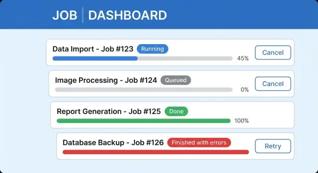
Name the states in the UI, not just in the backend. A job might be queued (waiting its turn), running (doing work), waiting for input (needs a choice), completed, completed with errors, or failed. If users can't tell these apart, they'll assume the app is stuck.
Use plain, useful copy next to the progress indicator. "Importing 3,200 rows (1,140 processed)" beats "Processing." Add one sentence that answers: can I leave, and what will happen? For example: "You can close this window. We'll keep importing in the background and notify you when it's ready."
Where progress lives should match the user's context:
For anything longer than a minute, add a simple Jobs page (or Activity panel) so people can find work later.
A clear long-running task UI usually includes a status label with last updated time, a progress bar (or steps) with one line of detail, safe Cancel behavior, and a results area with a summary and next action. Keep completed jobs discoverable so users don't feel forced to wait on one screen.
"Finished" isn't always a win. When a background job processes 9,500 records and 120 fail, users need to understand what happened without reading logs.
Treat partial success as a first-class outcome. In the main status line, show both sides: "Imported 9,380 of 9,500. 120 failed." That keeps trust high because the system is honest, and it confirms that work was saved.
Then show a small error summary users can act on: "Missing required field (63)" and "Invalid date format (41)." In the final state, "Completed with issues" is often clearer than "Failed," because it doesn't imply nothing worked.
An exportable error report turns confusion into a to-do list. Keep it simple: row or item identifier, error category, a human message, and the field name when relevant.
Make the next action obvious and close to the summary: fix data and retry failed items, download the error report, or contact support if it looks like a system issue.
Cancel and retry look simple, but they break trust fast when the UI says one thing and the system does another. Define what Cancel means for each job type, then reflect that honestly in the interface.
There are usually two valid cancel modes:
In the UI, show an intermediate state like "Cancel requested" so users don't keep clicking.
Make cancel safe by designing the work to be repeatable. If a job writes data, prefer idempotent operations (safe to run twice) and do cleanup where needed. For example, if a CSV import creates records, store a job-run ID so you can review what changed in run #123.
Retry needs the same clarity. Retrying the same job instance can make sense when it can resume. Creating a new job instance is safer when you want a clean run with a new timestamp and audit trail. Either way, explain what will happen and what won't.
Guardrails that keep cancel and retry predictable:
A good end-to-end flow starts with one rule: the UI should never wait for the work itself. It should wait only for a job ID.
User starts the task, API returns fast. When the user clicks Import or Generate report, your server immediately creates a job record and returns a unique job ID.
Enqueue the work and set the first status. Put the job ID into a queue and set status to queued with progress 0%. This gives the UI something real to show even before a worker picks it up.
Worker runs and reports progress. When a worker starts, set status to running, store a start time, and update progress in small, honest jumps. If you can't measure percent, show steps like Parsing, Validating, Saving.
UI keeps the user oriented. The UI polls or subscribes to updates and renders clear states. Show a short message (what's happening now) and only the actions that make sense right now.
Finalize with a durable result. On completion, store the finish time, output (download reference, created IDs, summary counts), and error details. Support finished-with-errors as its own outcome, not a vague success.
Cancel should be explicit: Cancel job requests cancellation, then the worker acknowledges and marks canceled. Retry should create a new job ID, keep the original as history, and explain what will be re-run.
A common place where background tasks with progress updates matter is a CSV import. Picture a CRM where a sales ops person uploads customers.csv with 8,420 rows.
Right after upload, the UI should switch from "I clicked a button" to "a job exists, and you can leave." A simple job card in an Imports page works well:
While running, show one progress number users can trust (rows processed) and one short status line (what it's doing now). If the user navigates away, keep the job visible in a Recent jobs area.
Now add partial failures. When the job completes, avoid a scary Failed banner if most rows were fine. Use Finished with issues plus a clear split:
Imported 8,102 customers. Skipped 318 rows.
Explain the top reasons in plain words: invalid email format, missing required fields like company, or duplicate external IDs. Let the user download or view an error table with row number, customer name, and the exact field that needs fixing.
Retry should feel safe and specific. The primary action can be Retry failed rows, creating a new job that only re-processes the 318 skipped rows after the user fixes the CSV. Keep the original job read-only so history stays truthful.
Finally, make results easy to find later. Each import should have a stable summary: who ran it, when, file name, counts (imported, skipped), and a way to open the error report.
The fastest way to lose trust is to show numbers that aren't real. A progress bar that sits at 0% for two minutes and jumps to 90% feels like guessing. If you don't know true percent, show steps (Queued, Processing, Finalizing) or "X of Y items processed."
Another common issue is progress stored only in memory. If the worker restarts, the UI "forgets" the job or resets progress. Save job state in durable storage and make the UI read from that single source of truth.
Retry UX also breaks when users can start the same job multiple times. If the Import CSV button still looks active, someone clicks twice and creates duplicates. Now retries are unclear because it's not obvious which run to fix.
Mistakes that show up again and again:
A small but important detail: separate the user message from developer detail. Show "12 rows failed validation" to the user, and keep the technical trace in logs.
Before release, do a quick pass on the parts users notice: clarity, trust, and recovery.
Every job should expose a snapshot you can show anywhere: state (queued, running, succeeded, failed, canceled), progress (0-100 or steps), a short message, timestamps (created, started, finished), and a result pointer (where the output or report lives).
Make UI states obvious and consistent. Users need one reliable place to find current and past jobs, plus clear labels when they return later ("Completed yesterday," "Still running"). A Recent jobs panel often prevents repeat clicks and duplicate work.
Define cancel and retry rules in plain terms. Decide what Cancel means for each job type, whether retry is allowed, and what gets reused (same inputs, new job ID). Then test edge cases like canceling right before completion.
Treat partial failures as a real outcome. Show a short summary ("Imported 97, skipped 3") and provide an actionable report users can use immediately.
Plan for recovery. Jobs should survive restarts, and stuck jobs should time out into a clear state with guidance ("Try again" or "Contact support with job ID").
Pick one workflow users already complain about: CSV imports, report exports, bulk email sends, or image processing. Start small and prove the basics: a job is created, it runs, it reports status, and the user can find it later.
A simple job history screen is often the biggest quality jump. It gives people a place to return to, instead of staring at a spinner.
Choose one progress delivery method first. Polling is fine for version one. Make the refresh interval slow enough to be kind to your backend, but fast enough to feel alive.
A practical build order that avoids rewrites:
If you're building this without writing code, a no-code platform like AppMaster can help by letting you model a job status table (PostgreSQL) and update it from workflows, then render that status in web and mobile UI. For teams that want a single place to build the backend, UI, and background logic, AppMaster (appmaster.io) is designed for full applications, not just forms or pages.
A background job starts quickly and returns a job ID right away, so the UI can stay usable. A slow request keeps the user waiting for the same web call to finish, which leads to refreshes, double-clicks, and duplicate submissions.
Keep it simple: queued, running, done, and failed, plus canceled if you support cancel. Add a separate outcome like “done with issues” when most of the work succeeded but some items failed, so users don’t think everything was lost.
Return a unique job ID immediately after the user starts the action, then render a task row or card using that ID. The UI should read status by job ID so users can refresh, switch tabs, or come back later without losing track.
Store job status in a durable database table, not only in memory. Save the current state, timestamps, progress value, a short user message, and a result or error summary so the UI can always rebuild the same view after restarts.
Use percent only when you can honestly report “X of Y” items processed. If you can’t measure a real denominator, show step-based progress like “Validating”, “Importing”, and “Finalizing”, and keep the message updated so users feel forward movement.
Polling is the simplest and works well for most apps; start around every 2–5 seconds while the user is watching, then slow down for long jobs or background tabs. Push updates can feel more instant, but you still need a fallback because connections drop and users move between screens.
Show that updates are stale instead of pretending the job is still active, for example by displaying “Last updated 2 minutes ago” and offering a manual refresh. On the backend, detect missing heartbeats and move the job into a clear state with guidance, like retrying or contacting support with the job ID.
Make the next action obvious: whether the user can keep working, leave the page, or cancel safely. For tasks longer than a minute, a dedicated Jobs or Activity view helps users find results later instead of staring at a single spinner screen.
Treat it as a first-class outcome and say both parts clearly, like “Imported 9,380 of 9,500. 120 failed.” Then provide a small, actionable error summary users can fix without reading logs, and keep technical details in internal logs rather than on-screen.
Define what Cancel means per job and reflect it honestly, including an intermediate “cancel requested” state so users don’t keep clicking. Make work idempotent where possible, limit retries, and decide whether retry resumes the same job or creates a new job ID with a clean audit trail.
Experiment with AppMaster with free plan.
When you will be ready you can choose the proper subscription.


